 Throughout his very brief career, Vincent Van Gogh painted a number of self portraits, chronicling an ever evolving and conciously imperfect human being. He chose himself so often as a subject because he wanted to paint a person, and did not have the money to pay models or have many friends who were willing to sit for him. There was always a man in his mirror, though, and that man lives on as his most frequently painted portrait subject.
At left is a quick sketch of Vincent that I painted (on an envelope that I used to mail out some information about the blog) this week. It is based on the portrait you see (at right) below.

Art historians have long celebrated Vincent's lack of access to models, because the 34 (more or less) self portraits that he produced tell a very human and intimate story of his life.
But are his faces the only autobiography that Vincent left behind? Absolutely not.
The letters he wrote provide a comprehensive, chronologically ordered story in which Vincent describes his location, his feelings, his dreams and disappointments, and the specific ideas that he was thinking about at any given moment.
In their own way, his other paintings are autobiographical as well. His landscapes capture the mise en scene of Vincent's world: the architecture of Northern Europe at the time that he lived there, the dress and habits of the common individuals that populate his paintings, and the pastoral and urban environments where he worked.
The flower pictures and other still lifes also tell their own tales - the sunflower paintings that Vincent did arguably encapsulate Vincent's thoughts on birth, life, death and rebirth, and his many celebrated portraits of (mostly his own) shoes are an intimate travelogue, revealing a life lived not as a tourist, but as an expatriate.
![[Image]](https://lh3.googleusercontent.com/blogger_img_proxy/AEn0k_s6O30lYKUs1boeZGlDr1H1ISiFcOMMIkkn9MDs8-x46363gVzB0AwG3nZZ_mTHhMnlHE7B5m7JFZiFn9AUKz2bi5YtdqTeIR5VidLuyCTUqws2A4cHqys-ZlAcegV77gXGG_O6ie4-eI5Mb2ya=s0-d)
Vincent's depictions of shoes are almost painfully intimate. Upon viewing the ones shown above, I felt as if I had walked (uninvited and unwelcome) into the wearer's bedroom. The rendering of the humble, worn boots was done so masterfully that as my eyes scanned the subject, I could feel the smooth, clammy lining with the sole of my own foot and the brush of the ticklish leather tops on my calves.
With only the briefest glance, the painting lets us know exactly how Vincent felt about walking, and hard work, and the worth of a man. Those boots describe not only Vincent's values, but what he valued, as well. The warm yellow atmosphere in the painting elevates the humble subject, bathing the cool black boots in a golden, almost heavenly aura. Without so much as a single word, Vincent's painting is a lesson on economics, the importance of a work/rest balance, and populism.
Many articles and scholarly papers have been written about Van Gogh's shoe paintings and their place in our cultural history. Vincent's elevation of such a humble object was an important advancement in the continuum of artistic discovery, and it was his still lifes of shoes that brought us (at least in part) to the pop art movement in the 1960's.
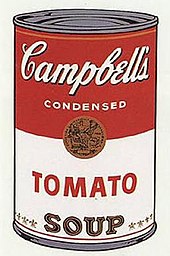
A can of Campbell's soup was, without question, one of the most humble and ubiquitous things in America when Andy Warhol exploded onto the mid century Art scene by creating paintings featuring their soup cans with the iconic red, white and gold label. He also produced paintings of other humble objects, including Coca Cola bottles and dollar bills.
But what you may not know about Andy Warhol is that he started with shoes.
After earning a BA in Graphic Design, Warhol began a career as a commercial artist, illustrating for magazines, advertisers, and others with commercial interest in his work. He created illustrations for companies as diverse as RCA and Tiffany and Company, and was hired in the mid 50's as chief illustrator for I. Miller, a shoe manufacturer headquartered in New York.
Below are some examples of his work for that company, which often included humorous or cryptic captioning of the illustration.


As you can see, almost all of the shoe illustrations featured above are of ladies shoes, which would be expected of an artist doing advertising illustrations for a women's shoe company. (The blue brogues were fanciful depictions of Andy's own shoes, and were as iconic a signature (of him) as was his blonde wig.) Accented with bows, flowers, and dainty heels, the Warhol shoes are definitely meant to be worn by a lady of leisure. Even the brogues don't look very walkable, with their exaggerated toe box and delicate color.
How do Andy's shoes look next to Vincent's?


Do they look like they could be invented by or even used by the same species?
Andy's shoe is beautiful: a delicate, impossible work of art. Vincent's shoes are realistic, utilitarian works of, well, work.
Compare the razor thin sole of the shoe on the right with the thick, hobnailed, indestructible soles on the left. Notice the thick leather uppers of Vincent's shoes, next to the almost lacey velvet of Andy's. Vincent's shoes are unlined and meant to be worn with dense, warm socks, while Andy's shoe is delicately faced in kid, and meant to be worn (if at all) with the sheerest silk stocking.
Vincent's shoes, like new F-150 tires, still have a lot of mileage left on them. Andy's shoedometer is most assuredly at zero. We all know that if we turned Andy's shoe over, there would not be a mark on the bottom of it except a delicately incised number 6.
The only context for Andy's shoe are his words: Shoe of the evening, beautiful shoe. Vincent's boots, in comparison, seem to be kicked off and dumped next to the straw bed of their snoring wearer, illuminated only by the candle he was too tired to extinguish.
The purple shoe is exclusively an object of beauty, and is never meant to be worn (it is no accident that there is only one of them), while the boots look so broken in that they have conformed exactly to their wearer's spread toes and the odiferous and fungal cracks in his aching heels.
Both of these images are so successful, that, with only a glance, we can smell each of the illustrations.
So what's the point of comparing these shoes? Because each of these images tells us a compelling and important story about the artist behind them.
Vincent spent his life desperately wanting to be known intimately by another person. He was rejected over and over; first by his mother, then by a handful of women that he had awkwardly tried to woo. Vincent knew that he was a boor, and spent a lot of time and energy apologizing for his many faux pas; he knew that he would never have the smooth, persuasive people skills that made his brother, Theo so successful. The more Vincent tried to get anyone to like him, the more they bullied, humiliated and rejected him.
Andy, on the other hand, focused his adult energy on keeping his many hangers on at arm's length. Despite his professed shyness and non conformist manner, Andy was popular and adored, working hard to center himself squarely in the middle of the thriving New York Art Scene. But he did not want to be "traditionally" admired. He wanted to make the world take notice and admit that he was everything that they (the right people - celebrities, art critics, the cultural watchdogs) wanted him to be, and so much more.

Andy didn't mind engaging in boorish behavior, which he did not see as a social risk, but rather participated in to increase his status. The Museum of Fine Arts in Boston has a lovely, coppery, verdigris painting on display (left) [just a few floors above some of the most iconic, historic and revered revolutionary period paintings in the United States] which Warhol "painted" by standing in a circle with his friends while they all urinated on a canvas primed with a metallic pigment.
I have seen it for myself, and I have to tell you, it really is beautiful, but it was created by a person who probably did not care a hoot what I would have thought.
I cannot imagine Vincent even conceiving of such a project. Even drunk. With a canvas dropped rightside up on the floor below him and layered with metallic paint. And an extremely full bladder. With his trousers around his knees. While drinking a cup of coffee. Vincent wanted to be liked way too much to participate in such an action.
Andy wanted to be liked too much not to.
So that brings us back to the shoes. All of Vincent's shoes are portrayed in a way that is so painfully, heartbreakingly human, and Andy's shoes are presented with no more intimacy than we would feel in looking a copy of Vogue.
Andy's shoes were rendered only after a deal had been struck for payment. Vincent's shoes were done probably to use up leftover paint and avoid wasting money.
Andy painted Shoes, Christmas Cards and Record Jackets to get the money and recognition that would allow him to retreat into a world populated only by people who were interesting to him; Vincent painted everything with the faint hope that maybe, one day, if his paintings were accepted, it would allow him to enter a world where he would be interesting to others.
Don't get me wrong. I am in love with all of these shoe paintings. They are each exactly perfect, because every painting does such an amazing job of communicating to us the context in which the artist lived. These men did not need to speak, or tweet, or post things on Facebook - what they made did their talking, and it tell us volumes about Art, Commerce, Women, Men, Society (both low and high), Culture, Value, Social Norms and Deviance, and, most of all, Power.
I dare say that Andy could not have happened without Vincent's laying some groundwork for him, and Vincent could not have survived ten minutes in Andy's world before being squashed like an insect.
You only have to look at their bodies of work to know that both men were important, groundbreaking, and visionary artists. I am glad to get to know each of them.
And now, for something completely different (than the great art and artists we were just discussing), I shall paint a still life of my own shoes:
These Beverly Feldman booties carried me all over Manhattan about ten years ago. In them, I saw (for the first time!) Vincent's The Starry Night, enjoyed the hell out of all the big shows on Broadway, ate in some of the best NYC restaurants, and walked arm in arm with my three favorite guys in the world. You could not pay me enough to actually wear a heel that high today, but I keep on keeping them in my closet because I can't bear to give away something that holds so many memories for me. Yes, they are completely impractical, uncomfortable, and impossible to walk in! Yes, I did really wear them. With no Taxis. In December.
And with that in mind, I thought a painting of this outrageous yet very real pair of booties might be the perfect bridge (shoe) between Andy and Vincent.

I start with a charcoal sketch, which I erase with a paper towel and redraw.


The heels are very thin and made of what looks like shiny plastic.


Once I was done with the sketch, I started filling in with some acrylic, (below) trying to match the actual colors of the embroidered flowers on the shoes.


Time is money. Or not.

First some crimson, then titanium white.
Gee, this is sure looking familiar...
Where have I seen it before?
Ahh, Crap on a stick! More pork cutlets!! (see dogwood blog posting...)

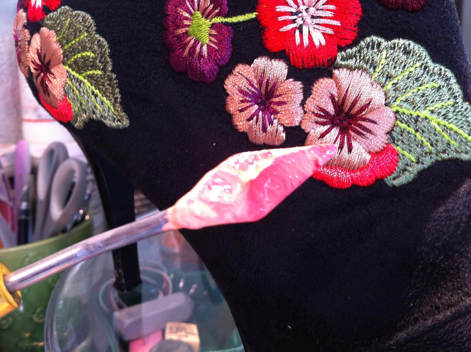

Applesauce, anyone?

I do like the red flowers, though.
At this point, the Art Demigod comes home and asks why I am doing more pork chops. I think you can guess that I had not started dinner (I thought it was his turn to cook).

There was nothing left to do except reject Vincent's exacting realism in favor of Andy's avant guarde thinking.

The pork is banished from my palette forever! (Or at least until I do another caucasian portrait; it's not just the other white meat, it's also the white person flesh tone....)
You can see above that I have darkened the flowers that were translucent/transparent with the proper, opaque colors. I have also sketched in some flooring, baseboard and a wall... I am imagining that these shoes got kicked off in a hotel bathroom just before a lovely soak in the tub.
In the image below, I have added the finishing touches on the flowers (embroidered satin stitches and french knots), and am starting to paint in the wall and tile floor.


I tried to make the flower colors "vibrate" by using accent colors that were the opposite of the field colors.

Below is a close up of the suede highlights, the seaming of the booties and the flowers.

 More close ups, at left (toes),
 At right (heel),

Please let me know what you think. Thank you all for reading along; it has been my pleasure to do the painting and write the blog. I hope that I am inspiring some of you to paint along with me, or, if you are not a painter, to be making whatever kind of art you like to make!
Have a good week.
Catherine


