 For Christmas, my very nice sister Chris often sends us mail order fruit from Harry and David. (This is ironic because her husband's name is David, and the label always says "Fruit from Harry and David with love from Chris and David" - which always sounds vaguely like an edgy new sitcom to me.) Anyway, Harry and David is a company which sells the most beautiful and delicious fruits imaginable, then ships them to you just prior to their peak of ripeness.
At the end of January, we received a holey H&D box, which I opened to find a dozen beautiful oranges nestled in a protective foam lined bed. Because this particular type of orange has a bell shape, these tasty beauties are called "honeybells," and they are so dense and juicy that Harry and David also sends along plastic bibs for you to wear when you eat them!
Vincent had done a few tasty renditions of citrus, including his 1888 still life with basket and six oranges (below.)
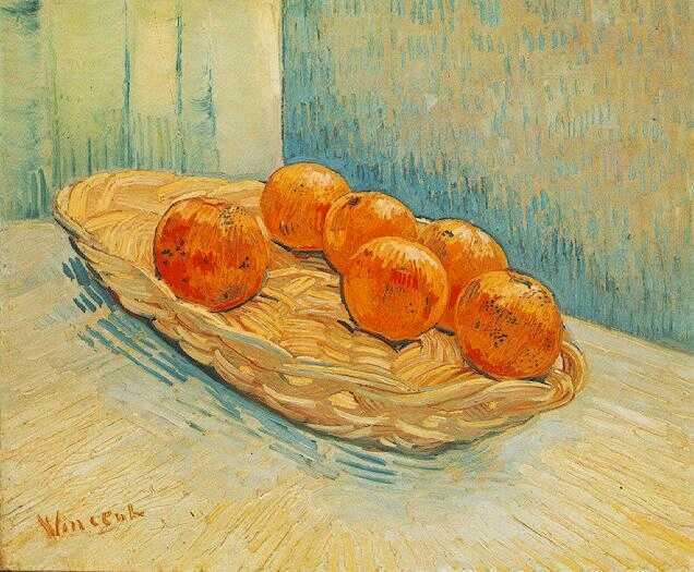
So I grabbed the basket in my collection that I felt was the most similar to the one that Vincent used. Please note that my basket was close only in color and in weave. Vincent's choice was flat, open, and had no handle; mine was high sided with a broad carrying arm. These minor differences would soon turn into a major headache for me, artistically speaking. I decided to set up my still life to photograph in front of one of my living room windows, because the light was particularly good (right then) in that spot. Below you can see my basket of oranges, lights and shadows.
I got out a student sized (11X14) canvas board and started to draw. I had no problem rendering the oranges, which are basically round balls with nipples, but the woven basket was a nightmare... I would get lost in the weaving in and out of the branches of the basket, and I knew that actually painting the shadows would be kind of impossible, to say the least. As I sketched, I determined Vincent's flatter basket choice was probably only roughed in (by him) with an extremely loose (and turbulent?) hand as he started on his painting - note how impressionistic his basket is in his final version - it is not so much a basket as the suggestion of a basket. He may not have even done an initial sketch on his canvas at all - wisely, Vincent allowed us to fill in our own details on the weave of his vessel, and his painting (in my opinion) is the better for it.
 I drew and erased, then drew and erased some more - until I finally looked up from my smudgy canvas and saw my nice, flat, handle-less glass fruit bowl. Eureka!
Not only would the green glass be easier to draw, because it was smaller, it would put more of the focus on the fruit rather than the container.
At left you can see my tribute to the sunshine state of Florida - Although the material of my vessel is markedly different from Vincent's, I think this is going more in the direction of his original work.
OK, not really, but I think it will be flat out easier to paint.
Here is my sketch, from right in front of my living room window.
The first thing that you may notice is that in my sketch, the perspective I present was more directly from the side than Vincent's three quarters downward gaze.

And although my bowl is flatter than my basket was, it is still not as flat as the one in Vincent's painting. The fact of the matter is that the glass bowl in my drawing is just too high sided.
At left and below you can see the bowl sans fruit.

The height of the bowl is made even more challenging because it is a mid century (Ikea knock off) design that is asymmetrically elliptical, presenting the fruit in the manner of a child sliding down and back up a very unsteep slide.
It is a beautiful bowl, and well worth the ten bucks (or whatever it was) that I spent on it at Ikea, but with the reflections and shape, it was a real challenge to render.
 I did not help myself by constantly changing the angle at which I was viewing the bowl. The fruit was stationary on a cabinet in my studio, but my chair is on wheels; whenever I rolled between my easel and desk I changed the perspective.
Vincent's flat basket was a wonderful choice. Clearly, that's what made him Vincent (and me the person who writes about him).
However, at this point I am sick of correcting annoying drawings, and ready to move on to a bit of brush work.
So, at right is the photo of the fruit which ( I am saying) is seen from the angle that I will be painting from.
I love oranges, limes, lemons and especially grapefruit - the combination of fresh, astringent, tart and sweet makes anything citrus one of my favorite flavors... but, unlike a typical still life subject that we can only look at - a bowl of juicy, ripe and appetizing fruit is something that we experience with all of our senses - not just our eyes.
Therefore, I decided to begin by painting my oranges to look like lemons. I am using some creamy, orange-y yellows, and a bit of violet to make the curvy orbital shading. I like the violet and yellow so well together that it seems a natural to vibrate the lemony oranges on an intensely purple background - the painting is simultaneously heated and cooled -

As I start to think about how to paint the bowl, I notice that there is a lot of cooling blue in the greenish Ikea glass - but I don't want to do anything to make the glass appear more opaque. After looking through my blues, I decided on a completely transparent dark blue hue - the impossible to spell indanthrene blue. Notice the little scumbles of purple and blue on the fruit that is suspended in the bowl - I am hoping this application of color will appear as reflections as the painting develops.
At left, you can see how much color - lights, darks, and shadow - is in the underpainting. You can also plainly see the pencil marks that I have begun painting over (albeit with transparent paint), indicating highlights and lowlights, as well as the cute little belly buttons of the naval oranges.
You can see on the right that I have added in more color to the bowl, mixing greens in with the blues. I have also added in some greenish blue reflections on the fruit - I think this helps (dimensionally) to put the fruit into the bowl, as well as to add depth and roundness to the orbs.

You can see a close up of my progress on the glass at your left. I realized as I was painting it that I was just being vain about the shape of the bowl. It was fun to paint the translucent vessel, and even when I realized that the shape was completely wrong, I doubled down on the error just because I loved the way that I was making the glass look. This was not the biggest mistake in the history of the world, but, in the interest of fairness, I should point it out.
Below are the photos that I almost forgot to take. Initially, I had drawn in the view that is just outside where I had set up the still life. You can see (above) that there was a lot going on in my sketch. When I started adding color, I tried to paint a true image of what I had seen, however, once painted, I did not like what I had done. I started to smearily cover over it, until I remembered my camera, and that I was also writing a blog!
 Looking southward, (from my second story window) you can see a large tree that is growing just across the street. Beyond the tree, across a narrowish river that we locals call "the lake," there is a hill that is cut by a winding road. What is off putting is that the road and hill are a good half mile from the location of the (actual) tree in the foreground. The lake and shoreline are too low to be seen from the window, so there is a large swath of missing real estate in my view.
Well, after I had painted it, I hated the tree. It looked very weird - Even though it was (approximately) what you see when you look out that window, the tree was just so big compared to the hill behind it, and was nothing more than an ugly brown distraction. It did the same thing for my painting that jumping teens do in a live news shot -

and that is why paint is awesome - I had (ready in my brush) a liquid ax that felled that snagally tree in no time!
Painting something in or out allows you to edit the world in any way that you want - this is a powerful and good thing, I think.

So in the view at left and below, please note that the view out my window is now just of the hill and the road -
I also gave the sky some scudding light clouds, because, with my newfound powers, I can even use my mighty paintbrush to change a weather pattern (at least in my painting)...
As I look back on these photos, the thing I am noticing is how carefully I am painting.
There is no turbulence at all.
What would Vincent think? What do you?
And yes, I rouged up my oranges, and laid down a tomato red tablecloth, to boot!
I don't know why I chose red for the table cloth - but I am liking it.
The cool and heat are layered in the composition - I am not sure why I think it is working, but it is working (at least for me).
You can see above and beside that I was moving the painting around as I shot the pictures - that is what is making the differences with the darkness and lightness of the oranges and the glass bowl.
Although it looks nothing like the actual shape of the Ikea vessel, I was pretty pleased with the way the glass looked in the shot at right. You can see additional red reflections in the glass, along with yellows and orange.
As a finishing touch, I added in some highlights on the oranges, as well as some darks to add depth to the navels.
On the day that I started this painting, I had an evening commitment to attend a white elephant party where everyone was supposed to bring an item that they had received for Christmas (or any other occasion) but did not want. I decided to take a painting because I wanted to challenge myself to complete a painting in the hours between 10 a.m. and 6 p.m., and I thought I could pass the unwanted item test by using a canvas that had been given to me because it was damaged (a slight nick in the corner of the board).
I was pleased at the party when the painting was fought over (for one round only - it was a very small and extremely polite group of ladies, and really, some of the other gifts were not bad at all...), but eventually, the finished piece went to my good friend, Jan.
But I felt bad for the original picker, Marcia, who was clearly sad that her "good" gift had been stolen. So, before the oranges had been eaten or turned into juice, I decided to paint them three more times.
I set up my bowl and three canvases, and painted factory style during the next two days. I tried to paint with turbulence.
Below are all four finished paintings, #14, #15, #16 and #17. Number 14 went to Jan, 15 to Marcia, 16 to my Mom, and I kept #17 in the VP collection.
Below are the photos -
 |
| #14 - for Jan |
 |
| #15 - for Marcia -the bowl is better! |
 |
| #16 - for my Mom - check out Vincent's similar bowl/background solution! |
 |
| #17 - for the collection |
 |
| And a final bonus - my last painted orange in the series (I accidentally dropped it on my wet palette!) |
Thank you for reading, and I welcome your comments....


