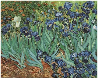
Van Gogh crafted this masterful "study" (study!) while confined to the asylum at St. Remy. It was one of the first paintings he did during his stay there; he was inspired to capture a stand of flowers that he had encountered on his way to visit his doctor (Dr. Paul Gauchet). No painting, of man, woman or flower could be more voluptuous in its rendering of subject matter. No painting, in its cool blues, greens and greys could make you feel (paradoxically) warmer; I dare you to look at this work without feeling the warmth of the sun spread like great hands radiating heat on your back and shoulders.
Our own Texas spring has been remarkably warm and sunny. With the exception of periodic snaps of cold with passing fronts, we have had one of the most mild winters and spring seasons that I can remember. Our bluebonnets, sadly, have been almost nonexistent, limiting themselves to a few small and scraggly patches looking for a foothold in the drought parched landscape. The photographs that you see below were taken about a month ago at a nursery in central Texas, in anticipation of painting the Irises.

Although that particular day was cold, the weeks before it had been unseasonably warm, and you can see that the flowers at the Antique Rose Emporium in Brenham were responding to the heat, light, and drip irrigation by putting on an earnest display.

As I wandered through the garden paths, I was soaking in the budding beauty of the flowers just coming to back to life after their winter slumber.

Although that particular day was cold and the wind was howling, the plants were basking in the bright sunlight; it was a cheerful and welcoming scene.


Given that he was checked into a mental hospital at the time he did this work, I wonder if the grand possibilities of rebirth were at the top of his mind that spring...
Notice how the light dances on the leaves and flower! Look at all of the color in this seemingly monochromatic image of white flower and other white flowers - there are yellows, greens, blues, creams, chartreuse, browns, turquoise, and, of course, a tiny bit of pink from the lil' photo-bomber at the upper left.


The leaves on these iris plants are so flat and broad that they almost look like an aloe vera. They lack the succulent's juiciness, though.

(sadly, we Texans will be running our Air Conditioners full blast by the time that happens....)

So, enjoy some geraniums on me in the best possible way - where you don't have to plant, feed, water or smell them!
So now, on to the painting:

Once again, I divided the work "pizza style," but this time (because the flowers were so "busy" and interwoven) I folded down my original into sections so that it would be easier to render.

One burning art history question that I have not been able to find the answer to: Did Van Gogh do a line drawing on his canvases prior to doing his paintings? (If you know this answer, please leave a comment, I am so curious about this!) There are, of course, many line drawings (often in pen and ink) that correspond almost exactly with his paintings - this is evidence that he at least was working out some of the compositional issues and brush strokes on his paintings in advance - but what is driving me crazy is this: what was the very first thing that he put on his canvases? Was it a charcoal drawing? A pencil one? Or did he go directly to the paint? How much (if any) detail did he put down? How the hell did he begin?
If this particular painting (of the irises) was indeed a study (according to the Van Gogh Gallery, it was a study because there were no line drawings found that corresponded with this work), does that mean that Vincent just painted it freehand, according to what he saw that day as he walked along that garden path? If it was, indeed, a spontaneous painting, then I am completely amazed...

I, on the other hand, found this "study" to be so complex that I had to number which leaves and flowers in order to keep track of everything in my copy. How on earth did Vincent keep all of those leaves separate, straight, and individual in his mind if he was just painting this piece directly from nature? His ability to do things like that as if it were an everyday, normal approach, is what makes VVG a genius!

What follows are some shots of the pencil drawing:


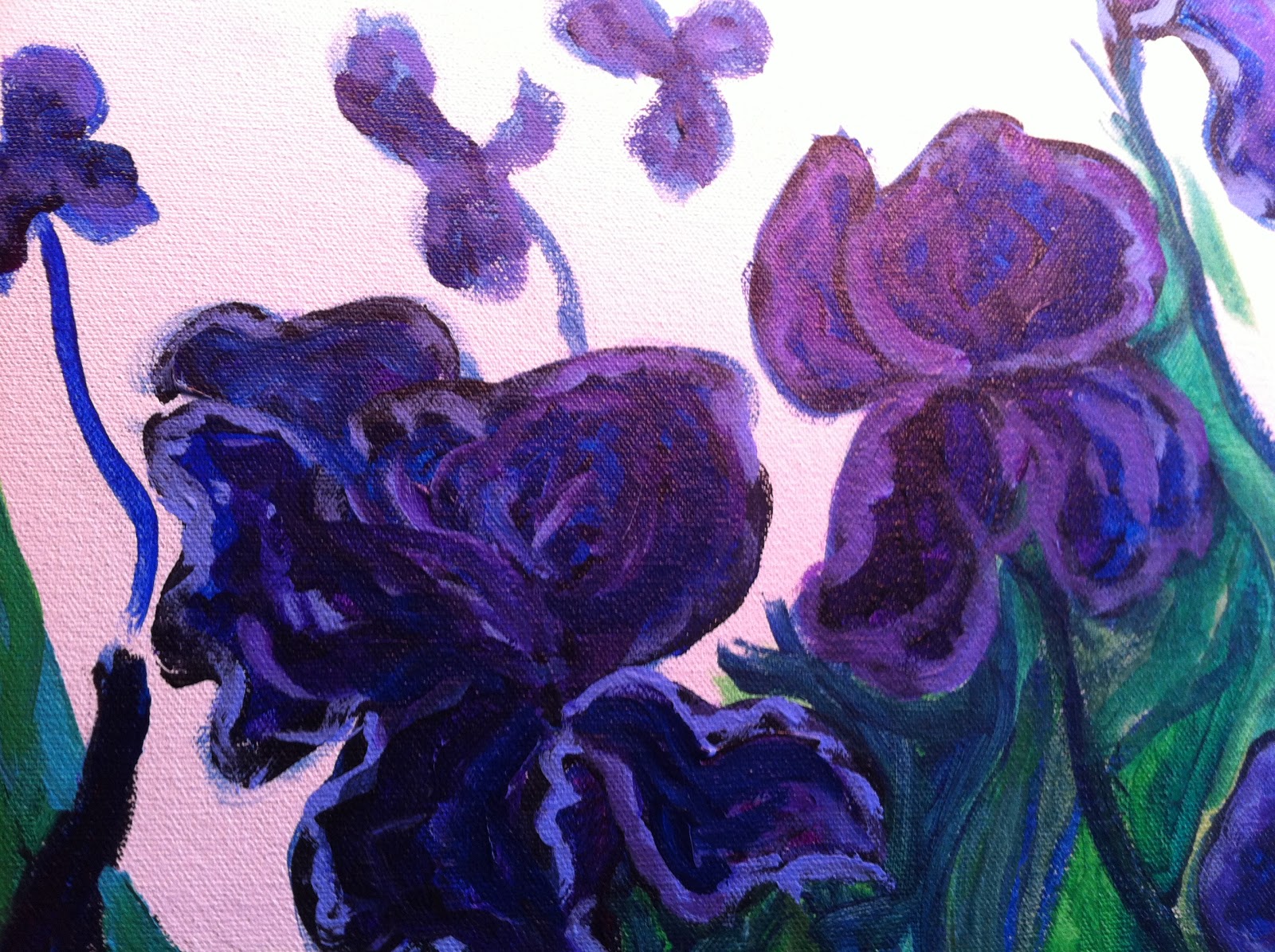
Because the leaves were such a bluish green, I did not hesitate to outline them in blue along with the flower heads.

It was very confusing keeping everything straight. I cannot imagine the added difficulty to trying to accomplish this task without any line drawings and/or in an environment where the subject was waving in the wind while you were trying to paint it! (Or being kind of on the edge of craziness and having just cut off part of my ear while attempting to do this very complex image...)

Ewwww.

The finished painting seems fine and does not smell bad.
Vincent ate his paint - so, I could be worse!

gross.................

(But I am trying to be as honest as I can with the blog... If you read this far, feel free to tell me just how disgusted you are.)


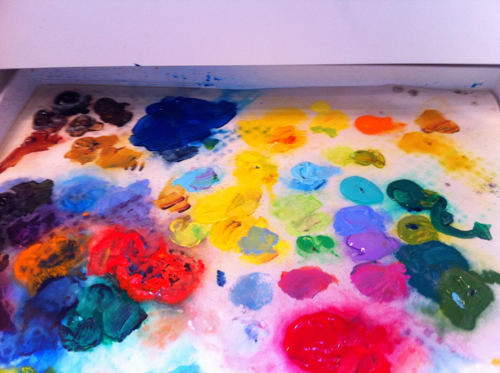
What you can see at right and in the
following photos are close ups of most of the colors that I used in the painting.
It will make the blog longer for me to make the photos big enough for you to read the colors, but I think that is part of the point of this exercise.
Violets, and more violets...
I thought I had two blobs of the same color, and it looks like I did (Prism Violet, at right and below...)


Close ups of some of the blues below:


Notice how some of the colors are opaque, (no clearish trail when they are spread) and some are translucent (the ones with the clearish trail).

Again, these are American Irises, which I think are different from the ones that Vincent painted.
Aren't they pretty?
I stuck them in the tallest thing I have, an antique lemonade pitcher.

I then looked at Vincent's original and observed that his flowers were orange.
But I was painting boldly and with turbulence!

Here are the live irises along with a copy of Vincent's painting. His are much bluer, and of course, I do not have that one lone albino iris (which in fact I kind of never liked in his painting... I get why he did it, but I just find it rather distracting).


And here they are lined up in their neat rows...


Are they too exuberant?
Yes.
I got carried away on some of the petals, as you can see.


The third flower from the left (with the curled over top petal) is the one that should have been white.
Mine is not. I think Vincent will forgive me.


Notice how they are already starting to fade, right after they just opened up!
I promise that I completely refreshed the water each day, and cut a bit off of the stems with every changing. In all, they lasted about a week.


I did this by mixing a lot of different greens on a very wet brush, then slopping them together on the canvas.


Notice at right and below, the many different greens and yellows that were deployed...


I really like the creamy naples yellow at the far right.


The colors at right are in the order below:
"dirt."


I started adding some white highlights to the flowers....


I kept on just playing with it, adding more and more color where I thought it was needed.
Until I finally declared it "done." (Again, I don't know if it is really done, or if I am just done with looking at it for a while... If you see anything you think it needs, let me know.)


It is a varietal straight from my imagination...

I was trying to be very impressionistic with these, as well as with the orange/pink/yellows.

More leaves and dirt are below, along with some fading, prostrate blooms.

And below is the finished painting!

Thanks so much for reading along! I welcome your comments, and would enjoy any discussion this painting might inspire. I have been getting a lot of feed back about selling some of my pieces. Please contact me with a message if you are interested.
Thanks for reading - happy spring!
Catherine
And PS - our coming attraction: tulips!
