Wednesday, August 29, 2012

I think about Vincent: he's crazy, he's crazy not...

At long last, blogophiles - a painting by Vincent that everyone knows!  I think you can guess by the picture on the left which of Vincent's works we will be reviewing this week...

But did you know that Vincent painted these famous flowers many, many times?

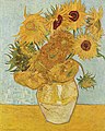
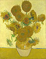
All together, Vincent painted a dozen or so versions of his famous Sunflowers during two significant periods of his life.

The first (of at least four) paintings were done in Paris, when he lived there with his brother, Theo.

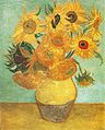
The Parisian Sunflowers (below) are less iconic than the Arles (shown in the book, left) versions, depicting a series of just a few flower heads lying on the ground.  The version you see below is his final one in this series; it is a compilation of several earlier oil "sketches" that Vincent had started with.

Although the Parisian sunflowers are not the favorite of the Art Demigod, I am haunted by their fragile beauty and how they are depicted, literally, decayed and dying, their petals dried and curled, with their very life cut off at the stem.  Maybe Vincent felt that way himself, and thus put the cut stems so prominently in the foreground.  Yet there is something very hopeful in the scene, as well.  The great flowers are captured just as they are being transfigured into the seed of next summer's beauty.  The colors that he used, specifically the juxtaposition of cool to warm, keeps our gaze moving around the canvas, and the brushstrokes allow us to feel the rough textures of the flower centers, as well as the cut stems with our eyes.

These sunflowers, however, were only a prelude to the masterpieces Vincent made in Arles.

As I mentioned, the Paris sunflowers were made during the time that Vincent lived there with his brother.

Theo

In the Art World, Theo Van Gogh was a very important man in Paris in the late 1880's.  Theo was smooth, poised, and polished.  As the company had evolved, Theo had been put in charge of a Groupil Gallery (the entresol) which bought and sold the works by the (increasingly popular, and newly establishment) impressionists, and, then later, by new and rising modernists.  Anyone who harbored any ambition as an artist knew of Theo, and many actively courted his midas touch of favor.  Theo had a keen eye, and his expertise helped to further or make the careers of artists like Monet, Degas, Lautrec, and Pissarro.

In orbit around this golden boy circled every up and comer in Paris.  Being noticed by Theo Van Gogh meant the opportunity to get your work shown to and seen by the right people: critics, the art establishment, and those with large bank accounts, modern taste, and empty walls.  But to get to Theo, first you had to get past Vincent.

Theo and Vincent lived together at this time in an apartment on the rue Lepic.  Theo had paid for studio space there for Vincent to work, and was providing for all of his needs.  Theo had positioned himself with the right job, the right connections, and the talent to be a major player as the head of the entresol.  

He and Vincent's views about art were converging at this time, and both brothers were fascinated with the new, modern, and rapidly evolving styles of painting.  Vincent  became acquainted with the new artists, and was even invited into some of their studios to paint.  Theo appreciated that having Vincent's help would allow him to cast a wider net, and trusted his older brother's ability to recognize and describe art that was good and would sell.  

We do not know the exact reason why, but during this period, Theo did not purchase or show any of Vincent's work at the entresol.

It may have been because Theo feared accusations of nepotism, or it may have been because, when he accepted social invitations from other artists, Vincent behaved like an ass.  He seemed to go out of his way to draw negative attention, like trying to make a point  by falling to his knees, screaming, and tearing at his clothes.  He also (breaking with protocol) brought paintings into the studios then demanded that they be noticed and praised.  Almost everyone involved feared that Vincent would "blow" at any moment, and most tolerated him only because of the hope that it would get them closer to Theo.

As the months progressed, everyone in the group tried their best to avoid Vincent.  
Because Theo would not show his work, Vincent tried to mount his own show in a disastrous exhibition at a cafe in Paris in  1887.  Vincent had spent much time and energy devising this show, which was mounted on the cavernous walls of a working class cafe.  Because his walls were empty, the owner eventually allowed the exhibition, and Vincent tried to recruit all of the other painters to participate.  He saw this as a great opportunity for the artists to all join together in a show of strength and solidarity.  Most saw it as an opportunity to be avoided, with only a handful of others showing with Vincent.  No one took notice of the exhibit.  No critics, no buyers, not even the diners.  Vincent's show was a complete failure.

This embarrassment put Theo, the artists, and Vincent in an escalation of awkwardness that contributed to Vincent's leaving Paris.  No one really knows the exact reason why he departed; because they were living together, the brothers left us no letters to explain what happened.  We only know that in February, 1888, Vincent went to Arles.  There, he rented a portion of a house and, with funding from Theo, had it painted yellow.


The yellow house in Arles; Vincent had rented the "right hand" wing of four rooms 
Vincent had gone to to Arles on the advice of Toulouse-Lautrec, who had encouraged him with tempting descriptions of the more southerly light, color, and weather.

Despite the failure of the cafe show, as well as the distaste with which he was treated by the other artists, it was Vincent's hope and dream that many painters would follow him to Arles, and would help him to establish an artist's colony there.

Vincent continued to accept a considerable monthly allowance from Theo, but he felt guilty for the support his brother provided.  But Vincent's response to that guilt took an unexpected turn: instead of stopping the gravy train, Vincent  devised a scheme which he felt would serve as a model for all working artists and the galleries that sold their wares.  

After carefully working out the argument in his mind, Vincent presented his case to Theo:  Galleries were in the business of selling paintings and other works of art, which could be created only by artists who had the necessary creative setting required to  make commercial, sellable work.  In order to create the work that the galleries sold,  artists should not have to be worried about such mundane, every day tasks like putting a roof over their heads and meals on the table.

Housing, feeding, and providing raw materials for many individual artists in many individual settings was a costly and inefficient way to produce the end product which the galleries could sell; therefore, Vincent argued, an efficiency could be created by housing, feeding and supplying artists together in a communal setting.

In addition to the (obvious to Vincent) economic efficiencies this system would create, the artists would be available to each other to fuel individual creative fires, as well as engage in synergistic "schools" which would develop new and ever evolving ways of creating.  Vincent termed this place, this dream, this fantasy, the "Studio of the South."

It was Vincent's hope that, with Theo's continued (and expanding) financial assistance, such a colony could be founded in Arles.  Theo would be responsible for providing housing, food, and materials, and, in exchange, each of the artists in the colony would send Theo (and Goupil) one painting per week, which could be sold, thus funding the enterprise.

Which was a great theory; but in practical terms, none of Vincent's paintings had ever been sold.

Vincent felt that this colony would provide a safety net for himself and all of the artists who joined.  He realized how fickle the art buying public was;  therefore, those individual artists who were in favor would support those who were not, until the taste and fashion of the buyers changed again.  The communal living arrangement would allow the artist to support one another as a family supports one another, with each member contributing what they could, when they could. ( I think that Vlad, below, would agree.)

(Not the Art Demigod; it's Vladimir Lenin)
Vincent's concept of a communal artists' colony  was a great theory; but in practical terms, nobody liked Vincent enough to want to live with him, much less support him until he could contribute.

Although he had no express approval from Theo, Vincent identified the first target of his recruitment campaign.  He beseeched the 19 year old painter Emile Bernard (15 years his junior), to join him in the yellow house.  Bernard was a talented self promotor and a bit of a maverick, who had been suspended from the Ecole des Beaux-arts for "showing expressive tendencies in his paintings."

Bernard by Toulouse-Lautrec (1886)
Bernard met Vincent in Paris, probably late in 1886.  The opportunist Bernard realized that Vincent, with his proximity to his dealer-brother Theo, could be a good person to use in jockeying for his own work.

Vincent favored the young artist for the colony because he had misinterpreted the younger man's completely commercial attention to him for friendship.

Vincent wrote many times to Bernard, begging for his participation, but Emile always demurred, choosing instead to spend his time painting in Brittany.

Later, it was Emille Bernard who wrote the most sensational (and greatly exaggerated) account  of Vincent's self mutilation, and who first reported the death of Van Gogh to be a suicide.  Bernard had not been present for either event, but he proved himself a man who understood the value of proximity to publicity.

When he realized that Bernard would not help with the colony, Vincent wrote to a distant runner up in the beauty pageant, Paul Gauguin.   (There will be more about Gauguin, his adventurous life, his very stormy relationship with Van Gogh, and his contribution to modern art, in a later posting.)

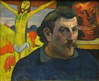
Self-portrait of Gauguin, 1889-1890
When Gauguin accepted Vincent's offer (and Theo's bribe of $150 francs per month - not to contribute to the colony, but to keep an eye on his brother), Vincent prepared glorious decorations for his new housemate by painting canvases full of sunflowers.


I was astounded to learn that Vincent painted at least three of these seven sunflower paintings simultaneously!  In one of his letters, he described the experience like "conducting a symphony," as he attacked the canvases with paint.  Although (at least three) of these were painted side by side, not one of these compositions is an exact copy of another.  Each painting stands individually, by itself; unique in color, character and mood.  Yes, if you look closely, you can see that some of the flowers are the same exact flowers in the same exact places; but his achievement in not copying himself is, to me, amazing.


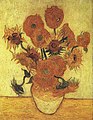
Vincent had thought about these paintings for a long time before he put flowers in a vase or his brush into a blob of paint.  He had worked out all of the color schemes in his mind's eye, and carried these individual and really very different paintings in his brain for some time.  He was nuts, but he was also a genius.

[Author's Note: I began this particular posting and painting during early July; as I am writing this, it is August 28.  After I completed the vase and flowers, I decided that I just didn't like it, and set it aside.  I then started on a second version (I guess the Vincent sunflower fever had somehow infected me..) which I also completed partially.  I then decided that I needed additional colors of yellow to complete the paintings, and by the time I had gotten those colors, I had moved on to other paintings and postings.  I have company this week and next, so am short on time; therefore I am taking advantage of these half completed works so that I can keep on posting in a somewhat regular manner.]

Anyway, I had been waiting for Whole Foods to put their Sunflowers on sale, and finally it happened (2 bunches, $10)! [These flowers were purchased around the fourth of July - don't blame me if you have to pay more!] I bought 5 bunches, which you see in the photo, right.  Thanks, WF, and thanks to the Artdemigod, my patron and supporter!

The actual sunflowers that I will be painting are different from the ones that Vincent painted, both in Paris and in Arles.  His flowers, of course, were the french varietal, and mine are from Texas.  His were in bloom and were painted (quickly, furiously, to beat their wilting) in August.  [I rendered mine just after the 4th of July.]  I plan on painting fast while I have them, and being grateful for photographs when I do not.

My painting will be more similar to the Arles versions; stacks of flowerheads, loosely arranged in a rustic vessel.


And now, for something completely different, I am going to start with a bona fide pencil sketch on a separate piece of drawing paper.


You can see that all I have drawn are big, loose shapes on the sheet .

I taped the drawing paper down on my canvas so that I could predict the size of my final sketch on the canvas board, which measures 20" X 24".

My composition differed from Vincent's in that my vase is much more forward in the painting than his was.

You can see below where I added in more details on the flowers.  The actual sunflowers were very challenging to draw; they grow in curly leafed layers from the back to the flowerhead.


 Below is a close up of the center of the flower head.  It was dotted with sticky, moist drops that glistened in the spotlight I had trained on the flowers.  Note the variety of color in this photo; I see blacks, grays, ochres, browns, whites, siennas, oranges, alizarin crimson, yellow and tan.  And that's just in the center!


 Here is the finished sketch on the canvas board.  I rendered it in charcoal, and I made the necessary corrections to the composition by moving the vase back a bit in the image, and adding in a horizon line.

I was glad to have done it "Vincent's way" as I studied his originals more and realized how much he used the background and table colors to make the sunflowers and vase colorations vibrate and hum.

Once again, Vincent sure knew what he was doing.  There is so much I am learning from him, and I hope you are, too!


At left and below are some shots of the sunflowers from various angles.  I had purchase a lot of flowers and felt like I had to use every one in my composition.
 You can see above that the flower on the bottom row in the middle was drooping a bit; the sunflowers in that vase drank almost the entire vase full of water each day!

I did remember the neat trick of cutting the stems while they are immersed in a sink full of water; that did seem to help most of the flowers, but sadly (see above), not all.
 Here is my initial palette of greens and blues, which I used to paint the vase and the flower stems with.

Some of the colors are opaque, and some are transparent.  See how the yellow green on the upper right looks like a solid mass (opaque), and the blue on the upper left (translucent) and can be spread very thinly?
 OK, here is the big view of the leaves and vase.

Initially, I had left a lot of the leaves attached to the flowers as I arranged them into the vase.  I figured it was easier to keep a leaf on than to put it back after I had cut it off, and I wanted to see how they would look.

The leaves made the composition very busy and confusing, so I started snipping them one by one.  I left only a few leaves in the final arrangement, which you can see at the lower right corner of the flowers.


Here is a close up of the vase; a series of green stripes accented by transparent blues.

And here is a close up of one of the flowers and leaves.  I wanted an acidy yellow green in the center, but made the mistake of drawing too heavily in charcoal (without blowing it away) before I painted.  My acidy green came out looking kind of acidy grey.


More leaves, more charcoal regrets, and I am finally ready to let the sun shine in!


I used a nice little filbert for this part.  What makes it so awesome is the rounded knife edge right along the tip.  That edge allows for pretty precise painting, which I will need to do the sharp edges and points of the flower petals.


Even though it is looking a little muddy to me, I like the yellow with the green and blue.

But the way that the flowers overlap each other and weave in and out of the bunch is quite confusing to paint!

I keep having to stop painting and isolate which flower I am trying to work on so that I know if the leaves and petals on any particular flower are above or below the leaves and petals on it's neighbor.


The charcoal is what is making things so muddy.


Lesson learned, Vincent.


Now every petal is painted, it is time to begin on the centers!


I have got to do something to brighten up the grayish acid green... now what is opposite green on my color wheel?


It is yellow or red violet, depending upon the color of the green.


As the flowers are already quite yellow, I think I am going to go purple.

The picture below is as far as I got before I set this painting aside.  I put it where I could see it, and let it "cook" for more than a month.  I didn't hate it, but I certainly didn't love it, either.


And a close up of the centers....


And the vase...

And both --

I am starting now to fill in some turquoise blue background.  I used three colors: light blue, teal and turquoise.

I picked up swirls of one, two, and three colors at a time, then blended them together on the background.

I think that the blues are a good foil for the yellows.
A close up where you can see the swirly, streaky painting.

Next, I look for more contrast by adding in a multicolored and very warm tabletop.


I kept that on my easel for a few more days, and this afternoon added in some more background (to replace confusing leaf placement), some stems, and a few more highlights in the centers of the flowers.  Below is the finished painting.


See you next time, and thanks for reading!

Catherine

Friday, August 17, 2012

Vincent and I discuss Andy Warhol. Andy pees on a painting.


Throughout his very brief career, Vincent Van Gogh painted a number of self portraits, chronicling an ever evolving and conciously imperfect human being.  He  chose himself so often as a subject because he wanted to paint a person, and did not have the money to pay models or have many friends who were willing to sit for him.  There was always a man in his mirror, though, and that man lives on as his most frequently painted portrait subject.

At left is a quick sketch of Vincent that I painted (on an envelope that I used to mail out some information about the blog) this week.  It is based on the portrait you see (at right) below.


Art historians have long celebrated Vincent's lack of access to models, because the 34 (more or less) self portraits that he produced tell a very human and intimate story of his life.

But are his faces the only autobiography that Vincent left behind?  Absolutely not.

The letters he wrote provide a comprehensive, chronologically ordered story in which Vincent describes his location, his feelings, his dreams and disappointments, and the specific ideas that he was thinking about at any given moment.

In their own way, his other paintings are autobiographical as well.  His landscapes capture the mise en scene of Vincent's world: the architecture of Northern Europe at the time that he lived there, the dress and habits of the common individuals that populate his paintings, and the pastoral and urban environments where he worked.

The flower pictures and other still lifes also tell their own tales - the  sunflower paintings that Vincent did arguably encapsulate Vincent's thoughts on birth, life, death and rebirth, and his many celebrated portraits of (mostly his own) shoes are an intimate travelogue, revealing a life lived not as a tourist, but as an expatriate.

[Image]

Vincent's depictions of shoes are almost painfully intimate.  Upon viewing the ones shown above, I felt  as if I had walked (uninvited and unwelcome) into the wearer's bedroom.  The rendering of the humble, worn boots was done so masterfully that as my eyes scanned the subject, I could feel the smooth, clammy lining with the sole of my own foot and the brush of the ticklish leather tops on my calves.

With only the briefest glance, the painting lets us know exactly how Vincent felt about walking, and hard work, and the worth of a man.  Those boots describe not only Vincent's values, but what he valued, as well.  The warm yellow atmosphere in the painting elevates the humble subject, bathing the cool black boots in a golden, almost heavenly aura.  Without so much as a single word, Vincent's painting is a lesson on economics, the importance of a work/rest balance, and populism.

Many articles and scholarly papers have been written about Van Gogh's shoe paintings and their place in our cultural history.  Vincent's elevation of such a humble object was an important advancement in the continuum of artistic discovery, and it was his still lifes of shoes that brought us (at least in part) to the pop art movement in the 1960's.


A can of Campbell's soup was, without question, one of the most humble and ubiquitous things in America when Andy Warhol exploded onto the mid century Art scene by creating paintings featuring their soup cans with the iconic red, white and gold label.  He also produced paintings of other humble objects, including Coca Cola bottles and dollar bills.

But what you may not know about Andy Warhol is that he started with shoes.

After earning a BA in Graphic Design, Warhol began a career as a commercial artist, illustrating for magazines, advertisers, and others with commercial interest in his work.  He created illustrations for companies as diverse as RCA and Tiffany and Company, and was hired in the mid 50's as chief illustrator for I. Miller, a shoe manufacturer headquartered in New York.

Below are some examples of his work for that company, which often included humorous or cryptic captioning of the illustration.


As you can see, almost all of the shoe illustrations featured above are of ladies shoes, which would be expected of an artist doing advertising illustrations for a women's shoe company.  (The blue brogues were fanciful depictions of Andy's own shoes, and were as iconic a signature (of him) as was his blonde wig.)  Accented with bows, flowers, and dainty heels, the Warhol shoes are definitely meant to be worn by a lady of leisure.  Even the brogues don't look very walkable, with their exaggerated toe box and delicate color.

How do Andy's shoes look next to Vincent's?


Do they look like they could be invented by or even used by the same species?

Andy's shoe is beautiful: a delicate, impossible work of art.  Vincent's shoes are realistic, utilitarian works of, well, work.

Compare the razor thin sole of the shoe on the right with the thick, hobnailed, indestructible soles on the left.  Notice the thick leather uppers of Vincent's shoes, next to the almost lacey velvet of Andy's.  Vincent's shoes are unlined and meant to be worn with dense, warm socks, while Andy's shoe is delicately faced in kid, and meant to be worn (if at all) with the sheerest silk stocking.

Vincent's shoes, like new F-150 tires, still have a lot of mileage left on them.  Andy's shoedometer is most assuredly at zero.  We all know that if we turned Andy's shoe over, there would not be a mark on the bottom of it except a delicately incised number 6.

The only context for Andy's shoe are his words: Shoe of the evening, beautiful shoe. Vincent's boots, in comparison, seem to be kicked off and dumped next to the straw bed of their snoring wearer, illuminated only by the candle he was too tired to extinguish.

The purple shoe is exclusively an object of beauty, and is never meant to be worn (it is no accident that there is only one of them), while the boots look so broken in that they have conformed exactly to their wearer's spread toes and the odiferous and fungal cracks in his aching heels.

Both of these images are so successful, that, with only a glance, we can smell each of the illustrations.

So what's the point of comparing these shoes?  Because each of these images tells us a compelling and important story about the artist behind them.

Vincent spent his life desperately wanting to be known intimately by another person.  He was rejected over and over; first by his mother, then by a handful of women that he had awkwardly tried to woo.  Vincent knew that he was a boor, and spent a lot of time and energy apologizing for his many faux pas; he knew that he would never have the smooth, persuasive people skills that made his brother, Theo so successful.  The more Vincent tried to get anyone to like him, the more they bullied, humiliated and rejected him.

Andy, on the other hand, focused his adult energy on keeping his many hangers on at arm's length.  Despite his professed shyness and non conformist manner, Andy was popular and adored, working hard to center himself squarely in the middle of the thriving New York Art Scene.  But he did not want to be "traditionally" admired.  He wanted to make the world take notice and admit that he was everything that they (the right people - celebrities, art critics, the cultural watchdogs) wanted him to be, and so much more.


Oxidation Painting
Andy didn't mind engaging in boorish behavior, which he did not see as a social risk, but rather participated in to increase his status.  The Museum of Fine Arts in Boston has a lovely, coppery, verdigris painting on display (left) [just a few floors above some of the most iconic, historic and revered revolutionary period paintings in the United States] which Warhol "painted" by standing in a circle with his friends while they all urinated on a canvas primed with a metallic pigment.

I have seen it for myself, and I have to tell you, it really is beautiful, but it was created by a person who  probably did not care a hoot what I would have thought.

I cannot imagine Vincent even conceiving of such a project.  Even drunk. With a canvas dropped rightside up on the floor below him and layered with metallic paint. And an extremely full bladder.  With his trousers around his knees.  While drinking a cup of coffee. Vincent wanted to be liked way too much to participate in such an action.

Andy wanted to be liked too much not to.

So that brings us back to the shoes.  All of Vincent's shoes are portrayed in a way that is so painfully, heartbreakingly human, and Andy's shoes are presented with no more intimacy than we would feel in looking a copy of Vogue.

Andy's shoes were rendered only after a deal had been struck for payment.  Vincent's shoes were done probably to use up leftover paint and avoid wasting money.

Andy painted Shoes, Christmas Cards and Record Jackets to get the money and recognition that would allow him to retreat into a world populated only by people who were interesting to him; Vincent painted everything with the faint hope that maybe, one day, if his paintings were accepted, it would allow him to enter a world where he would be interesting to others.

Don't get me wrong.  I am in love with all of these shoe paintings.  They are each exactly perfect, because every painting does such an amazing job of communicating to us the context in which the artist lived.  These men did not need to speak, or tweet, or post things on Facebook - what they made did their talking, and it tell us volumes about  Art, Commerce, Women, Men, Society (both low and high), Culture, Value, Social Norms and Deviance, and, most of all, Power.

I dare say that Andy could not have happened without Vincent's laying some groundwork for him, and Vincent could not have survived ten minutes in Andy's world before being squashed like an insect.

You only have to look at their bodies of work to know that both men were important, groundbreaking, and visionary artists.  I am glad to get to know each of them.

And now, for something completely different (than the great art and artists we were just discussing), I shall paint a still life of my own shoes:

These Beverly Feldman booties carried me all over Manhattan about ten years ago.  In them, I saw (for the first time!) Vincent's The Starry Night, enjoyed the hell out of all the big shows on Broadway, ate in some of the best NYC restaurants, and walked arm in arm with my three favorite guys in the world.  You could not pay me enough to actually wear a heel that high today, but I keep on keeping them in my closet because I can't bear to give away something that holds so many memories for me.  Yes, they are completely impractical, uncomfortable, and impossible to walk in!  Yes, I did really wear them.  With no Taxis.  In December.

And with that in mind, I thought a painting of this outrageous yet very real pair of booties might be the perfect bridge (shoe) between Andy and Vincent.


I start with a charcoal sketch, which I erase with a paper towel and redraw.


I added in the flowers, which on the actual booties are embroidered in silk thread on beautiful black suede.

The heels are very thin and made of what looks like shiny plastic.

In the sketch, which I did on a primed, stretched 16" X 20" canvas, I used a charcoal stump (at left), which I sharpened to a point by just rubbing it on a scrap piece of paper.  You can see below about how big my piece of charcoal was.


Once I was done with the sketch, I started filling in with some acrylic, (below) trying to match the actual colors of the embroidered flowers on the shoes.
Like Vincent must have, I was using up the leftover paint on my magic pallette - the mistake I was making was in using up all of the translucent and transparent paints from the end of the dogwood painting - you can see for yourself what poor coverage I was getting in my effort to economize.


Here is a little close up of the flowers and leaves.  Yup.  They're translucent, all right.

Time is money.  Or not.
I am mixing up some of the pinks for the many peachy/pinky flowers that are on the boots.

First some crimson, then titanium white.

Gee, this is sure looking familiar...

Where have I seen it before?

Ahh, Crap on a stick!  More pork cutlets!!  (see dogwood blog posting...)


Yep. Pork.

Perhaps painting in some of the background of the bootie will make this seem less like Groundhog's Day...


Applesauce, anyone?


I do like the red flowers, though.

At this point, the Art Demigod comes home and asks why I am doing more pork chops.  I think you can guess that I had not started dinner (I thought it was his turn to cook).


There was nothing left to do except reject Vincent's exacting realism in favor of Andy's avant guarde thinking.


The pork is banished from my palette forever! (Or at least until I do another caucasian portrait; it's not just the other white meat, it's also the white person flesh tone....)

You can see above that I have darkened the flowers that were translucent/transparent with the proper, opaque colors.  I have also sketched in some flooring, baseboard and a wall... I am imagining that these shoes got kicked off in a hotel bathroom just before a lovely soak in the tub.

In the image below, I have added the finishing touches on the flowers (embroidered satin stitches and french knots), and am starting to paint in the wall and tile floor.


Some close ups of the flowers; you can see that the cobalt blue one above has the orange stitches but not the light blue ones; the one at right has both.

I tried to make the flower colors "vibrate" by using accent colors that were the opposite of the field colors.


At left I have added more to the background, as well as some shadows underneath the shoes.


Below is a close up of the suede highlights, the seaming of the  booties and the flowers.


More close ups, at left (toes),
At right (heel),


and left again, the ankle of the upright bootie.
And here is the finished painting!


Please let me know what you think.  Thank you all for reading along; it has been my pleasure to do the painting and write the blog.  I hope that I am inspiring some of you to paint along with me, or, if you are not a painter, to be making whatever kind of art you like to make!

Have a good week.

Catherine