A large part of what makes Vincent original painting so beautiful and memorable is the stunning blue background that he put behind his almond branches.

Vincent painted the almond branches to hang in the bedroom of his brother, Theo, and Theo's wife, Jo. The gift was in honor of the birth of their son, whom they named Vincent.
In part, I selected this particular project because I wanted to make a housewarming gift for my Mom, who will be moving soon to an assisted living facility. I wanted her to have something beautiful to wake up to each morning, and I love the juxtaposition of the gnarled old branches still blooming with new life - a metaphor that I found appropriate for an octogenarian who still has a lot of living to do. But this work is about so much more than flowers and branches. Vincent absolutely nailed the background, which is like a master class in atmosphere.
Look closely, and you will see that although the background is blue, and basically "sky" color, it is really buzzing with layers of deep blue, light blue, medium blue, cool blue and warm blue, and painterly additions of greens, yellows, pinks and whites. The color is so artfully applied - you can't look for a moment and keep your eyes from moving on to the next brilliant patch. This lively movement is what makes this painting so successful! It does look like the sky, but like the best sky on the best day that you have ever lived. Vincent makes you feel the warmth of the spring sun seeping into bones chilled from winter. (Not easy to do, considering I am viewing this in Texas. In August. Triple digits and all...)

So I want to do something that will help me to capture in my own work the happy feeling that Vincent's painting gives me.
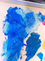
I start by just filling in the background with big patches of a variety of light, deep, and medium blues. Sometimes, I mix the blues together on my brush, blending them streakily on the canvas, and sometimes, I am just pulling pure color and trying to dance it around the images of the branches and porkchops (see part 1).

 Since the last post, I have also added some white and true pink to the flowers, and dotted the middles with some mossy green hints, topped by bright yellow and orangey yellow centers.
Here is a closeup of the background technique.
It was really fun to do this, and the new magic palette kept all of the paint very mixable, which was key to the blending on the canvas.
I did keep the paint well misted with water, using a very fine spray recycled glasses cleaner mister, which I had filled with h2O.

At right is my book with the image of the painting that I had traced; I used this and another copy of the painting from a different Van Gogh book to inspire my own blue application.
As an aside, I did observe that there are HUGE differences in the color quality of different books, and even in the images of the same thing on the web. I did use the books for inspiration, but at the end of the day I had to stand back, look at my own painting, and decide if it was working or not.


At right you can see where I have a little bit more of the background filled in...
I was thinking that this was making things look even more dappled, and kind of cool...

But the ArtDemigod came home and said that everything looked like it was underwater.
I was a little miffed, considering how long it took me to mix all of that color and fill all of that in, but after setting up the painting in the living room and looking at it while we watched the Olympics...

(And, please, someone tell me this: why is it that everytime I turn on the Olympics it is either two girl beach volleyball, indoor ladies volleyball, or water polo, which is essentially just in the pool volleyball? Is it just me? How about at least showing some testosterone fueled men's volleyball? Is that too much to ask?)
... I decided that he was right. The background was starting to come off not as Vincent's beautiful sky blue, instead it was looking much more like a deep ocean blue. I half expected a dolphin to come swimming out around one of the branches.


I started adding in some deep, bluish greens, which you can see on the right side of the thin branch in the painting on the left.
I then pushed in mossy, as well as more yellowish greens, which I blended with the most spectacular transparent color, phthalocyanine blue (green shade). It is a mouthful, and I have no clue how to actually pronounce the name, but who cares? This stuff worked just like a waring blender for the greens and the blues. I will explain how I used this wonderful muddling mixer, but first, a little definition of terms:
Acrylic and oil paint can be transparent (meaning you can see through it), translucent (you can partly see through it), or opaque (you can't see through it at all).
Consider this: you can think of these different levels of color like the items that you find in a drawer of underwear.
Transparent color is like a pair of the finest silk stockings.
Translucent color is like a pair of cheap tights.

Opaque color is SPANX.

The original colors that I laid down (the medium, deep and light blues) were opaque, and they formed the first layer.
At left you can see where I added the transparent phthalocyanine blue (green shade), mixing it with a variety of different greens, blues, and the tiniest hint of yellows, which were all either translucent or opaque (or somewhere in between - it is a scale...).
I would pick up a little bit of the green, blue or yellow that I wanted to use, and mix that on my brush with the phthalocyanine, then blend the two, or sometimes three or even four different colors together on the canvas.
This was super fun to do; there was a lot of swirling colors around, then sitting back to watch as the colors mixed.

In this second layer, which you can see quite well above and to the right, I blended everything together very streakily.
I think that part of what was making it look good was that I was able to keep everything quite loose (and not have to paint very carefully in every nook and cranny...) because I had already laid down that good layer of streakily blended opaque color.
The more streaks of new color that I added, and the more layers of blended color that were applied, the more swirly and deeply layered a resulting color(s) I got.

At left you can see the original swirls of the varying shades of just blue, and below, you can see the first layer of green, particularly around the central branch.
 |
| The single flower in the center of the image is the one where I "whited out" the original stem. |

I have to say that I am liking the way the bark is looking next to the blue; the colors seem to vibrate together; and I am really loving the way the grayish highlights are looking.
So far, the bark has been my favorite part of doing this painting...
So far, the bark has been my favorite part of doing this painting...

Here are some random images that show the progression of the swirls and whorls of the background.
It did feel very cool and pleasant to be enrobed in all of this cool, cool color; it was a delicious contrast with the wilting, browning grass outside of my window.


You can see for yourself how much color I am getting by just by blending blues, greens and the faintest hints of yellow...

I did put few broken branches into my painting, as did Vincent in the original. I wanted the tree to look old, and I think that old trees have probably seen some bad weather and aggressive deer in their day... the broken stems were actually quite easy to paint; filling in the negative space around them took a steady hand, but it was a manageable event.

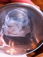
Here is a photo of part of the palette that I was using; you can see how much blending of the colors there was...
The transparent phthalocyanine blue (green shade) can be seen in the lower left corner of the image; you can estimate how much of this color I was using when you see it in scale next to the other colors in the photo.
I think that I replenished that color about 3 times during this part of the painting.

And the flowers are looking a little better than the porkchops from before, right? Actually, I am concerned that the flowers have gone from looking like dinner ingredients, to looking like the orchids that are used in making leis.

Below is the painting depicted upside down. I had to turn the painting over in order to really get in to all of the tight spots next to the wood; I don't really mind the upside down view; it makes me feel like I am laying on the ground underneath the tree...

And, when it was dry, I put it back out in the living room for easy looking and critiquing during the - all Volleyball all the time - London Olympic Games.

ArtDemigod (when he was, at last, able to tear himself away from the Sets, Bumps, and Grinds of the bikini clad girl on girl beach Volleyball), pronounced the background a very good replication of the type of background that cheesy photographers put you in front of for those awkward family photos.
I was not happy to hear this, especially when I concluded that he was right...

Poco summed up my feelings perfectly.
So, it was back on to the easel the next morning. I knew that if I just kept adding paint on top of paint, that all I was going to do was ruin what I did like about the background, which was the variety and depth of color that I had achieved. I agree; it did look a little too "done" and "backgroundy," and did not look enough like what I was trying to depict, which was "sky." It was time to break out the big guns.

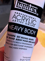
Pictured at left is a product that is always displayed on the shelves of every art supply store; you will find it at the best, most professional art supplier in your city, and you will also find it at Michael's.
Before I learned anything at all about painting, I would see this in the painting section, and wonder what it was used for. Glazing medium... did it make things shiny? Was it a special kind of paint to depict doughnuts and ham? (It seemed like a big bottle for such a specialized task.)
Was it a drink forced onto unsuspecting models by demanding painters, to give their portrait subjects a vacant look?
This glazing was a mystery, until I took a basic adult painting course (offered through the art school of my local museum... look for one near you!), where the magic of glazing was revealed.
The idea of glazing is to apply a super thin layer of color on top of another (dry) color. The super thin layer should be thin enough that the underneath color can peek through, allowing the viewer to see a third color, which is a blend of the first color and the glazing color.
Artists use this technique to add in a different color, to correct a color that may be not quite right, and to blend neighboring colors so that they look more cohesive.
But all of this was still quite confusing to me. If you wanted thinner paint, wouldn't you just add water? Wouldn't that make it thinner? Couldn't the color peek through then?
My painting instructor explained that the glazing medium (there are special mediums just for use with oils and special mediums just for use with acrylics) held the color without diluting the pigment. I thought, "OK," but I still didn't quite get it until I was cooking some chicken soup.
 The glazing medium is like stock.
You could add water to stretch your chicken soup, but thinning the soup with water would just wash out all of the flavor, along with all of the good stuff that draws your taste buds to the chicken soup in the first place.
The stock allows you to stretch your dish without any sacrifice of flavor. All of the flavor molecules are still there in a rich, even distribution. The soup is thinned without it tasting thinner.
 At left and below are two photos of a portrait that I did of my son, Kiefer, for his college graduation present. The one on your left is the earlier version, before I had extensively applied glazes of color to the areas other than the windows of the buildings (his college) behind him.
You can see the differences that the glazes added, particularly in the

cowboy hat, the sky, the lawn, and his hair. The illusion of the windows in the center building was done almost entirely with layers upon layers of glazes. You can see, also, how the glazes warmed the image, and cast a sunny glow of atmosphere to the scene.
This technique is how the old masters were able to paint such finely detailed works; they were done very slowly and precisely, one layer at a time.
I don't think that Vincent generally used this technique; his painting was much more the fast, loose, gestural style. But I am going to give it a go in this painting, mainly because I can't think of any better way to solve my background problem.
Before I learned anything at all about painting, I would see this in the painting section, and wonder what it was used for. Glazing medium... did it make things shiny? Was it a special kind of paint to depict doughnuts and ham? (It seemed like a big bottle for such a specialized task.)
Was it a drink forced onto unsuspecting models by demanding painters, to give their portrait subjects a vacant look?
This glazing was a mystery, until I took a basic adult painting course (offered through the art school of my local museum... look for one near you!), where the magic of glazing was revealed.
The idea of glazing is to apply a super thin layer of color on top of another (dry) color. The super thin layer should be thin enough that the underneath color can peek through, allowing the viewer to see a third color, which is a blend of the first color and the glazing color.
Artists use this technique to add in a different color, to correct a color that may be not quite right, and to blend neighboring colors so that they look more cohesive.
But all of this was still quite confusing to me. If you wanted thinner paint, wouldn't you just add water? Wouldn't that make it thinner? Couldn't the color peek through then?
My painting instructor explained that the glazing medium (there are special mediums just for use with oils and special mediums just for use with acrylics) held the color without diluting the pigment. I thought, "OK," but I still didn't quite get it until I was cooking some chicken soup.
The glazing medium is like stock.You could add water to stretch your chicken soup, but thinning the soup with water would just wash out all of the flavor, along with all of the good stuff that draws your taste buds to the chicken soup in the first place.
The stock allows you to stretch your dish without any sacrifice of flavor. All of the flavor molecules are still there in a rich, even distribution. The soup is thinned without it tasting thinner.
The glazing medium allows you to thin your color without washing it out. I can dig it!
So how much glazing medium should you use? Like cooking with chicken stock, the recipe can be pretty loose. If you want just the tiniest hint of color and a whole lot of clear, then use a lot of the glazing medium. If you want your top color to really dominate what is underneath it, then use just a little of the glazing medium, or none at all.
Keep in mind, though, that if you want the lower color to still shine through, painting without any glazing medium at all will work only with thinly applied transparent colors (see method described above), and no glaze means no shine. If you use transparent, translucent, or opaque paints and cover what is underneath, then you are not glazing, you are correcting or repainting.
That said, who cares how we define the terminology? The action should suit whatever goal you are trying to accomplish; what you call that action is, actually, irrelevant. It is your painting - there is no "right" or "wrong" to it - is simply is what it is. The only wrong you can do is to not pick up your brush.
The glazing medium also can slow down the drying time; your results will depend on how much medium you are using, the humidity in your environment, and if you want it to dry quickly or not (the more you want it to dry, the slower your drying time - it has to do with the wry humor of the art gods). Don't try to repaint over wet glaze - it will lift the previous layer and ruin your painting.

You can see the differences that the glazes added, particularly in the

cowboy hat, the sky, the lawn, and his hair. The illusion of the windows in the center building was done almost entirely with layers upon layers of glazes. You can see, also, how the glazes warmed the image, and cast a sunny glow of atmosphere to the scene.
This technique is how the old masters were able to paint such finely detailed works; they were done very slowly and precisely, one layer at a time.
I don't think that Vincent generally used this technique; his painting was much more the fast, loose, gestural style. But I am going to give it a go in this painting, mainly because I can't think of any better way to solve my background problem.

You can see where I am just starting to mix the glazing medium and the color (ultramarine blue). I am mixing right on the palette paper in my magic palette box; the implement I am using is a palette knife.
I should have picked out a long palette knife rather than this short one, but this was the first one I grabbed.
The mixing is done just by pushing and folding the color and glaze over and over, kind of like kneading bread (we have such a food theme going in the blog this week!)
The ultramarine is not transparent, it is translucent; I used it because the transparent blue that I had was too dark, and the light colors I had were all opaque.
I know that even mixed with the glazing medium, the ultramarine will still be too dark, so I am going to add in some of this transparent mixing white to get the color to where I want it. I keep on kneading in the medium and incorporating tiny bits of the transparent white until I get the shade I am looking for.
I should have picked out a long palette knife rather than this short one, but this was the first one I grabbed.
The mixing is done just by pushing and folding the color and glaze over and over, kind of like kneading bread (we have such a food theme going in the blog this week!)
The ultramarine is not transparent, it is translucent; I used it because the transparent blue that I had was too dark, and the light colors I had were all opaque.

I know that even mixed with the glazing medium, the ultramarine will still be too dark, so I am going to add in some of this transparent mixing white to get the color to where I want it. I keep on kneading in the medium and incorporating tiny bits of the transparent white until I get the shade I am looking for.

As is my custom, I over added the white and got it too light, then had to add back in some of the darker blue.
However, given the scale of the painting, I will probably easily use all of this up. If I run out at the end I can always stretch the color with a bit more glaze. You can see that I switched to the better mixing spatula.
However, given the scale of the painting, I will probably easily use all of this up. If I run out at the end I can always stretch the color with a bit more glaze. You can see that I switched to the better mixing spatula.

Here I am testing a bit of the mixture in the corner...

This is a close up of a now glazed area.
You may note the slight sheen on the bluish area. The glaze makes it shiny...
and below is an extreme close up of a glazed area (on the left) and an unglazed area (on the right).
You may note the slight sheen on the bluish area. The glaze makes it shiny...
and below is an extreme close up of a glazed area (on the left) and an unglazed area (on the right).


After more glazing, and I decide to mix up some other, varying shades of blue glaze, which I will grab in multiple dabs on my brush to swirl and blend together on the canvas.


Hopefully, you can see the blend in the super close up above.

Here is a sideways shot of the fully glazed painting. You can see that the color is quite softened, overall, compared with the version that the ArtDemigod said needed improvement.
Below is the "pre glazed" version.

Below is the "pre glazed" version.


Now, I have to do something to fix these flowers! I finally realized that part of my problem is the way I was depicting them, where the edge of each petal was folding in and on itself.
After careful study of photos of the real thing, I have concluded that dogwood petals don't always curl inward, they sometimes actually splay outward.
Mine are all also way too hot pink and/or light pink.
After careful study of photos of the real thing, I have concluded that dogwood petals don't always curl inward, they sometimes actually splay outward.
Mine are all also way too hot pink and/or light pink.
So, I need to start correcting all of these petals, and I think that the way I will do it is with another glaze.
Below, you can see my little cocktail sauce cup (available at restaurant supply stores), which I am going to use to mix up just a very small amount of glaze.
Below, you can see my little cocktail sauce cup (available at restaurant supply stores), which I am going to use to mix up just a very small amount of glaze.


I mixed in transparent white and titanium white with the glaze, so that I could get the flowers back to a more neutral stage and begin again. At right is the "after."

You can see the streaks, striations, and veining in the petals in this shot.
There is also a definite "sometimes in, sometimes out" curl to the edge of each of the petals; that will be difficult to capture.
The pictures that you see in this section show flowers that look almost freakishly overcolored - I know that they are real flowers, but my trying to mimic that color only makes my flowers look badly oversaturated. I am having a difficult time finding the balance point between too much white and too much color...


While I was looking up specific information on how to do the glazes, I was reminded that you really can correct color with a translucent glaze. DUH! It was time to get out my color wheel.

Using my restaurant cup and an broken off bamboo skewer, I mixed up some yellow green glaze.

(Doesn't it look like we are cooking?)

At left, you can see some streaks of the glaze, which I applied to some of the little flowers on the side of the canvas.
I felt like this was neutralizing the violet somewhat; you can check the flower below to see if you agree.

But I still did not think that they look right. They're still too pink to look even remotely realistic.
So I mixed up yet another glaze, this time using transparent white, parchment (opaque), and iridescent white (transparent). The natural flowers below, with their more subtle coloration, was what I really wanted to shoot for.

I used the raggedy brush again (the one that looks like a bad haircut, pictured above), and painted this creamy white glaze on the very tops of each of the petals, swirling the swirls in the direction that I thought the veins on the petals would go.


You can see the before and after shots of the same flower above, along with an example from nature way above. I think that I finally got it!
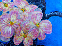
Except for putting the protective varnish on top, below is the finished painting.

Please let me know what you think!
I enjoyed doing the double blog and big painting this week, but I think I will go back to something smaller next week. I am proud to say that this blog is being read in all corners of the world, from Canada, to New Zealand, with stops in Germany, India, China, Malaysia, and everywhere in between!
Thank you all for reading; feel free to become a follower or find out about new postings by subscribing by email.
See you next week!
Catherine
No comments:
Post a Comment