
Like NBC's "Today Show" and their recent overly enthusiastic coverage of ladies swimming at the Olympics, I will give you a very small spoiler right here - just a little taste of the painting to come:

Read on to find out if I made it all the way to a completed painting, how I might have accomplished that task, and why it was crazy to do such a large scale, finely detailed painting in just one short week.
In this post, we will be discussing light, shadows, glazing techniques, (not just for doughnuts any more!) transparence, translucence, opacity, and the most superb palette system ever devised...


Because it was difficult to see through the milkiness of the tracing paper, the first thing that I did with my pencil was to outline all of the branches darkly so that I could find them on my pizza pie. You will see that I am using a leftover school supplies coloring pencil; I don't think any fancy type of drawing instrument was required, and as long as my crayola had a sharp point, I was good to go.

It is a good idea to check the image you have just drawn before completely removing it from the image that you are trying to trace, that way you are still in registration in case you have missed something major.
I do not have 100% of the painting on my tracing, but I have enough of the image to get a semblance of what I want to transfer.

I hung up the tracing on my canvas so that I would not have to keep shifting my focus back and forth to try to follow my cartoon. At the bottom of the photo (right), you can see the faint lines where I used my giant ruler to pizzafy my canvas in the same fashion as my tracing.

This time, I used an enormous canvas, which measured a whopping 48" X 36" (4' X 3' - in keeping with the Olympic coverage theme, it was like going from ladies gymnastics to the shot put). The canvas that I selected was a professional grade, prepared and wrapped canvas. Unlike the canvas boards I have used previously, this one is gessoed canvas fabric stretched taughtly across a sturdy wooden frame.

You can see above and at right that the stretched canvas material "dimples" when depressed by my thumb. Although this does not seem like a big deal, I had to learn to anticipate the "bounce" when I was drawing or painting on the canvas. Each time that my pencil or loaded brush hit the surface, it was like my stylus was jumping on a tiny little trampoline. The movement was not huge, but it moved, and that took a little getting used to.

Above is yet another out of focus photograph of the finished preliminary drawing on my canvas. I spent about 8 hours rendering this, including the time spent on the cartoon. Perhaps I should spend some time on my photography skills, as well.
Now some of you may be wondering why I am veering away from the original almond branches in bloom with what appears to be huge and floppy flowers rather than the tight buds and blossoms of Vincent's painting. I chose to paint dogwood flowers because I love dogwood trees, which are native to the eastern United States. Because he never crossed the Atlantic, Vincent probably never saw a dogwood tree in bloom.
Neither had I, until I was in college and went on a spring break camping trip to Caddo Lake, in East Texas (the very western edge of the North American dogwood range). On that trip, we arrived at our campsite late in the evening, and had to pitch our tents by flashlight. Exhausted, we went to bed (sleeping bag?) and woke up the next morning to a crisp spring sunrise, ready to begin a mosquito filled but fun day of exploring the swampy beauty of Caddo Lake.
| If you are ever bummed out about anything, google flowering dogwood images Your eyes and mind will be happy. |

 To give you an idea of the scale of the canvas, I am providing you with (another) supremely out of focus shot of my easel with the drawn canvas on board. You can see that I had to adjust all of the picture holding clampy things on my easel to allow for fit. I am grateful for my versatile and very adjustable easel.
This baby is going to take a lot of paint to complete, so there will be a break in the action while I hit the art supply store (thanks, friendly dudes at Jerry's Artarama in Austin, Texas!) for acrylic: mood indigo. Cue Rhapsody in Blue.....
While I was at Jerry's, I wandered past the aisle where they keep the palettes. A palette, for those who may not be in the know, is a board, or glass, or paper, or any surface where paint is squirted onto to hold it in an open state so that it can be applied to the painting support. The palette is also where the mixology occurs, most usually with a palette knife (and only rarely with a cocktail shaker...).
At right is one of Van Gogh's self portraits depicting him with his thumb through the hole in his palette and his brushes gripped in the fingers of the same hand. Vincent probably used this type of "no table required" palette because it is ideal for doing field work; it is easy to hold, light to carry, and provides a steady surface for mixing and blending with palette knives. Was Vincent left handed? This image certainly points in that direction. Why, no fears, dear readers! This sounds like a job for the internet!
http://wiki.answers.com/Q/Was_Vincent_van_Gogh_left-handed

The manufacturer is Masterson, and they claim that their "stay wet" Palette kit will keep acrylic or other water based paints moist and spreadable for days.

I am standing in the aisle pondering if I should buy or not, when I glance down at the $40 worth of paint (3 small tubes) already in my basket. The "stay wet" system costs about $15. I am already buying "dry" palette paper (I don't use a board or glass; I prefer paper, which I can just wad up and toss without any haz-mat disposal issues.) So I decide to take a chance on the "stay wet" system. (Thank you again, to my husband, my patron, my art demigod!)

 So the way you set up the stay wet palette system is that you get some very hot water (I used boiling agua caliente from my tea kettle; thank you, Earl Grey!) and you soak the special palette paper in a steamy soaky hot tub for 15 minutes. (I used a big commercial cookie sheet for the soak, which was sized perfectly.) In the meanwhile, you prepare the sponge by soaking it in cold water, wringing it out, then soaking it again until it can't hold any more liquid.

Looking left again, you can see the wet paper, which I laid over the soaked sponge in the box; I did follow the directive to make sure that the surface of the paper was not visibly wet, this was accomplished with the swipe of a paper towel. The instructions also indicated that it did not matter which side of the paper was facing up, and they said that the paper could actually be scraped and scrubbed if you were inclined to want to recycle.
And with that, I began to paint.
 I wanted to start with the tree branches, which I painted by mixing (basically on the canvas) ultramarine blue (a deep, intense blue) and burnt umber (a medium brown). To my delight and amazement, this combination really started looking like wood because the ultramarine is translucent (meaning you can see through it), and the umber (don't you just love to say umber?) is opaque. The ultramarine always let the umber peek through, and there was enough ochrey yellow in the brown that the layer of blue on top gave it a greenish cast. The two colors boogied together in a way that looked like variations in the wood tone, as well as dappling of light and shadows on the branches.
So I started adding in some scumbling (painting lightly on top of the base color with a different color on a dryish brush) in white on top of the bark, to represent the natural striations found on the trees.

I further cool the mood by adding in some light bluish scumbles, as well.
This part was very fun to paint. I could be very loose with the brush, and the color variation occurred naturally, with very little conscious effort on my part. You can see that I left the flowers and smaller branches wide open, and just painted around them.

At left is the upper left corner of the painting, where I drew in many buds.
You can also see how the last stem bends around the edge of the canvas.

The photo at right shows more painting on the side of the canvas; by wrapping the image and background around to the sides, I will save myself from the necessity (and huge expense, with a canvas this size) of having the painting framed, if I wish. It was also fun to paint on the side, and to imagine what I would need to do to make the wrapping and bending look believable.


At right you can see another error - my solution for this one was to repaint the branch, then cover the offending stem in a coat of titanium white.


 Clockwise around are more close ups of the scumbles, including a view of the blue scumbles at right. Note how I changed my mind as to the width of the branch...
As I neared the end of the trunk and branch portion of the painting, I sprayed down all of the paint (an amount large enough that I would have felt bad to waste it) on my palette with a fine mister, then carefully closed the lid on the painting system box. Much to my annoyance, I was not able to paint again for about 40 hours, but the paint was just fine. Thanks to the palette system, the color was still moist, had not mixed inadvertently, and with the exception of the paint that had already been scraped very thinly on the paper, it was as if I had just squirted the blobs straight from the tube. The sponge smelled very neutral, and did not mildew or sour, as I had feared. The paper was perfectly cool and damp. I also found that I enjoyed mixing and grabbing the paint from the soft, spongy surface; there was just enough "give" that I could easily get under the paint and lift it from below. When the paint did skin up a little bit on the upper surface of some of the bigger blobs, I just treated that "skin" just like the skin on a blister, burrowing underneath like a pin prick with my brush when I needed to release the color. (Please note: this is not medical advice, and even if it was, it would probably be bad advice.) This system was well worth the $15 that I spent on it. Two thumbs up from me.


And finally, some flowers. I chose to paint the dogwood blossoms pink, because I wanted my painting to look quite different from Vincent's version.

( And yet more bad photography... I must learn to turn off my easel lights before I take the blog pictures, and I must learn to check the outcome of each photo before I move on to the next thing...)
I am painting the flowers with a mixture of alizarin crimson, titanium white, potters pink, cadmium yellow light, and magenta.

A close up of some of the buds...
and blooms.
These flowers are looking excessively pink and oddly familiar, but not in such a good way.


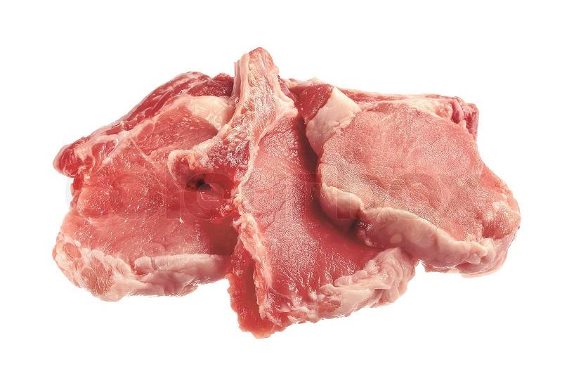
After a trip past the butcher department at the Supermarket, it hit me: my flowers look like dozens of tiny pork cutlets, waiting to be taken home and braised, each searching diligently for their place in a shopping cart next to some applesauce.
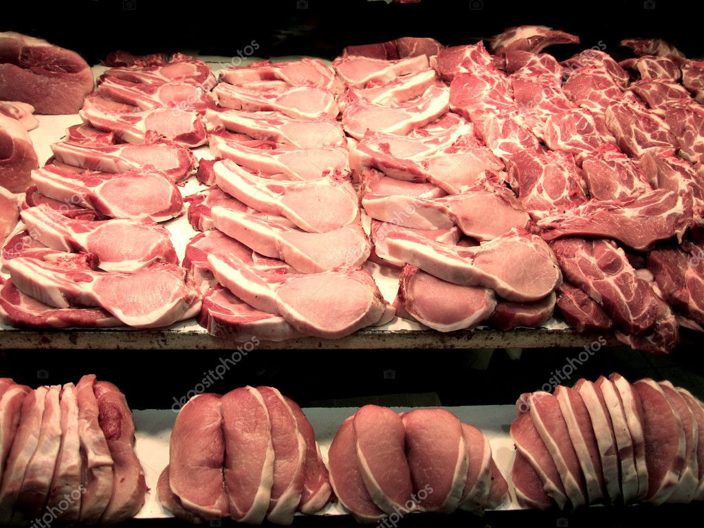
Just what I was hoping for: a 3' X 4' painting of the other white meat....
Not to go all political on you, but what follows is, quite simply, more pork. (Vegans be warned... some of the following images may be graphic and unsuitable for an ethical vegetarian audience.)


More mistaken branches (left) and I think I have finally figured out how the mom of The Monkees Michael Nesmith was inspired to invent whiteout... (Look it up - I guessed correctly!)

At right are several examples of how different the various clusters of flowers are looking as I strive to correct my growing pork problem; all of this pork is feeling like too much bacon at a bad buffet.

The right petal on the blooming flower on the left looks like a hitchhiking thumb; consider it my homage to Sissy Hanshaw from Tom Robbins Even Cowgirls Get the Blues.

And these ones are just sad. Just plain sad. Now, what wine goes with pork?
My next step was to hit the web for more photos of flowering dogwood branches, which I apparently cannot reproduce from memory. Come to think of it, I don't think I have ever actually seen a pink flowering dogwood; the only ones I've seen live, up close, and personal have been creamy white. I can see why Vincent put up with the mosquitos and painted from life. (The contemporarily unavailability of the internet probably also entered into his decision making process....)
Apparently, there is more than one kind of pink flowering dogwood. Not one of them looks even remotely like a porkchop, but all would pair nicely with applesauce, I think.


So I decide that there is no other choice than to keep pondering the images on the web and go ahead and pour myself a glass of a delightful new wine: a soft, very dry rose made with malbec grapes, and served deliciously chilled. I shall companion it with a vegetarian selection, for I have now completely lost my desire for pork, bacon, or sausage.
Next, I will begin the background of the painting. I have laid in my supply of extra blue, I have a glass of the aforementioned wine primed for sipping next to my brushes, and I am ready to start mixing.
Sadly, you will have to wait to hear the rest of the story.
Blogger is balking at my download of additional images, so I think that in light of the size and scope of this week's painting, my blog will be broken into two separate postings. I will be publishing part 2 on Thursday - I hope you will read along!
In the meanwhile, here is the finished painting:

I feel like Paul Harvey. I wonder if he likes pork chops. Until Thursday. Bottoms Up!
Catherine

No comments:
Post a Comment