As I was looking through the Van Gogh section of the google art project, I kept turning back to his portrait of Armand Roulin (1888), a portrait of the hat wearing older brother of little Camille Roulin (see earlier blog posting).
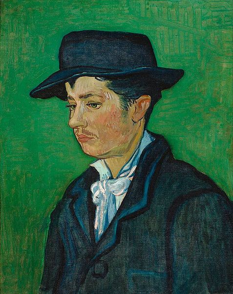
There was something about Armand that looked so familiar to me, with his downcast eyes, straight nose, thoughtful expression, and loose white shirt contrasting against his dark suit.
I loved the rakish floppiness of his hat, and the way his suit looked too big for his neck, shoulders and chest.
His sparse, lightly colored mustache, and the barest hint of sideburns reminded me of my own two young adult sons.
Then it hit me: I knew I had seen a picture like that somewhere before. Duncan (of the velvet shoes) was horsing around on the piano while waiting until it was time to leave for his junior year high school prom when I took this photograph of him -

OK, enough of my high school french.
Like Armand, Duncan was posed in a dark suit, a crisp white shirt, and a black felt hat. What you cannot see, but I know you already know - is that those black velvet loafers will be cushioning and cradling his dancing feet all night long.
The view of Duncan is more of a profile than Armand's three quarter, and Duncan's gaze is focused more downward than Armand's. I have been painting for more than a month now, and I have known Duncan from the moment of his birth. I should be able to paint around this, right?
Read on.

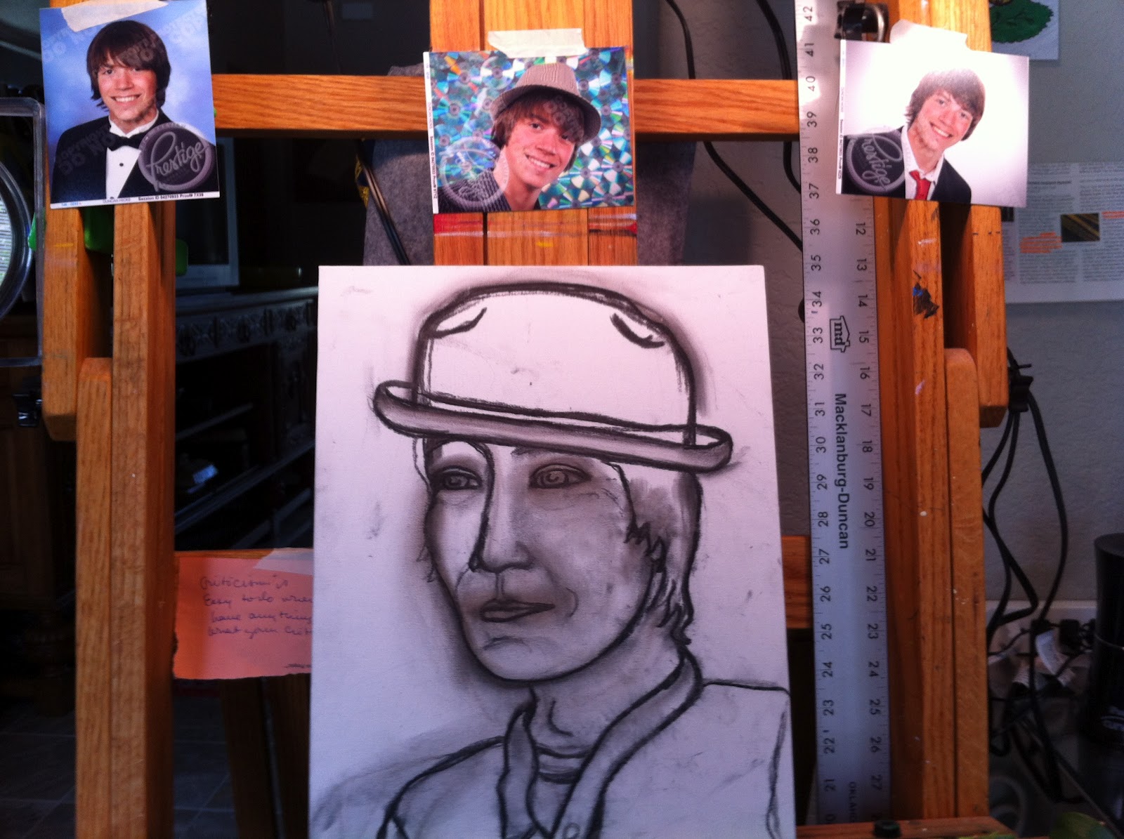
I selected an 11" X 14" flat canvas covered board as my support, and began my sketch in charcoal.

Because I wanted to quickly get to the (much more fun than drawing) painting part, I skipped my usual step of measuring and laying out the original as I transferred the image to my canvas. I did not measure Armand, and I also did not measure Duncan. I should have, as you will see.
Take a moment to look at the sketch. By comparing my charcoal to Duncan's photo, can you see where the drawing is wrong? Can you see where I got it right?
Do you think that I drew what I saw, or what I thought that I saw?

Next, I did some corrections to the eyes, the nose, and to Duncan's mouth.
The nose is still too long and flat, and the jaw line is far too low; I had forgotten that the jaw actually hinges from just below the ear lobe. My Duncan has a jaw that emerges directly from his neck, which lends him a Fred Flinstone physicality - yet, somehow, I thought it was looking pretty good.
I did mark the sections of the shirt, suit, and tie so that I would know where I was painting what.
 |
| This version is cleaned up in anticipation of applying the paint. |
 |
| I start with burnt umber and alizarin crimson |
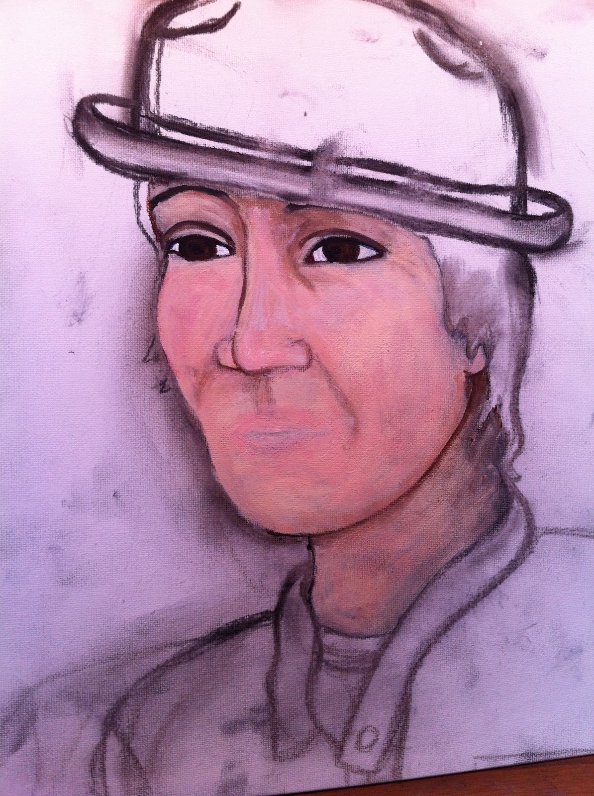
You can see the two flesh tones that I used on the right - if you want to mix your own, you can use titanium white, cadmium yellow, cadmium red and burnt umber.
 |
| and the two flesh tones - portrait pink and Lukas flesh. |

You can see that my original sketch is not magically getting better by applying paint to it.
Hmmmm....

The lips are looking better with a little flesh tone added on to the top, but I have managed to twist them toward the viewer, and they are pursed in a way I have never seen Duncan do.
The eye looks fishy to me.
Van Gogh, no doubt, would cut off that ear.
For no apparent reason other than panic, I am also adding in some (titanium) white highlights, which you can see on the side of the nose and on the cheekbone.

More corrections to the face, and the under-bluing (with ultramarine) of the white shirt...
The blob at the left is where I removed the eye (which you can see above) - they were not eyes, they were more like frisbees that had been flung with great force into his face.
Hmmmm.

This eye is such a problem...
looking back at the picture, I tried to just draw the eye, and found it impossible to do. Although it was an actual photograph of his eye, the eye was just at a very bad angle to depict.
Because Duncan was looking down in the photograph, his eye was really little more than a slit with eyelashes and a nearly indistinguishable iris.
I decide that I will just open up his eye and everything will work out.
As you can see by the Japanese boy in the painting, it does not.
Please note the cubist effect of the nose turned in opposition to the mouth, and both the nose and mouth turned in opposition to the all seeing and super creepy eye. The face is amazingly flat, as if it were just a piece of paper laid on top of the canvas. The only dimension I can see is the nose, which, thanks to my titanium highlights, looks as if it is being lifted from below by a thermal updraft.

That is the nice thing about painting; if you make a mistake, you just layer over it, and do not have to erase.
This works though, only as long as the mistake is not so enormous.
If the mistake is too systemic, or redone too many times, there will be an obvious build up of paint which will only draw attention to the problem.
I had also apparently come to the decision that Duncan's head was not really deep enough to hold his brains, which I resolved (oh, snap! How could it possibly be this easy?) by adding more hair to the back of his head.
Oh, snap! Indeed. This solution would prove troubling, because it caused me (in yet another chain reaction of horribleness) to have to increase the depth of the hat, as well.
The lesson that I think I learned (or, at least I hope I am on the way to learning) is that doubling down on bad proportions only leads to more really, really, really bad proportions.

At first I drew it completely closed, then, in a fruitless effort to make it better, I gradually kept painting it more and more opened up.
It does look very much like a fish eye on one of those flat fishes that live on the bottom of the ocean. Yes. The word is flounder. I get it. 'Nuff said.
The face is also quite torqued around, and, take just a moment now to look at the lips. Where have you seen them before?


This painting looks NOTHING like my Duncan, who is a very handsome fellow.
I question the validity of even filling in the rose, but I have alizarin crimson left to use, so I sally forth.

In desperation, I add some eyelashes and eyeliner, which does not help. (In my defense, sometimes these additions make me look better.) I keep adding paint onto the Groucho looking eyebrows, and, for no artistic or other reason, make his right eye look as if it is pointing in a completely different direction than the left.
Bryan is home, and asks why the jaw is coming from Duncan's neck instead of his ears. Derp! So I finally see the problem, and sketch in a quick charcoal correction.
I also make corrections to the throat and to the front temple, which was too pronounced. (I know my son is not a neanderthal, yet I insisted upon portraying him that way. My bad.)
 |
| The Final Painting. |
Go ahead and laugh out loud if you wish. I did. It is really bad. Sorry, Duncan! Sorry Armand! My beautiful boy looks like an extremely kissable turn of the century thug. Words cannot express the awfulness of this image, and I am so sorry that you (and I) will never be able to unsee it.
So, I start over.

(Although it seems like Duncan is a regular James Bond, the way he is always appearing in tuxedos, he was actually required to don formal wear frequently when performing with his high school choir.)
These performance snapshots and the prom pictures were some of the few times that Duncan or his entourage would allow photographs.
(At left is evidence of one of the rare instances when Duncan's date of performance came just after a hair cut.)

You will note the center lines, which are drawn on sticky notes that I had used to crop the image.
I matched these to crossed center lines on my support, which was, again, an 11" X 14" canvas covered board.
 |
| Here is my nearly complete sketch. I changed the hat to a different one that Duncan had, which is shown below. |

One of the few entourage snapshots.
They are such a cute couple!
(I am sure that Duncan is grateful for his summer internship, which puts him a day's drive away from this entire episode.)
I start with the face. How on earth do you do men's lips without them looking like they are wearing the latest shade from Revlon?

How are the proportions?
As I start painting, I feel as if I may be falling back into the rabbit hole I just climbed out of. This is not a good feeling.
I am coming to the realization that you can't just "mash up" a bunch of different photos because each expression positions the rest of the face in a completely unique way. Merde!
OK, the mouth just had to go. With my French teacher's voice ringing in my ears, I keep hearing the phrase fermez la bouche!, which means "shut your mouth!" I take that to mean paint it shut. Vite! Vite! Vite!
I decide to concentrate, instead, on all of the other things in the painting, then come back to the mouth and lips after I have a chance to study more Duncan photos in depth.
How on earth did Vincent do it without photos to study? Or did he use portrait photos? Would his subjects have had photos of themselves made? Did he have Armand sit still while he stared intently at his mouth? Did he make a number of sketches from different angles that are now lost to history? Did he allow Armand to talk while he sat for him? How did his keep little Camille in place?
I am grateful for the invention of photography.

I begin avoiding the painting of Duncan's mouth by making some adjustments to the shape of the hat, and simplifying the band to a single color so that it will be less distracting.
After many paints and repaints, I am finally happy with Duncan's eyes, which are big, but not bulging. I am pleased with the iris color, which is done with patches of burnt umber, mars black and prussian blue.
Next, I added highlights of titanium white and raw sienna. There are no lashes, just a rim of prussian blue daubbed with black, and drawn on with a thin brush. With the blue black quite dried on my brush, I add the barest hint of a shadow underneath the lids of each eye to give the eyes depth and dimension. The eyebrow on the left side of the painting still needs lightening and roughening to look realistic.
The hair is painted with mostly the same colors as the eyes, including the prussian blue. Although I did finally get the hinge of the jaw in (almost) the right place, I need to soften the jaw line to make it look less cartoony.
The tee shirt and jacket were typical Duncan clothes, and they look good enough for now. Although Duncan has no wrinkles, he does have smile creases in his cheeks and around his mouth, and he always has merry little cat's whiskers around his eyes, just like his Dad and Grand Dad.
After a nights sleep and Duncan's complete silence on the issue, I begin again the next day.

So, I got out a book that I had purchased long ago called Secrets to Drawing Realistic Faces (which apparently I was keeping a secret on my bookshelf), that breaks down the face into component parts with lessons on each.

After a basic anatomy primer on the lips, teeth, and skull (who knew that the little trench above the center of your lips is called a "philtrum?"), the author advised
focusing first on the upper lip, which should be drawn out fully.
In contrast, the lower lip should only be suggested, and NOT completely outlined. This "suggestion" is probably easier to accomplish in a drawing, which can leave unmarked areas, than in a painting, which is typically completely filled in.

I would agree that the teeth look more realistic when not drawn individually.
The shadows inside of the mouth (and particularly at the edges) were also important to the illusion.

I can see (now!) that my mouth is too compact and not stretched sideways and elongated enough. Crap!

My take away: I need to draw what I see, instead of what I think I see. I thought I knew what my kid looked like - these paintings are proof that all teenagers are right about one thing: Their parents don't have a clue.
Below is the finished painting. Please let me know what you think, if you are so moved.
And here is Duncan (barely):

No comments:
Post a Comment