Showing posts with label Van Gogh image. Show all posts

Tuesday, November 27, 2012

Vincent is perfect. I'm not.

Hello all!

As I begin this posting, it has been 46 days since my last blog; as many of you know, at the end of September, my husband made the decision to move his office, our house sold, and we have moved into a work/live loft space in the downtown of our small town's commercial district.  The move, consolidation of the office and our home, huge estate sale and final closing all are, at last, over.  We are mostly settled in, loving our space, and enjoying the stimulating and creative new environment that greets us each morning.  Finally, I can turn my attention away from the move, and refocus my energies on my art lessons with Vincent.

From the moment I had announced my hiatus, I had been itching to paint.  As I packed up the things we wanted to keep, and decided which items were most expendable, my mind kept circling back to painting.  What seemed like hundreds of ideas kept running through my head - new techniques to try, or color combinations that I wanted to see together, or which painting I would do first in my new studio.

The move was making me feel energized and inspired.  Making all of the decorating and logistical decisions didn't drain me of creative energy, rather it seemed to be feeding it.  I felt like I was conducting a big and energetic orchestra with Vincent rehearsing as the first chair in the art section.  With every cabinet I emptied, and every box I carried up the stairs, I felt I was one step closer to ripping open and attacking a blank white canvas.  I could not wait to paint!

So why wasn't I painting?  After all, I was doing everything else; shopping for furniture, arranging kitchen cabinets, making new curtains, walking dogs, chatting with new neighbors, watching TV.... There was plenty of time for Words with Friends, and even the oh so addictive Draw Something, but the real question was, why wasn't I painting?

I had arranged the studio almost immediately after we moved in.  I then rearranged and re - rearranged again to get everything in just the right place.

I put my desk in front of a sunny, east facing window that looks out over the downtown and then beyond to tree covered hills on the other side of bridge.  I can see the cars coming and going, and enjoy watching the pedestrians sauntering, strolling, and occasionally hurrying their way past the stores, restaurants, and the coffee shop.


Just opposite the window, I put my "egg" chair and ottoman, which is always piled with art books and sketch pads.  It is a comfortable place to read and doodle, and is an enjoyable spot for watching the ever changing Texas sky.  Next to the chair is my china cabinet, filled with my beloved rummage sale dishes and the water glasses my mother and her siblings gave to their mother as gifts during the Depression.  Each year at Christmas, one, beautiful, cut crystal goblet was presented; I was lucky enough to get the nine that remain.


From the office, I inherited two banks of drawers, as well as large and small shelves, and they have been outfitted with all of my art supplies - all neatly arranged, accessible, and ready to use.  Although you can't see them, the puppies are snoozing doggedly in the carrier in the foreground...  They seem to have no trouble re-embracing their life's work, even in this new setting.

 My easel fits neatly into the corner between my desk and supply drawers; It is clipped with lights, at just the right height, and is positioned to offer an over the shoulder view right up Main Street.  My Mac, the hardware for all blogging and searching, is at the ready just to the left of the painting area.

As you can see below, my magic palette fit serendipitously into one of the drawers; this let me cram a lot more work surface into a lot less space.  There was also handy room for my water cups and brush holders.

 So everything was arranged in the way most conducive to painting, creating, blogging, growing, learning, etc. etc.

And I was on round 338 of Draw Something.  And my email was all opened, read and organized.

And everything in the new house, which wasn't even dusty, had been dusted.  Hmmm.

So why wasn't I painting?
In a word: Fear!
Let me back up to the packing phase of the move.  When we first made the decision to make this huge change, we walked around the house and the office and identified only what we wanted to keep.  Because our space was going to be so limited, each item we moved had to be carefully considered, and The ArtDemigod and I agreed that, on furniture, we both had to love it at least 90% in order to take it with us.  Personal items were our own choice.  He kept his base guitar and fly fishing gear.  I was adamant about my studio.

So deciding what to keep was easy.  And, honestly, deciding what furniture, old dishes, and household items to let go wasn't hard at all.  (Now cue the bad ghost movie suspenseful music...)

I was fine until I went into to tackle my "craft closet." This closet was a 4' X 12' room that had actually lived a life (under the previous owners of the house) as a tanning room.  As I had little desire to spend my free time cooking my already plenty wrinkled enough skin, I instead lined the long wall from the floor to the ceiling with shelves, which I used to store all of my "projects."

That room was cram packed with supplies for every imaginable type of creative activity.  Beading, sewing, needlepoint, embroidery, knitting, upholstery, and costume supplies were just a few of the items in my own private Michaels.  Along with the inventory, there were literally dozens of half finished projects in almost every imaginable stage of (in)completion.  I had no idea what to keep and what to let go.  It was, literally, overwhelming.

But because the estate sale had been scheduled, and we had a firm closing date, I had to move beyond my paralysis and into action.  But every time I looked at, or moved, or even thought about all of those piles, I felt like a complete failure. Goddamn Martha Stewart, the queen of expectations, the matriarch of unrealized possibility...

What I finally realized about these piles brought me to a very upsetting thought.

I wasn't the the artist who had committed to The Vincent Project; I was the lazy big spender who never finished anything.  (To be fair, there was no corresponding craft closet on the other side of the house storing all of the things I had completed; those items had been long ago given as gifts, recycled, or used up in ordinary living.)  But, in the end, I was still standing in a room with a lot of incomplete passes.  This was something I had to think about.

Without a choice, under an ever shrinking time deadline, as I sorted through all of this stuff,  I realized a common thread - the partially finished projects were all completed to exactly the point at which one of two things had occurred:  either I realized that the end product that I had imagined was beyond my ability to execute, or the materials that I had selected had some how not lived up to my imagined expectation.

In other words, the projects were abandoned because the product had somehow fallen short.

This realization left me feeling very out of sync with The Project, and Vincent, and Art, and Creativity, and exactly who the hell I thought I was.  Was this blog just another thing that I would start and not finish?  Was I even capable of doing this huge task of 52 paintings and essays?  Was this going to be something that would just wind up, unfinished, in some new craft closet in my new studio?

For about two weeks, I just hid from thinking about this whole issue by busying myself with moving in.  I made curtains, and arranged the kitchen, and picked out new furniture and lamps.

On the first weekend after we were all moved in,  I even tried to just kickstart myself back into an inspired state by attending the Lucien Freud Portraits exhibit in Fort Worth (It was FANTASTIC, even in my less than receptive state). I even engaged in a brief fling with two fascinating books on Picasso, which only left me feeling more guilty.

Nothing was working.  What had happened in that craft room had left me feeling completely uncreative and as utterly dried up as an old sponge.

So I decided to think about all of this for a week.  I told myself I wasn't even going to try to paint, and I wasn't going to go near the blog.  I was going to try to figure out what it was about these unfinished projects that had stripped away whatever Mojo I thought I had.  I was going to try to figure out why I had walked into that craft room feeling like an artist, and walked out feeling like a fraud.

The projects were abandoned because the product had somehow fallen short.  If the product had fallen short, did that mean that I had fallen short?  And what did "fallen short" mean, exactly?  After about three days of thinking, I finally figured it out.  I abandoned all of those projects because I could not finish them perfectly.  In all of this work, I was not allowing myself to be "good enough;"  it had to be perfect.  I had to be perfect.

What an awful realization that was.  There was no way in doing this project that I could paint "perfectly."  Vincent had already covered that territory; no one, no matter how good, could paint a Vincent Van Gogh better than Vincent Van Gogh.  To be sure, a lot of people, including myself, have tried.  But all of that work could only be, at best, derivative.

That was what I liked so much about doing the Vincent Project.  From the beginning, I never felt like I had to be perfect because Vincent already was.  All I was trying to do was to try to learn about painting by copying Vincent and forcing myself to write about it.  And that's when I finally got it, or rather reminded myself of my original intent.  The purpose of The Vincent Project was NOT to produce "perfect" paintings.  The purpose of the Vincent Project was to learn how to paint.

And that realization freed me, at least enough to pick up a canvas and start scribbling. (Please see Author's Note, below*) 

On Day 46, I went back to the beginning.  I decided to paint a chair.

In my very first blog posting, I mentioned that all of this started with a student assignment from a painting class where we were asked to copy a painting by a great artist, and I chose to paint Vincent's chair.  This was the chair that he had painted while living in the little yellow house in Arles in anticipation of the visit by fellow painter Paul Gauguin.

On the left is Vincent's chair - mine is on the right.

As a companion to the painting of his own chair, Vincent also rendered the chair of Paul Gauguin.


I would find my way back to Vincent the way I found him in the first place.  I could (at least try) to paint Gauguin's chair.  I could paint!  Finally! There was something I wanted to paint!

People read a lot of symbolism into the two chairs, saying that Vincent painted the chairs as portraits; they were expressions of how he felt about both himself and his guest.  Vincent's chair was a peasant's chair: rough, armless, and placed on a clay tile floor, probably in a kitchen.  Gauguin's chair, in contrast, was very fancy, with curved arms and a carved back, resting on a lush carpet in what looked like a more formal area of the house.

Vincent positioned on Gauguin's chair totems of learning (books) and culture (the lighted candle).  In contrast, Vincent's chair held the small, cheap pleasure of the common man, a pipe and pouch of tobacco.  Notice that, like the candle, Vincent's pipe could have been depicted with an ember of lit tobacco; instead he presents it with the bowl of the pipe turned away from the viewer.  Vincent's chair is seen in sunlight, Gaugin's is shown in a nocturnal scene.  In the background of Gauguin's chair is a lighted sconce, behind Vincent's chair are a box of sprouting onions.

Most telling, for me, is the door that Vincent painted into his own chair view.  As any patron of movie symbolism will tell you, a door is a portal, and a portal is an escape.  No door or window is presented in the Gauguin chair; Vincent clearly did not want to provide any retreat for the first painter to join him in what he fervently hoped would become a thriving artist's colony.  I wonder if Vincent meant all that I am reading into what he painted, or if there just happened to be a door right behind the chair he was painting?

So, with a newly opened, fresh, white canvas student board positioned to receive, I (re)started the Vincent Project by dividing a copy (that I had in a book) of the painting into quarters.  As I observed the image, I was excited to get started: Gauguin's chair was so much fancier than Vincent's chair, and it had all these awesome lights and very atmospheric electric blue shadows.

First, I transferred the image from the book to my canvas, one quarter at a time.

I drew out the entire cartoon,  then loaded my brush with the ochrey red that I observed underneath the wash of green on Vincent's wall.


Here is a close up of the red...

And a longer shot - notice the deeper hues behind the chair, away from the source of light

My trusty angled brush


And here is the green wash that I put over the ochre.  

Here is a view of the palette that I was using to make the green wash.  I think that my color wound up as a little to "tourquoisy," as compared to Vincent's painting, which had the wall as more of a hunter green.

Eventually, I do catch this difference, and it will get corrected later.  Can you see what I missed?  Compare the right arm of my chair to Vincent's.  His has a beautiful, sensuous curve, while mine looks like the arm of the chair was broken and badly set.  I wish I had noticed this before I went on with the painting.

(Author's note to herself: "Shut up! Think about the process, not the product... It does not need to be perfect... what can you learn from the mistake?")

The close up at right shows this mistake in all its ignominious glory.

But I do like the way the ochre and the green are vibrating against each other; it is so cool how our eyes process these opposite colors and make them come alive.

On this painting, I used a charcoal pencil (rather than a stick) to make the initial drawing.  I liked doing it this way because the pencil line was much more precise, and there was far less smearing of the charcoal, both from my my hands brushing against it, and from the black swirling into my freshly applied paint.
Here is my chair next to Vincent's, so far.

Next, I started to get my browns on.  I started with Van Dyke Brown and the ever popular alizarin crimson hue.

I also squeezed out the following:
raw umber and transparent raw umber,
burnt umber and transparent burnt umber,
transparent raw sienna,
burnt sienna and transparent burnt sienna (I did not have any transparent raw sienna).

Notice how all of these groovy browns have a raw or burnt option, as well as a "regular" (opaque) or a transparent option.

It was a lovely lesson to have all of these choices ordered onto my palette.  I admit it was confusing at first, but each of these tubes contains a unique product, and each of these products does a different and very individual thing on the canvas.

After reviewing the theme of this week's blog, here is my advice: do not be afraid of "wasting" paint.  You cannot learn from paint that is trapped in a tube.  Release the paint and let it teach you.

Observe my lesson plan below:  With the exception of the transparent raw sienna and Van Dyke brown (both shown at the bottom of the picture; raw sienna is on the left), transparents are on the right, and opaques are on the left.  The colors are ordered, (top to bottom, left to right) as raw umber, transparent raw umber; burnt umber, transparent burnt umber; burnt sienna, transparent burnt sienna, then transparent raw sienna and Van Dyke brown.  Alizarin crimson is (as of the photo session) still locked in its tube.


Ultimately, this is a rose by any other name situation.  The bottom line is that the colors are simply ways of expressing an observation or idea.  It is less important to focus on their names, and more important to focus on what they can do for you in your painting.  That said, knowing the names will keep you from a hunt and peck method of finding which color you want.  So, don't get bogged down by brown confusion.  Start squirting, painting, and take command of your colors!

At right are some browns on the chair.  I definitely used all of the colors that I had out; but I cannot tell you exactly what I used where.

(That is the point of a student board; it is a place to experiment and make mistakes - and remember, Martha - it doesn't have to be perfect!)

Speaking of "mistakes," has anyone yet observed what is missing from Vincent's original painting?  There are no stretcher bars  on the right side (as you are sitting in it) of the chair.  I observed this when I was doing the drawing, and decided that Vincent left them out on purpose because it would be confusing to see them juxtaposed against the patterned carpet.


At left is a close up of the front underskirt of the chair.  Notice how transparent the paint is, you can still see the white canvas peeking through the wood tone.

The Payne's gray outlining the rush seat will add depth and dimension to the straw as it is layered on.

I was observing other colors that I thought were missing, and threw out some cadmium yellow, yellow ochre, and a reinforcing portion of the transparent raw sienna.

These are the sunny colors of the South of France, and just seeing them got me in the mood for a glass of wine, the Provincial sun, and a Peter Mayle book.
At left you can see I have started on the rush seat of the chair.  As I painted the cover of the book, I accidentally slopped paint that should have been only on the cover onto the "pages" area.  (I know I don't have to be perfect; I just don't want to be intentionally sloppy.)

This was a classic case of coloring outside the lines.  And, although I am usually totally in favor of coloring outside the lines, in this case, I did not want the cover of my book sliding, Dali - like, down the pages below.


Luckily, I had my little "scrubber" brush handy to correct my mistake.  This type of brush can be purchased individually or in a set, and they come in various sizes for cleaning up all sorts of painting messes.

The red handled brush has stiff, white, synthetic bristles which can be used to literally scrub the canvas, as long as the paint you are scrubbing away is still wet.

The brush is really called a "scrubber," it is put out by a company called Creative Mark; look for it at your art supply.


When using a scrubber brush, I typically wet it in some water, then dab the bristles off with a paper towel so that the scrubbing area is moist, but not wet, when I apply it to the mistake.

The scrubber is such an excellent tool, and I am so glad that I have them to work with.


Shown at left is an extreme closeup of the newly cleaned canvas.


And now for the electric blue shadows.  I have already added a lot of greens and yellows to the rush seat.  I think it is looking appropriately rounded, and I am happy with the rough quality of the seat itself.

The first time I saw Vincent's painting of Gauguin's chair, I just didn't get the shadows.  They seemed unshadowlike, primarily because of the choice of color.  You could tell that they were shadows because they were placed exactly where you would expect shadows to be, but the color - that color was definitely not a regular shadow color.

But as I looked again, I realized that those shadows are what make that painting work.  Almost all of the other colors in the piece (with the exception of the green walls and seat) are warm and very cozy tones.  The green hardly even counts as cool, because painted beneath both the walls and the seat are still more layers of warm.  There are black outlinings, which are cool, but they did not pop at all until I layed in the electra glide.

Without us having to see the other side of the room, those shadows give us the atmosphere of a crackling fire's reflection on a well polished and barely used chair. Those shadows cool us, and cause our eyes to move around the painting in exactly the way that Vincent intended.  In the underlayment of the candle is the same bright blue - if the candle does indeed symbolize culture and knowledge (for Vincent), then he has absolutely bathed Gauguin's chair it.

Yet he does the same (although much more indirectly) in the painting of his own chair, by rendering the wall and door behind in a cool selection of turquoise and sky blue.  He may have just chosen these watery colors because he thought that they would look nice (if so, he was so right!), but who knows?  Half the fun in observing art is in asking the rhetorical "why" questions; the spell would be broken if we began expecting replies.


Above are some closeups of what I did to try to get the rug... Even Vincent's version was really just a series of different colored blobs.  Although I did not match him blob for blob, I think I got sorta close with it.  After doing the rug, I agreed with him 100% on the whole stretcher bar thing.

Below are some final shots of the finished painting.  What do you think?


Thanks for reading, everybody!  Please feel free to make a comment; I would love to hear your thoughts, whatever they may be.

*Author's note: Although it sounds like I just snapped my fingers to get myself out of my funk, nothing could be further from the truth.  The subject of perfectionism and its impact is a long and complex one, particularly for the women in my family.  I think that the impasse that I described at the beginning of this posting is really a signpost for me as I continue down the road of this project.  In future blog postings, there will be more said about perfectionism, it's effect on other artists, and the ways in which it has shaped my own life.

Happy holidays to all, and I will see you as much as I am able between now and the new year!

Catherine

Tuesday, July 24, 2012

Vincent and I ponder current events


Isn't this gorgeous?

In the dog days of the hottest summer, I thought you might enjoy Vincent's stunning breath of spring....

This is Almond Blossoms (February, 1890), which Vincent painted for his brother, Theo, and Theo's wife, Jo, upon the occasion of the birth of their child.

The painting was completed while Vincent was confined to the asylum at Saint-Remy, where he had gone to recover his mental health and physical strength after the incident where he had cut off his own ear.

Vincent at Saint-Remy
There has been a lot of discussion this week about a mentally unhinged genius with flaming orangey-red hair who pours his creative energy, phenomenal skills and precise artistry into a body of work that stuns the world.

He whom I shall not name
Like many of you, my news feed has been filled with the unfolding facts and the public's shocked reactions to the horrifying massacre in Aurora, Colorado.  I feel such a deep compassion and sorrow for the victims of this senseless action on the part of a person who is so obviously deranged.  As he was paraded for the cameras during his arraignment, I was fascinated to watch his dazed facial expressions, which ranged from stupefied, to sleepy, to seeming amazement at the attention he was (at last...?) receiving.

As they vied for ever higher ratings in the slow summer season, the anchors blathered on and on about what a gifted student this young man was, and what promise he had shown as a middle class boy from a good family who had been gifted with incredible intelligence and every advantage in achieving his full potential.

I knew that I had heard all of this somewhere before.  In Van Gogh, The Life, the authors describe an individual of striking similarity.

Vincent was incredibly good at learning things.  As a child, he obsessively collected and categorized - bugs, flora, bird's nests - anything that fascinated him was taken home, identified in a neat hand by it's latin name, and treasured, studied, explored and absorbed.
Vincent

Vincent was also a loner, and described by many as "een oarige..." a strange boy.  He enjoyed solitary walks, and would tramp for hours by himself in all types of weather, including at night and during storms.  This was very disturbing to his minister father and "propriety above all" mother.  At the tender age of only eleven, his parents had finally had enough of their constant worrying and trying to get Vincent to "be normal," and they sent him away to a boarding school.  Although his father did briefly visit him after a few weeks, he did not see the rest of his close knit family again until Christmas.  At the age of eleven.  Eleven.

This abandonment by his family would prove to have a profound effect on Vincent's life.  He likened his time at the school (where he was the youngest and arguably the most intelligent student, as well as a complete outsider) to his time (later, as an adult) in the Asylum at Saint-Remy.  After only two years at the first school, his parents, for reasons that probably had to do with money, moved him to a different school, which was even further from their home.

Vincent van Gogh
Vincent with his classmates and instructors - he is on the front row, the third from the right - note his crossed arms, folded body and hat protectively on his knee (from the Van Gogh, the Life website.)
Modern day educators might have described the second boarding school that Vincent attended as "progressive," with cutting edge instructors and curriculum.  Vincent was admitted without having to attend the (usually) required preparatory school, and he threw himself into learning languages, math, history, geography and the sciences.  Despite his academic success, his time at this school was described (in Van Gogh, the Life) as a "haze of mental absenteeism."

When he was 15, and only two months away from the end of the school term, Vincent had had enough - He walked out of the school and didn't stop walking until he was home, seven hours later.

Vincent then began his adult life with a series of the lowest entry level jobs, most of which his father helped him to get.  First, he apprenticed as an art dealer at his Uncle's company in The Hague, Brussels, London and Paris (the transfers were not promotions; it was more of a hot potato situation).  He worked as a teacher under absolutely miserable conditions (for himself and the students) in London.  He also held a clerk's job at a book and map shop in Dordrecht.

Despite Vincent's intelligence and willingness to throw himself into his work with tremendous (probably manic) energy, he failed at each of these endeavors.  Vincent was surly, socially ill at ease, and a complete loner, which did nothing to endear him to his employers.  Throughout this period, Vincent followed a predictable pattern of initially being "good" and doing everything he could to impress and satisfy his bosses, followed by barely masked hostility when his unsustained and unsustainable efforts were interpreted as not being "good" enough.

No matter what Vincent did, it was never good enough for his parents (particularly his mother) his employers, and even (in Vincent's mind) for God.

So each year brought only more failure, more tramping (on long, marathon distance walks), and more withdrawing into his interior self.  Although he worked brutal hours (a typical day was 8 a.m. until midnight), he slept very little, often staying awake until deep into the night pursuing his passions.  During this time, he translated writings from language to language (Dutch, French, German, English), he made scrapbooks of favorite prints, poetry and prose, and he read hungrily, both popular works as well as repeated readings and study of the Bible.

He also started visiting prostitutes and openly rebelling against his parents, who by then had about given up on him, as they definitively and without question escalated their favor of his "good" brother, Theo.

Poor Vincent was lost!  He was a failure at his work, he could not get any traction on his adult life, he remained dependent upon his parents financially, he was living a secretive life far from home, no girl would give him the time of day... Is this sounding more and more like the current news reports of the would be "Joker?".... So Vincent, in his despair, found God.

And it was through God, and his feelings about why God created the beautiful earth and all of the nature on the earth, that Vincent found his way to ART.

(Again, I cannot encourage you enough to rush out today and consume the Van Gogh biography...the story I am telling here is the merest whisper of a life that was shouted with a deafening roar...)

Vincent spent more fruitless, failed months trying to become a well educated minister like his father.  It did not work.  Then, when he had washed out of doing it the "right way," he made an effort to become a lay minister, which required only rudimentary schooling in order to obtain a position.

It was this last, desperate activity that brought him as an intern to the coal mining area of Belgium.  There, he lived among the miners, a poor and desperate people who's lot in life was one of filth, poverty and early death.  Vincent, who was in an absolute religious fervor at this time, lived with and like the miners, sleeping on straw, eating poorly, and keeping himself in the lowest condition imaginable.  His family was appalled, and his superiors (like all of the others before them) declined to renew their extremely limited support, pronouncing that his talents were insufficient for even that job.

But Vincent had started to sketch.  An obsession with the copying of maps while working at the map and book store had gotten his pencils and pens moving again, and he had begun listening to sermons that preached "a religion of beauty in which God was nature, nature was beauty, art was worship, and artists were preachers.  In short, art was religion." (Van Gogh, the Life)

So if the church bosses wouldn't let him preach with words, then he would do it with pictures.

He began with somber, tonal renderings of the coal miners and other peasant life that surrounded him in Borinage.  He gloried in the humble subjects, drawing at first, then beginning to explore an interest in painting.  He studied and began to copy works by other artists like Millet and Daumier, and developed a friendship with another painter, Rappard.  Theo, who was swiftly climbing the ladder at the Paris branch of their Uncle's art gallery, encouraged Vincent to continue with his art and to study anatomy and perspective at the Academy of Art in Brussels.

And of course, you know the rest.  The first great work was the sober, dark and humble Potato Eaters, which led to the explosive colors of the Sunflowers and Irises, which led to the intensely atmospheric Fishing Boats on the Beach and The Night Cafe, then to the most personal and poignant Yellow House, and the spiritually mesmerizing Starry Night and then finally back to the joyous and life affirming Almond Blossoms...


Vincent Willem van Gogh 128.jpgVanGoghIrises2.jpgVan Gogh - Fischerboote am Strand von Saintes-Maries1.jpegVincent Willem van Gogh 076.jpgVan Gogh - Das gelbe Haus (Vincents Haus)2.jpeg


What made Vincent, the original red headed stranger, transfigure our world through his visual imagery, instead of disfiguring all of us through blood and gore and sorrow?    Why did Vincent turn his physical struggle inward and against himself by slicing his ear, while the awful boy in Aurora felt compelled, instead, to metasticize his anguish like a cancer?

You hardly ever hear about these horrifying, violent episodes without nauseatingly detailed reports that the perpetrators were really smart.  There is always planning and precision involved, and, honestly, the dumb ones get caught before they can complete their plots.  Typically, the perpetrators were also bullied, or did not receive support from family or their community.  Sometimes they suffered a loss, such as the one Vincent experienced when he was wrenched from his family and deposited at the boarding school.  Almost always they are described as sensitive.  Like that's a bad thing.

As awful as the episodes are, there is a level of artistry involved; this latest madman was obviously a symbolist, with his dyed curls, strategically rigged "lair" and bad ass black ensemble - what was it that caused him to take his particular art in this unthinkable direction?

New details will be published in the New Yorker this week about Bruce Springsteen's own battle with depression, and how the concert stage was the only place where he could stop the "voices inside my head..." How did the Boss turn his depression and self loathing into songs that became the defining anthems of contemporary American life?  How did he make the choice to let his art save him?

I am grateful that when Vincent came to the fork in his road, that he was able to take a path toward beauty, light, hope and salvation.  I am grateful for the uncredited people in his life who helped him, or were friendly to him, or who at least did not go out of their way to be assholes to him.  I am grateful that when he felt bad, he fixed it by letting the art come out of him.  I am grateful that it was easier for him to destroy his own ear than to destroy his paintings.

In one of his letters, Vincent said "for what is wrought in sorrow, lives for all time."

The victims of the Aurora shootings should never be forgotten, and they never will be forgotten by the families and friends who care about them.  But their names, we all know, will eventually become eclipsed by the name of place where they bled to death, or by the name of the shooter who forced our attention.

Vincent knew that the art he made was his path to sanity and salvation.  Instinctively, viscerally, and physically, Vincent knew that it was his art that gave him the only real voice that he had.  It was the art that held the demons at bay.

We all make art.  It is part of what makes us human.  Everything each of us does, in a sense, is a form of expression.  The words we choose, the way we put our food on our plate, the music we sing along to, the precision of driving a car well - each of these is an expression of who we are and what we think.  Even doing something badly, or clumsily, is still an expression, and our expressions are always our choice.

But the real choice is not the decision to either make art or not not make art.  The art, the expression, the communication is going to happen, whether you are consciously thinking about it or not.

The real choice we each make each day is: What kind of art do we want to make?

I am going to go ahead and publish this post now, and will begin the painting tomorrow.

Catherine

A painting of a scene at night with 11 swirly stars and a bright yellow crescent moon. In the background there are hills, in the middle ground there is a moonlit town with a church that has an elongated steeple, and in the foreground there is the dark green silhouette of a cypress tree.


File:Van Gogh Almond blossom.jpg


Friday, July 20, 2012

I homage Cubism, Fred Flinstone, and Mrs. Potato Head in one spectacularly bad painting.


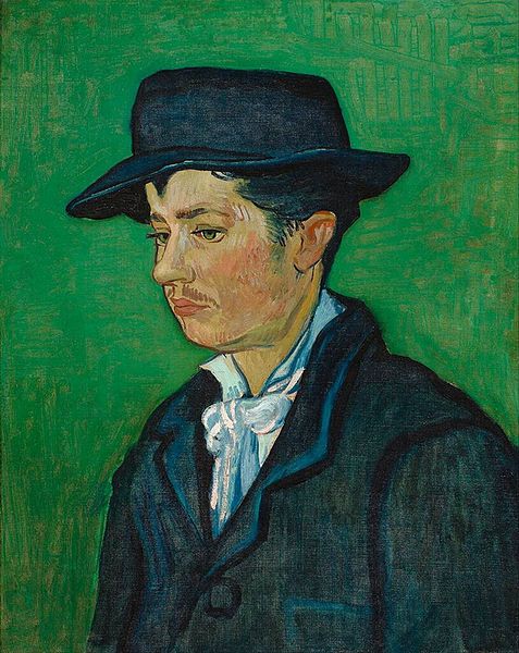
As I was looking through the Van Gogh section of the google art project, I kept turning back to his portrait of Armand Roulin (1888), a portrait of the hat wearing older brother of little Camille Roulin (see earlier blog posting).

File:Vincent Willem van Gogh 087.jpg
There was something about Armand that looked so familiar to me, with his downcast eyes, straight nose, thoughtful expression, and loose white shirt contrasting against his dark suit.

I loved the rakish floppiness of his hat, and the way his suit looked too big for his neck, shoulders and chest.

His sparse, lightly colored mustache, and the barest hint of sideburns  reminded me of my own two young adult sons.

Then it hit me:  I knew I had seen a picture like that somewhere before.  Duncan (of the velvet shoes) was horsing around on the piano while waiting until it was time to leave for his junior year high school prom when I took this photograph of him -

EE does look a bit like Armand, n'est pas?  Oui!
OK, enough of my high school french.

Like Armand, Duncan was posed in a dark suit, a crisp white shirt, and a black felt hat.  What you cannot see, but I know you already know - is that those black velvet loafers will be cushioning and cradling his dancing feet all night long.

The view of Duncan is more of a profile than Armand's three quarter, and Duncan's gaze is focused more downward than Armand's.  I have been painting for more than a month now, and I have known Duncan from the moment of his birth.  I should be able to paint around this, right?

Read on.

 I started by cropping my photo of Duncan so that the composition would remain closer to Van Gogh's original.  You can see my photo juxtaposed with the thumbnail of Armand on the GAP.

I selected an 11" X 14" flat canvas covered board as my support, and began my sketch in charcoal.
 At right you can see my first draft.

Because I wanted to quickly get to the (much more fun than drawing) painting part, I skipped my usual step of measuring and laying out the original as I transferred the image to my canvas.  I did not measure Armand, and I also did not measure Duncan.  I should have, as you will see.

Take a moment to look at the sketch.  By comparing my charcoal to Duncan's photo, can you see where the drawing is wrong?  Can you see where I got it right?

Do you think that I drew what I saw, or what I thought that I saw?


Next, I did some corrections to the eyes, the nose, and to Duncan's mouth.

The nose is still too long and flat, and the jaw line is far too low; I had forgotten that the jaw actually hinges from just below the ear lobe.  My Duncan has a jaw that emerges directly from his neck, which lends him a Fred Flinstone physicality - yet, somehow, I thought it was looking pretty good.
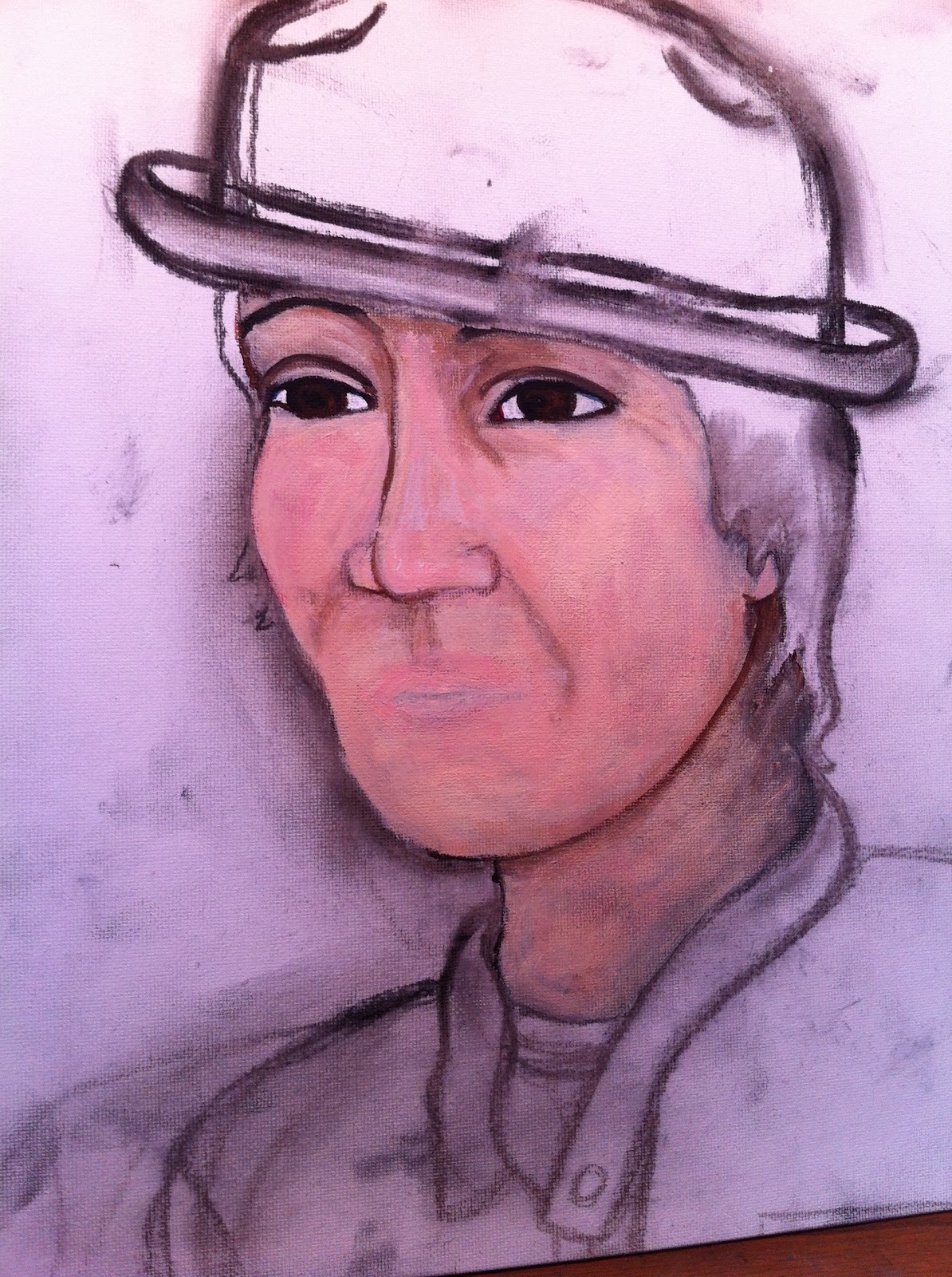
I did mark the sections of the shirt, suit, and tie so that I would know where I was painting what.
This version is cleaned up in anticipation of applying the paint.

I  start with burnt umber and alizarin crimson


You can see the two flesh tones that I used on the right - if you want to mix your own, you can use titanium white, cadmium yellow, cadmium red and burnt umber.
and the two flesh tones - portrait pink and Lukas flesh.

I begin applying paint, first outlining the face with the burnt umber, then adding in the flesh tones.  The first pass at the mouth is outlined in the umber, then filled in with the alizarin crimson.

You can see that my original sketch is not magically getting better by applying paint to it.

Hmmmm....


The lips are looking better with a little flesh tone added on to the top, but I have managed to twist them toward the viewer, and they are pursed in a way I have never seen Duncan do.

The eye looks fishy to me.

Van Gogh, no doubt, would cut off that ear.

For no apparent reason other than panic, I am also adding in some (titanium) white highlights, which you can see on the side of the nose and on the cheekbone.


More corrections to the face, and the under-bluing (with ultramarine) of the white shirt...

The blob at the left is where I removed the eye (which you can see above) - they were not eyes, they were more like frisbees that had been flung with great force into his face.

Hmmmm.


This eye is such a problem...

looking back at the picture, I tried to just draw the eye, and found it impossible to do.  Although it was an actual photograph of his eye, the eye was just at a very bad angle to depict.

Because Duncan was looking down in the photograph, his eye was really little more than a slit with eyelashes and a nearly indistinguishable iris.

I decide that I will just open up his eye and everything will work out.

As you can see by the Japanese boy in the painting, it does not.

Please note the cubist effect of the nose turned in opposition to the mouth, and both the nose and mouth turned in opposition to the all seeing and super creepy eye.  The face is amazingly flat, as if it were just a piece of paper laid on top of the canvas.  The only dimension I can see is the nose, which, thanks to my titanium highlights, looks as if it is being lifted from below by a thermal updraft.

 My only move is to shut that eye up by painting right over it.

That is the nice thing about painting; if you make a mistake, you just layer over it, and do not have to erase.

This works though, only as long as the mistake is not so enormous.

If the mistake is too systemic, or redone too many times, there will be an obvious build up of paint which will only draw attention to the problem.

I had also apparently come to the decision that Duncan's head was not really deep enough to hold his brains, which I resolved (oh, snap! How could it possibly be this easy?) by adding more hair to the back of his head.

Oh, snap! Indeed.  This solution would prove troubling, because it caused me (in yet another chain reaction of horribleness) to have to increase the depth of the hat, as well.

The lesson that I think I learned (or, at least I hope I am on the way to learning) is that doubling down on bad proportions only leads to more really, really, really bad proportions.

 So, with his enormous hat and now much rosier lips and cheeks, I take another crack at Duncan's eye.

At first I drew it completely closed, then, in a fruitless effort to make it better, I gradually kept painting it more and more opened up.

It does look very much like a fish eye on one of those flat fishes that live on the bottom of the ocean.  Yes.  The word is flounder.  I get it.  'Nuff said.

The face is also quite torqued around, and, take just a moment now to look at the lips.  Where have you seen them before?


 I fill in the suit, add more highlights and a hat band to the hat, and carry on.

This painting looks NOTHING like my Duncan, who is a very handsome fellow.

I question the validity of even filling in the rose, but I have alizarin crimson left to use, so I sally forth.
With one more squirt of a new magenta, I fill in the rose boutineer, paint the loosely tied cravat, and throw on  a light purply blue background.

In desperation, I add some eyelashes and eyeliner, which does not help.  (In my defense, sometimes these additions make me look better.)  I keep adding paint onto the Groucho looking eyebrows, and, for no artistic or other reason, make his right eye look as if it is pointing in a completely different direction than the left.

Bryan is home, and asks why the jaw is coming from Duncan's neck instead of his ears. Derp!  So I finally see the problem, and sketch in a quick charcoal correction.

I also make corrections to the throat and to the front temple, which was too pronounced. (I know my son is not a neanderthal, yet I insisted upon portraying him that way.  My bad.)

The Final Painting.

As you can see above, the final painting is awful.  It looks like a cross between Charlie Chaplin, Sean Penn, and Kato from the Pink Panther movies.  The mouth looks like it is hiding some very bad teeth, and had just been wiped clean of some stinky, viscous drool.  The whole image, including the rose, looks like it has been ironed flat; not with a home iron, but with one of those giant road rollers that David Letterman uses to crush things.  Like bad paintings.  And my ego.  But not my spirit.... at least not yet.

Go ahead and laugh out loud if you wish.  I did.  It is really bad.  Sorry, Duncan!  Sorry Armand!  My beautiful boy looks like an extremely kissable turn of the century thug.  Words cannot express the awfulness of this image, and I am so sorry that you (and I) will never be able to unsee it.

So, I start over.

Here is a pretty good three quarters of Duncan.

(Although it seems like Duncan is a regular James Bond, the way he is always appearing in tuxedos, he was actually required to don formal wear frequently when performing with his high school choir.)

These performance snapshots and the prom pictures were some of the few times that Duncan or his entourage would allow photographs.

(At left is evidence of one of the rare instances when Duncan's date of performance came just after a hair cut.)

 Because I want to keep a hat in the painting, I got my sketch proportions from the photo at right, which was one of the left over proofs from Duncan's senior photos (hence the weird writing across the image).

You will note the center lines, which are drawn on sticky notes that I had used to crop the image.

I matched these to crossed center lines on my support, which was, again, an 11" X 14" canvas covered board.
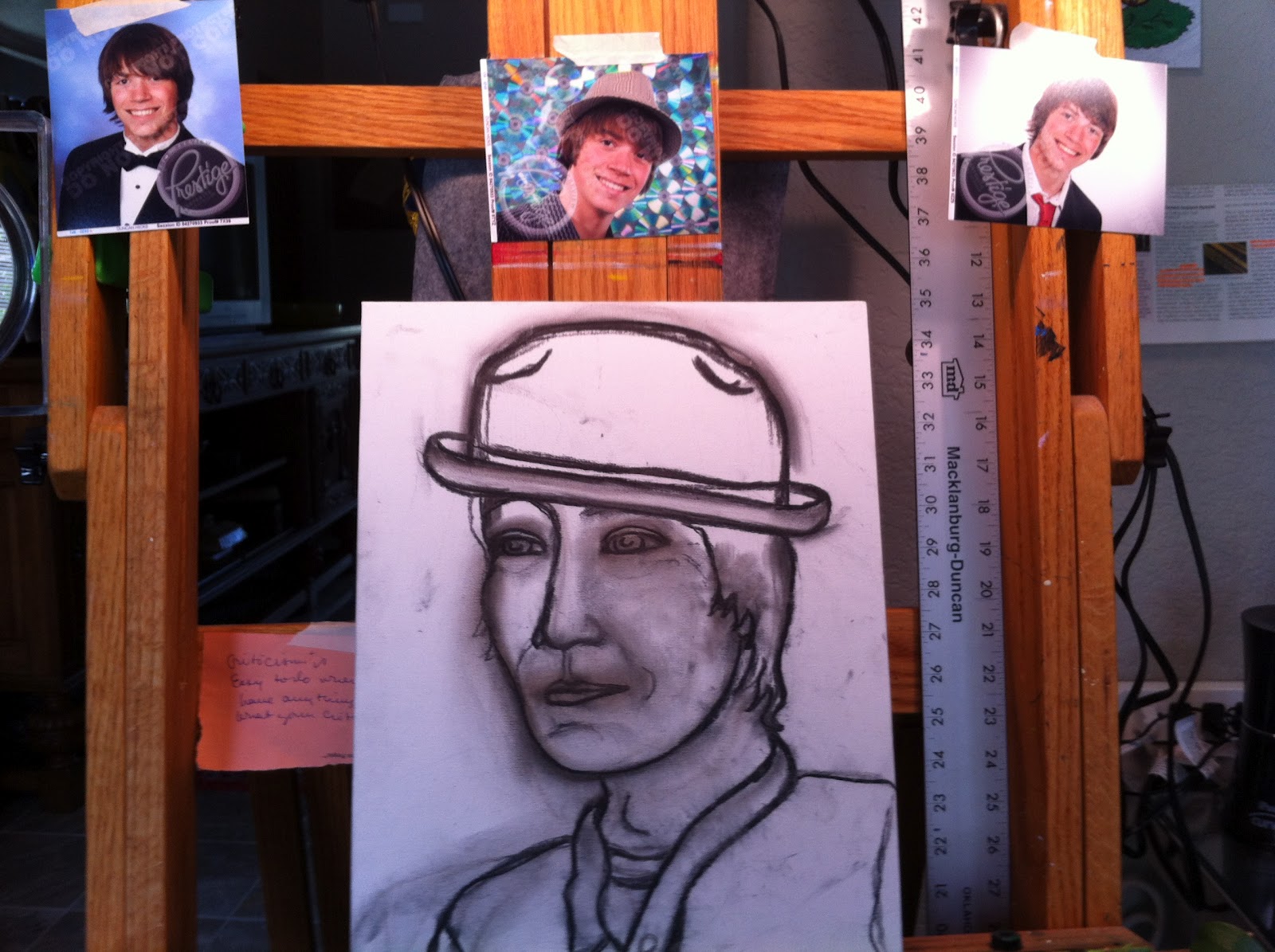
Here is my nearly complete sketch.  I changed the hat to a different one that Duncan had, which is shown below.

Duncan's hat is seen at left, modeled by his buddy, Brent - in heaven with his arm around his girlfriend, Anna.

One of the few entourage snapshots.

They are such a cute couple!
The sketch on the easel surrounded by pictures of Duncan.

(I am sure that Duncan is grateful for his summer internship, which puts him a day's drive away from this entire episode.)

I start with the face.  How on earth do you do men's lips without them looking like they are wearing the latest shade from Revlon?

The charcoal is smudging into the paint (which always happens), but it should get blended and covered by subsequent layers of color.

How are the proportions?

As I start painting, I feel as if I may be falling back into the rabbit hole I just climbed out of.  This is not a good feeling.

I am coming to the realization that you can't just "mash up" a bunch of different photos because each expression positions the rest of the face in a completely unique way.  Merde!


OK, the mouth just had to go.  With my French teacher's voice ringing in my ears, I keep hearing the phrase fermez la bouche!, which means "shut your mouth!"  I take that to mean paint it shut.  Vite!  Vite! Vite!


I decide to concentrate, instead, on all of the other things in the painting, then come back to the mouth and lips after I have a chance to study more Duncan photos in depth.

How on earth did Vincent do it without photos to study?  Or did he use portrait photos?  Would his subjects have had photos of themselves made?  Did he have Armand sit still while he stared intently at his mouth?  Did he make a number of sketches from different angles that are now lost to history?  Did he allow Armand to talk while he sat for him?  How did his keep little Camille in place?

I am grateful for the invention of photography.


I begin avoiding the painting of Duncan's mouth by making some adjustments to the shape of the hat, and simplifying the band to a single color so that it will be less distracting.

After many paints and repaints, I am finally happy with Duncan's eyes, which are big, but not bulging.  I am pleased with the iris color, which is done with patches of burnt umber, mars black and prussian blue.

Next, I added highlights of titanium white and raw sienna.  There are no lashes, just a rim of prussian blue daubbed with black, and drawn on with a thin brush.  With the blue black quite dried on my brush, I add the barest hint of a shadow underneath the lids of each eye to give the eyes depth and dimension.  The eyebrow on the left side of the painting still needs lightening and roughening to look realistic.

The hair is painted with mostly the same colors as the eyes, including the prussian blue.  Although I did finally get the hinge of the jaw in (almost) the right place, I need to soften the jaw line to make it look less cartoony.

The tee shirt and jacket were typical Duncan clothes, and they look good enough for now.  Although Duncan has no wrinkles, he does have smile creases in his cheeks and around his mouth, and he always has merry little cat's whiskers around his eyes, just like his Dad and Grand Dad.

After a nights sleep and Duncan's complete silence on the issue, I begin again the next day.

 The first item on my agenda was to review how to (actually, carefully, and taking my time) draw a mouth in general, and Duncan's mouth in particular.

So, I got out a book that I had purchased long ago called Secrets to Drawing Realistic Faces (which apparently I was keeping a secret on my bookshelf), that breaks down the face into component parts with lessons on each.

After a basic anatomy primer on the lips, teeth, and skull (who knew that the little trench above the center of your lips is called a "philtrum?"), the author advised
focusing first on the upper lip, which should be drawn out fully.

In contrast, the lower lip should only be suggested, and NOT completely outlined.  This "suggestion" is probably easier to accomplish in a drawing, which can leave unmarked areas, than in a painting, which is typically completely filled in.

 Above and at left is my sketch of Duncan's smile.  Note that the teeth are not separated by lines - the book termed this practice "flossing with a pencil."

I would agree that the teeth look more realistic when not drawn individually.

The shadows inside of the mouth (and particularly at the edges) were also important to the illusion.

 At right is the mouth as I painted it.  It is not perfect, by any means, but after the 16 previous incarnations of the mouth that I had already put underneath it, I was relieved to have anything on the face that looked remotely like a dimensional, human pie hole.

I can see (now!) that my mouth is too compact and not stretched sideways and elongated enough.  Crap!
 I threw in this close up picture of the eyes because I think that they are the most successful part of the painting; and after this week's work, I just felt like I had to encourage myself with a "rose" after such a barrage of self inflicted "thorns.

My take away: I need to draw what I see, instead of what I think I see.  I thought I knew what my kid looked like - these paintings are proof that all teenagers are right about one thing: Their parents don't have a clue.

Below is the finished painting.  Please let me know what you think, if you are so moved.


But before you look, I want to take just a moment to personally thank everyone who is reading this blog.  Blogspot informs me that I now have an international readership, with page views from Canada, Russia, and Germany!  Thank you all for your interest, and I will strive to reward that interest by being interesting.

And here is Duncan (barely):


You may definitely expect a landscape or floral next week.  Geez!