Hello, readers!
I was looking at my calendar the other day, and realized that I have three months left in my year long project with Vincent. (Yikes!)
The tulips, which were the last official painting that I finished, marked painting #21 of the 52 that will be required to complete the task I set before myself. Although I am no math major, even I know that I am officially far behind my schedule.
It has taken me 9 months to do less than half the paintings, so there is NO WAY I can finish on time, right? Well, not necessarily.... (cue Catherine, the cockeyed optimist, the biter off of more than she can chew, queen of ridiculous, self imposed (but more often than not, met) deadlines.)
As of today, I have about 90 days to complete (roughly) 30 paintings. O.K. That seems daunting, but not impossible. 3 months, with 4 weeks in each month translates to 12 weeks to paint. If I can do 3 paintings each week (3X12) then I will have 36 paintings by the end of the 90 days. All I need to complete the assignment is 31 (52-21= 31). If I can strive to complete 3 paintings every week, then I will not only make my goal, I will overshoot by 5. This seems hard, but doable.
I will make a slight compromise for time as far as the blog goes: I am going to try to be more brief and to the point - I will write about the three weekly paintings in a single blog, and will try to be concise. Honestly, though, with the way I write, I offer no guarantees. I am only promising to try...
So, let's give it a go.
Painting #22 - Bluebonnets

Spring is truly sprung here in Texas, and the annual orgy of roadside wildflower color is about at its zenith. I don't know how it is in other states and countries, but here in Texas, and especially central Texas (where I happen to live) the bluebonnet season is a
huge deal. Spring is the only truly beautiful season in the Texan calendar, and honestly, I don't think I could live here if the wildflowers didn't join me annually.

During her tenure as First Lady of the United States, fellow central Texan Lady Bird Johnson made the beautification of America (by planting self seeding wildflowers) one of her pet projects, and her legacy lives on here (and I hope all across the country) each spring. The bluebonnet is the state flower of Texas, and it's appearance every year marks the first of multiple waves of color as each subsequent type of wildflower has it's own brief time before the onset of Dante's favorite season, the Texas summer.

Because of the ongoing drought, this has not been the most spectacular wildflower season I have seen, but thanks to some late spring rains, the bluebonnets got a second wind, and have been blooming assertively for over a month. It is a dangerous time on our highways as cars packed with families search hi and low for the best patch to get their annual bluebonnet photo fix. I will share my three favorite bluebonnet photos of my kids...
Can you guess which one is now an engineer, and which one is now an actor?
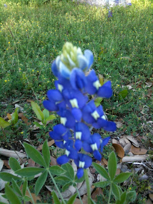
So in addition to searching each year for the best kid photo op, most artists in Texas at one time or another try their hands at a bluebonnet painting. You almost can't help but wanting to paint them; a good patch of bluebonnets can be as inspiring as any ocean. There is a "thing" in my state about painting bluebonnets. Everybody, and I mean everybody paints these flowers - I myself share these ambitions, and in anticipation of that, here is a closeup of a bluebonnet that I took during a previous spring:

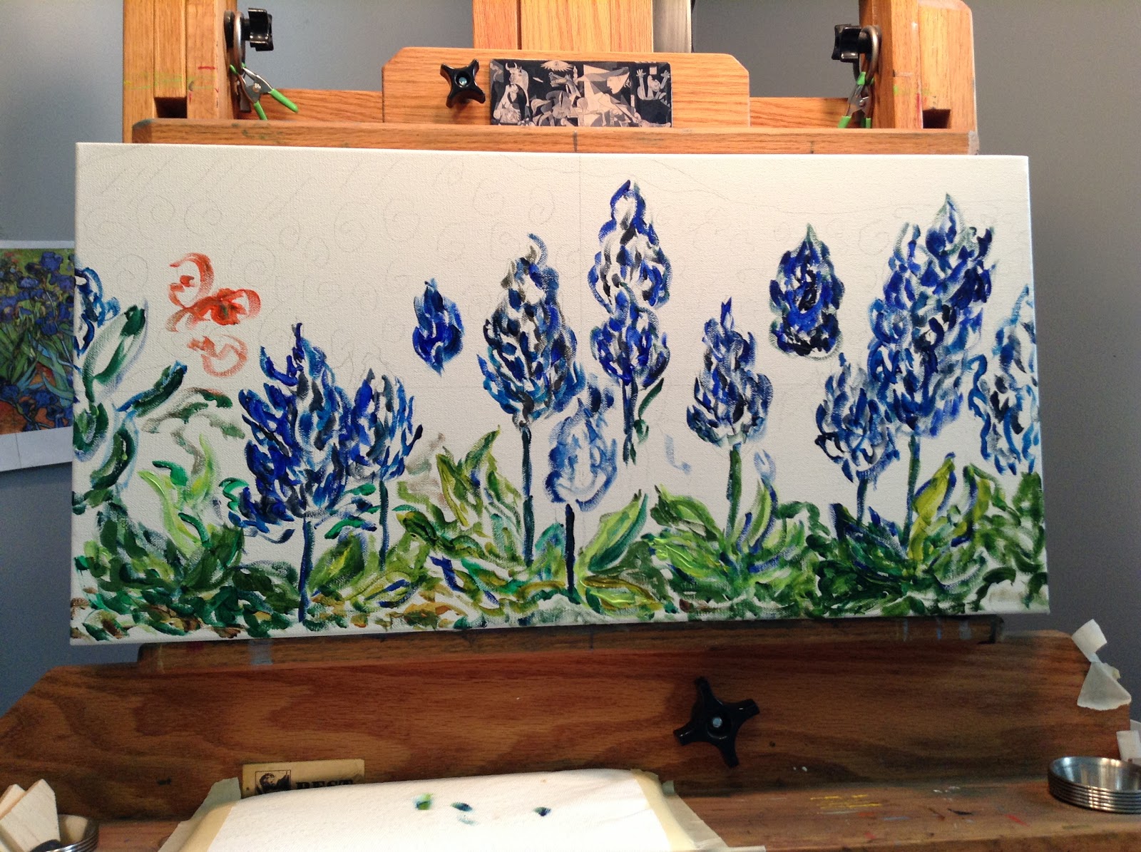
So, I am going to give it a try. I wanted to do a long, narrow landscape, (which I drew kind of free hand - Hey, I've lived in Texas for decades - I know what they look like!) with the bluebonnets in close focus rather than the often depicted waves of prairie color.
The drawing is loose and shlumpy, and as I am drawing, I keep noticing little errors, which I then tell myself I will "fix" while I am painting it.
That is an extraordinarily stupid thing for me to do, as you will discover by reading on...
I was trying to do something from a snake's eye view, where the observer would be looking up and over the flowers. As an aside, those who may be visiting Texas to see these flowers may want to be cautious about positioning small children for their photos - one of the most favorite hangouts for snakes in Texas is smack in the middle of a bluebonnet patch.
I did pull a photo off of the internet so I could get a handle on the density and placement of the leaves in a grouping; the photos I had taken myself were all more of single flowers.
In thinking about how friend Vincent might have tackled bluebonnets, I wanted to paint with great turbulence, attacking the painting quickly and hitting hard with masses of color...
on the close in, detailed and intricate individual bluebonnet plants and flowers. Are you sensing a disastrous trend here?
For inspiration, I brought my cypresses painting back into the studio. It had the looseness and rapidity that I was looking for in this new painting.
Apropos of nothing, I told myself that I needed to get the painting complete or very nearly so in the time I had left that day; at the time I picked up my brush it was about 6 hours until I would have to quit...
So I started with some blues and greens, trying to capture the variety of the cool shades endemic to any bluebonnet patch.
At this time, I thought my drawing was going to work.
Filling in more, I continued on...
and on...
throwing in a little orange for variety...
and adding in a wide range of greens for the foliage.
I got the landscape up behind the bb; painting as loosely and turbulently as I could.
I am kind of OK with this at this stopping point. It is a snake's eye view, we have a little rolling hill in the background, a small sky - overall, I think that it is coming along.
But there is still a lot of white space.
So I paint in some more, filling in specific leaves, and trying my best for a swirling, undulating Vincent-like sky.
Spoiler alert: please note how the flowers are getting fatter and squatter as I go. I am filling in white space, but not with air - I am filing in with extra flower parts that kind of look flowery, but do they look like bluebonnets?
Allow me to pause here and remind you what I should have reminded myself of:
Vincent painted from nature, standing out in nature, surrounded by nature... Vincent did not mind bugs, or heat, or humidity.
And that is why Vincent is so much better than me...
So, in my air conditioned studio, with my refreshing glass of icy cold tea at hand, with my lovely music playing in the background, and every comfort imaginable, I proceed to not paint bluebonnets.
Instead, I start painting a random weird bluebonnet/hyacinth hybrid that I think look just like bluebonnets.
Do I even glance at a reference photo?
What do you think?
So, further and further on the hybrid path I tread; doubling down on imaginary indian paintbrush (the orange flower in the background) and on what are now undoubtedly illegal cannabis leaves supporting and nurturing the flora.
Do I look at a damn reference photo?
What do you think?
I am making good time, staying right on track with my schedule; the painting does look appropriately turbulent, and as you can see below the cypress painting, I have gotten out and used almost every tube of color in my arsenal...
But this is reminding me of one of those family trips (like from my childhood, out to take a bluebonnet picture) -
where the focus seems squarely planted on making good time rather than on enjoying the trip.
Nertz!
Here is my close up, and let me remind you again of what an actual bluebonnet looks like...
Just a little bit different, wouldn't you say?
So the artdemigod comes in and expresses concern over my promotion of marijuana with the leaf structure, so I decide to de-emphasize the leaves by shading them in a setting sun...
which, unfortunately, seems to put the spotlight directly on my fat, fluffy, oompa-loompa-ish crossbreed hyacinbonnets.
Nertz again!
Am now trading my tea for a scotch. A double scotch. No ice.
And here is the "finished" painting. Rather than being accompanied by the sound of a contented sigh, this one went out with a snort of disgust.
So, what did Vincent remind me of with this painting?
1. Go outside, and paint nature from nature.
2. Observe accurately by going outside and painting nature from nature.
3. You don't know what you think you know - go outside and paint nature from nature.
4. If the fix to your problem is not found in nature, then you can't make it better, unless you go outside and paint nature from nature.
Thanks, Vincent.
Painting #23 - The Conversation
So I decided to enter a contest. During the last year, as I drove around Austin and the surrounding area, I kept observing the most delightful,
artistic billboards, which were (as the teens sometimes say...) 20 pounds of awesome in a 10 pound cannon.
Instead of the usual advertisement for divorce or vasectomy reversal, these billboards were just beautiful paintings, drawings and photos that had been supersized into billboards. A local outdoor advertising company (Reagan) just started
this contest to promote art and artists in the Austin area. Cool, huh?
So I got online and read the rules. Naturally, the contest required that the finished art be a very specific, billboard friendly size. They wanted each piece to be exactly 6 by 24 inches, but said that you could do any medium that you wanted, including photography, collage, painting, even sculpture (as long as it photographed well for the billboard format).
Then I thought and I thought about what I wanted to do. I thought about doing a bluebonnet painting (see above) then thought that might not be so good. What would work in such a long, skinny, horizontal format?
I didn't want to do a landscape, that seemed too obvious, and there were already some beautiful landscapes that had won for the 2012 contest. I thought some more. I decided that I wanted to somehow depict some faces, because that is what usually drew me to noticing a billboard. But what kind of faces?
I googled images of eyes (do not do this unless you are unsqueamish... seriously...) and saw lots of different kinds of eyes - I kept honing in on eyes of babies and young children. So I googled those specifically, and saw many cute eyes, which I was considering arranging "Brady Bunch" style on the billboard. I played around with that in my sketchbook, but decided that the Brady Bunch style was better suited to television than to the long skinny format I was constricted to.
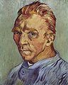
So I kept on thinking... I picked up one of my Van Gogh books for inspiration, and started thinking about Vincent's eyes... I kept looking, searching self portrait after self portrait - and just looking at and into Vincent's eyes... Wow, that was kind of emotional! Vincent's eyes were truly the mirror to his soul. He painted them so masterfully, with every possible emotion, mood, and nuance drawn through his brush into those images. That was a very moving and interesting experience.
But that got me to thinking about other artists, and how they depicted their own eyes through self portraiture... I had just seen all of that black and white work by Picasso. His eyes were stormy, flashing, and always kind of sexy, I thought. They were deep and intelligent, and in observing his own portraits, you could almost feel his eyes observing you back.

But what about other artists? I looked up the self portraits of some of my other favorites: Manet, Monet, Warhol, Khalo, Matisse, Freud... all were very good, very moving, and quite interesting to observe in succession.
Yet something kept nagging at me: some of the artists were much more instantly recognizable than others. Like Vincent, there were several artists whose self portraits were absolutely iconic - either a single one of their portraits was so famous and recognizable that you instantly knew who it was, or the artist had compiled such a significant number of self depictions that the collected work became iconic in and of itself.
Even the term self portrait conjures up very specific images in most people's minds: Vincent,
Frieda, Andy, Pablo. We all know what those people looked like, because they are very famous for their own images. Frieda's work is so important in this arena - she was badly injured in an accident and was bedridden much of her adult life - her main subject was the person she spent the most time with - herself.
So I printed off some self portraits and just started playing around with them. I used my color printer and made a pile of portraits on my desk.
Just for the hell of it, I went ahead and printed off one of my own portraits, and stacked it in the pile. I wanted to isolate the eyes, so I started folding and manipulating all of the images.
Then I played with scooting them together like puzzle pieces. Like a puzzle...
Well, now I was getting some where. A portrait of Frieda kind of fit in with my own self image. And my hair sort of fitted in with Vincent's swirling blue backdrop... This was quite interesting.
I played with the portraits, and played with the printer, sized things up and down, folded and taped, repositioned and resized until I got to here:
Then here:
Rembrant fit into Vincent; Vincent's background (sort of) fit into me; my face fit into Frieda's; Frieda's background (sort of) fit into Pablo's, and Pablo's mouth sort of fit into Matisse's mustache. Cool!

So how do I transfer this from printed sheets into something that I can paint? I can try to draw it freehand, because that worked out so exceptionally well in the bluebonnet painting, or I can try to cheat.
Cheating it is!
Because everything in the painting will fit together like a puzzle, it is important that I be exact. I got out my tracing paper, and made a line tracing of each of the painting fragments, boxing them in so that they will interlock in the final work.

Now how the heck do I get it from the tracing paper to the support? I remember from sewing with patterns that you use a special transfer paper to move pattern markings onto fabric so that you know where to put in things like the darts, make little clips, etc. That is literally moving an image from tissue paper to fabric, and I am literally trying to move some marks from tracing paper to a canvas covered board, so what I need is some kind of transfer paper -
Jerry's Artarama to the rescue! I knew I had seen artist's transfer papers in their drafting department, so off I went.
I bought graphite (dark grey) paper, but you can also purchase many different colors (including white) for whatever you want to do. It comes in a roll just like Saran Wrap, although it is called Saral.
One side looks like thin whitish/grey paper. That is the wrong side.
The other side is kind of waxy, with fine striations. This picture is not nearly as dark grey as the actual paper is. It was very obvious which was the wrong side.
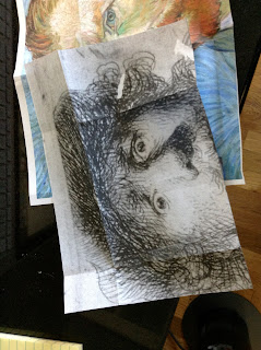
I did a test run of part of Vincent's face on a small board that I had in stock. I sandwiched the layers together, my practice support (a canvas covered student board), the transfer paper, and then the tracing paper on top. I made sure everything was positioned just so. and that I had the traced image lined up where I wanted it.
I used a small, pointed stick to trace around the image (the instructions said you could also use a pencil), and with medium pressure, I drew all around my tracing.
Voila!
Vincent's face magically appeared when I took away all of the paper - why oh why hadn't I thought about doing this before?
To be honest, I had thought about it, but I thought it was cheating. But is it really cheating if they manufacture and sell a legitimate product at a bona fide Artist's supply store to do it with? So I have to ask myself the question I always ask myself when it comes to an artistic moral quandry - What Would Vincent Do?
I honestly don't know.
But Catherine would use the magic, exacting, perfect image, awesome and really, really cool tracing paper.

So I laid out on to my 12X24" canvas board the intertwined and connected images of myself and all of the other artists.
From left to right are:
Rembrandt and Vincent
Catherine and Frieda,
and Pablo and Henri.
The images of Rembrandt and Matisse were different, though.
The Rembrandt was described as an etching or burin, and it had the look of a charcoal sketch on grey paper. The
Matisse was a pen and ink, also on grey paper. So that is what I wanted to reproduce. I had purchased varying tones of grey artist's papers when I got the transfer paper, so I proceeded by transferring the images from my tracing paper onto the heavyish art paper.

I used charcoal pencils to fill in the first one, trying to stick as closely as I could to Rembrandt's original image. I used black, white and dark grey charcoal pencils. Because charcoal is very smeary, I finished it off (once I was done) with a can of (unliked) hairspray that did not agree with my personal hairstyling needs.

I did the Matisse with a good felt tipped pen, tracing over the transferred image on the art paper. I did not finish his portrait with hairspray because the ink was permanent ink.

Next, I painted all of the portraits, leaving blanks where the paper portraits would be adhered onto the painting after I was done (this was accomplished with some very fancy and expensive dry adhesive transfer paper (worked only kind of OK, was not worth the $$) and some good, old fashioned white glue.
Here are some close ups of the finished portraits:
Yes, the final Rembrandt is different from the original one I did (that you see above) I messed it up when I was gluing it on to the canvas, so I said to myself, if I can do it once, I can do it again. And I did.
I was originally thinking that I would do a black background (you can see in my initial sketch, above) but the artdemigod suggested that the black was too dull.
I knew it would be too busy to do another human face, then I thought about other artist's whose work was iconic enough to stand on it's own. Pollock and
Mondrian came to mind. I chose Piet, and added a modified homage to
his most signature composition to my painting.
My adding my own image in to the portraits is my tribute to Andy Warhol, who was never shy about including himself in his own artistic efforts.
I called the work
The Conversation because it really felt like I was listening to each of these artists as I examined, pondered, and attempted to reproduce their portraits.
I learned a lot by doing this project, and I am certainly glad that the Austin Art Boards contest came along to inspire me. I know everybody says that they don't care if they win or not, the experience, blah, blah, blah... but I am so glad that I took on this billboard challenge. I have seen each of these artists in a new way, and I am the better artists for doing this work. It really, really felt just like a conversation - a good, 3 a.m., best dorm, best college, freshman year, all the time in the world, open to every new idea, I don't give a crap what my parent's politics are kind of conversation - and I am so grateful that I took the chance to do it.
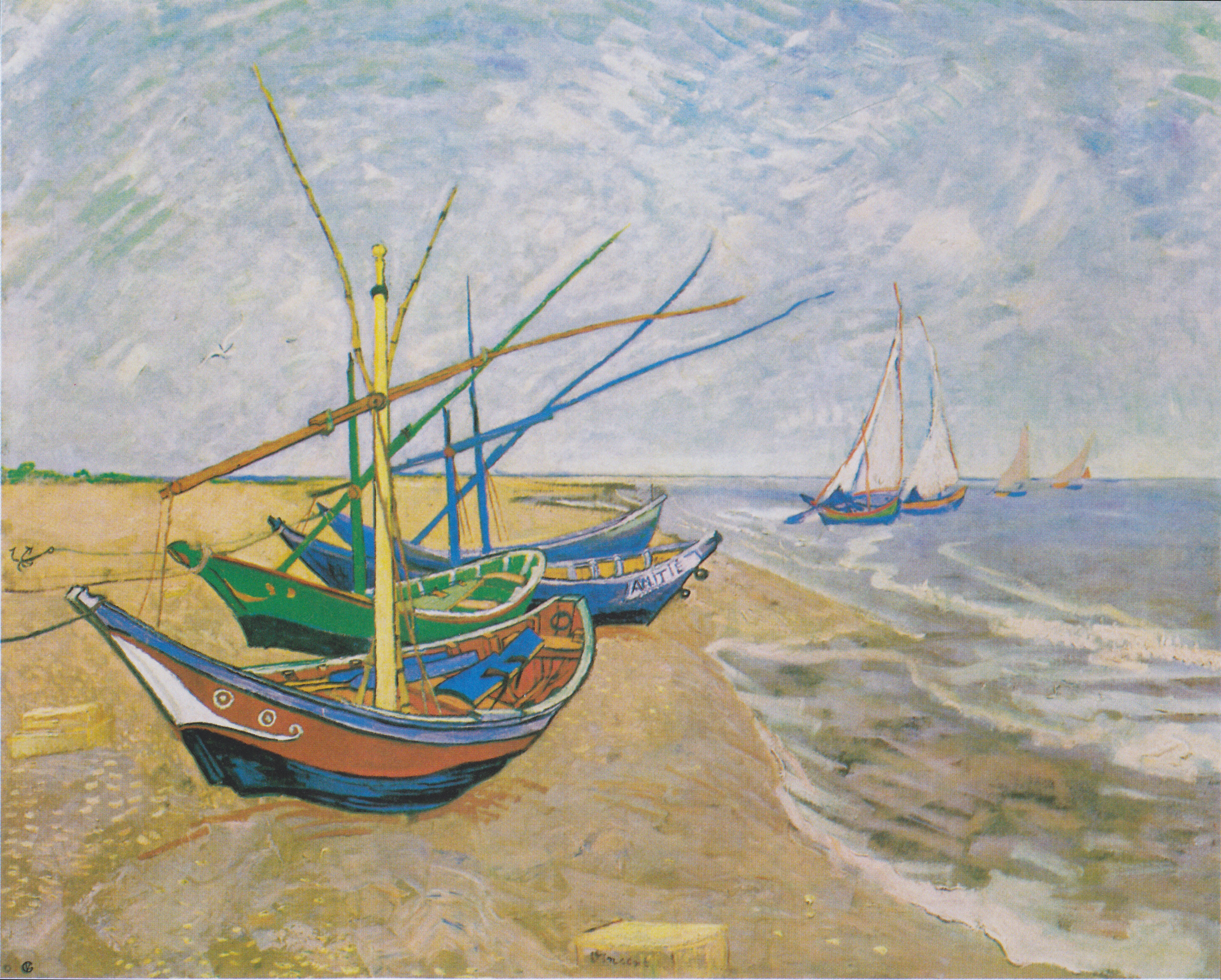
Painting #24 - The Fishing Boats

I am sure many of you recognize
this happy image - it was painted by Vincent in 1888 at the sea side village of Saintes-Maries-De-La-Mere, an ocean community about 30 miles from Arles.
I have always loved this painting, but have been a little afraid to paint it because of the complicated intertwined masts of the boats and fishing equipment.
So my brother, Joe, and his wife, Margo, were visiting from Florida last week. Joe and Margo are the truly free spirits of our family - they go and do what they want when they want, and, since they met, Margo has been such a good partner for Joe. She really makes him happy, and that makes me truly happy, as well. Margo has also been a good friend and sister in law to me, and has given me a lot of encouragement and support with both my blog and painting. I told Margo that I would like to do a painting for her, and asked her to give me an assignment.
While Joe and I had fun talking politics, Margo leafed through my books and found the fishing boats. I told her I would do it, and that I was glad to have someone set this task before me, since I was not quite brave enough to do it on my own. Margo's only stipulation was that she wanted a very
very small version of the painting because she and Joe moved to Florida in their Motor home, which they are still living in (they love to travel!) and enjoying.
So we agreed on a 5X7 size, and, on the day that they headed back east, I got to work.
As I am not a complete fool, I got the transfer paper back out.
Online, I found one of Vincent's sketches for his painting, and as it was a simplified version of his work (no sailboats, printed off at very close to 5X7), I thought there was no point in reinventing the wheel.
This time, I did the tracing with a very dull blue colored pencil (silly english language - is the color blue dull, or is the pencil dull - it was the pencil).
You can see at left and above that I started with the easiest part, the horizon.
All traced -
I declined to color in the details, saving that for my paintbrush.
Here is the completed tracing. My support is a gessoed board, which is very smooth, flat, and has no bounce.
Yeah, I left things in kind of a mess.
The masking tape that you see on the right hand of the printed image was used to hold the three layers in place so that I could not go off of registration with my transfer.
The blue pencil was very helpful so that I could see where I had already traced and not repeat a line.
Let us pause for a moment and marvel at the happy simplicity of Vincent's composition - I feel the salty wind on my face and can hear the cry of the gulls just by looking at this crude outline of his painting. I bet he stood outside to get this.
Not knowing where to begin, I started with the sand and the blues and greens of the surf.
I also did a little ivory black mixed with Payne's grey to outline the boats and the masts.
OK, I am now starting to get a sense of moving ocean water and a little hillock of sand.
On a 5X7" canvas the boats are very tiny and intricate, and the details are quite challenging to render.
Switching to smaller and smaller brushes...
Same pause in painting, with a different camera angle...
The painting was too small to have any control over it in the traditional holder on my easel, so most of this piece I did while just holding it in my hand.
My fingers were hilariously painted at the end of the day.
OK, here I am lightening the sky. I have also added in some turbulence (!) in the water, and a bit of green on the horizon.

Notice how I have abandoned the idea of painting around the masts. They could probably be worked around on a larger painting, but this one was so tiny, the only solution was to just paint over them.
It is difficult to tell in the photo, but I could still see the faint tracings of the painted in masts through the over painting.
Notice the white out in the foreground. I attempted to paint the square object that you see in that position in Vincent's painting, and it ended up looking very odd in the small picture.

It was proving very challenging to do the hatching marks that Vincent made as he painted the sky.
No matter how carefully I was working, there was just not enough room to get them going in the right direction.
It was like trying to back up a big car in too small a space - there was just no room to turn in time.
I finally decided that I couldn't do the hatch marks at all, and opted to do an impressionistic, swirly sky instead. I used this old, rough, angled brush to to paint in sheer layers of white and blue, swirled over the horizon in a loose, scumbly fashion.
OK, that sky looks better, but the boats look like they have been through a
hurricane with their broken and missing masts.
(Note how they are all now carefully tied down...)
I then stop and look for my absolutely smallest (1/8") angled brush...

and get started on the masts.
On the closest boat, I outline the masts in black because it looks like that is how Vincent did it, as well.
The more distant boats have masts and what I assume is some sort of fishing equipment (tackle?) that is in a color that coordinates with the boat.
Painting the masts is like painting a weaving or spider's web - it is hard to keep track of what is in front and what is behind.
You can see how my boats compare to Vincent's...
thank God I left out the sailboats - I would have had to use some eyelashes to paint them!
I did shade and outline all of the masts with dark grey, black and dark brown.
I think that the water is pretty good.
And here is my painting for Margo on it's own...
I knew that the colors and the scene with the golden brown sand were reminding me of something.....
I hope that my painting stays crunchy, even in milk.
I think this is a fitting reminder, since my big brother Joe could (and did!) easily consume many an entire box of the puffy golden sugar bombs during our youth.
Ah, Captain Crunch! I smell you when I pee.
And with a few more tweaks, I am doneski!
I will be sending it to Joe and Margo soon, but not before adding a little something more, which will be featured in next weeks blog....
Three paintings down, only 28 to go...
Until next time,
Catherine