
About two weeks ago, I walked into the grocery store and saw that fresh, barely budding tulips were being unloaded into buckets, where they were marked at a special sale price of about a buck a stem.
I immediately put down the bananas I was loading into my cart (they would have just rotted on the counter anyway; bananas are something we often forget to eat until it is too late)...
and reallocated my banana budget to tulips!
The buds were beautiful - yellows, pinks and reds, with nice, strappy leaves that reminded me of the recently painted iris greenery. I got the flowers home, trimmed the stems under water, and put them in a cut crystal vase. Then I jumped on my computer to find some of what I thought would be many examples of Vincent's paintings of tulips.
The man was Dutch, after all...
And here they are. Both of them:
 |
| I don't know if these are actually tulips, they are described only as bulbs. |
The only other painting he did (that I have been able to find... if there are others, please let me know!) that featured tulips is his Bulb Fields. This is a beautiful perspective painting of a farmer walking through a commercial field of flowers, but it only shows a very impressionistic view of swaths of colored blooms. There are no individual flowers in the piece. It was one of Vincent's earlier works; he painted it while in The Hague, The Netherlands, in April 1883.

 I have no idea why Vincent did not paint more tulips. He painted many floral still lifes, probably because flowers are easy to pose, and, once purchased or picked, require no model's fees.
 Interestingly, there is only a single mention of tulips Vincent's letters. (And thank you a thousand times to the team that has organized and annotated Vincent's letters. Your work has made my exploration of Vincent's life so much easier!)
 In a letter to Theo in 1883, he described an art business "bubble" as being similar to the the tulip mania which reached its zenith in the Dutch economy in February, 1637. According to Wikipedia (link above), tulips became so popular during this time period that they were traded like currency. Some single bulbs (like the specimen at right) during that period sold for more than 10 times the annual income of a skilled craftsman! No wonder the term "tulip mania" has become synonymous with any large economic bubble.
So Vincent did not write about being inspired by tulips (as he clearly was by other flowers); he wrote about them strictly as a descriptive term. I find this very curious!
 Although I don't think that Vincent shied away from painting things that are difficult to render (like, for example, darkness!) it really kind of shocks me that there are not dozens of still lifes with tulips in his work. I mean, he must have come across them in someplace other than a field... they sing with color, which he loved... and tulips are not even that hard to paint with their simple one bloom/one stem growth habit.
  So why did this distinctly Dutch artist not paint a vase of tulips? It seems that tulips would be the most logical subject every Spring during the ten years that Vincent painted. Fellow Post Impressionist Paul Cezanne painted Still life with tulips and apples at about the same time that Vincent was working, so tulips were a known subject, even in France. Now this question is really bugging me. What was the deal with tulips? If anyone knows, please dish.
In the meanwhile, I have tulips blooming their heads off, so I'm going to shut up and paint.

The canvas is a wrapped 16 X 20.
I am confessing that I had a lot of paint left on my (still - ew!) moldy smelling palette. (Honestly, even if it smells gross, the paint flows just fine, and the odor goes away after about 2 minutes with the lid off.) Ew, but, hey.

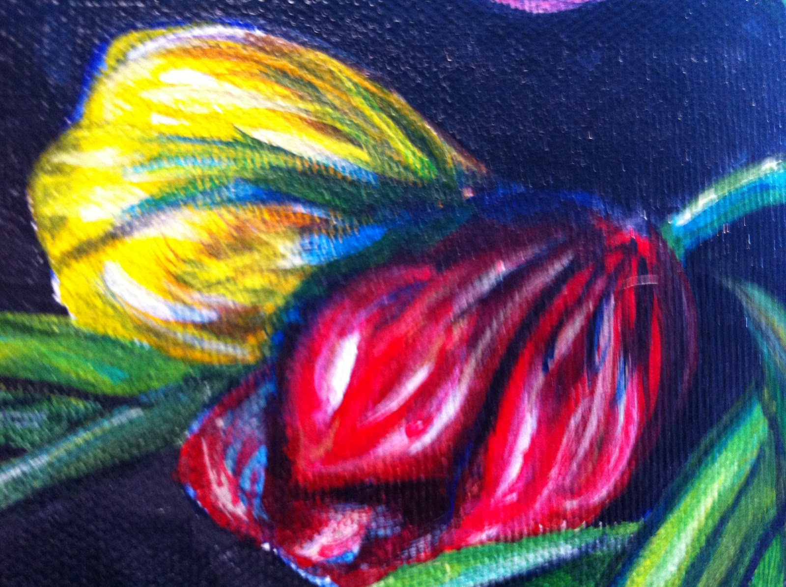
The real challenge with painting tulips is that they keep on changing. Of course, as they blossom, the flower head progresses, opening from tight, prayerful hands into big empty cups that look like hollowed out heads of lettuce.
But that wasn't the hard part. The flowers themselves kept moving. I don't know if they were following the sun or what, but they kept on waving around in the vase. Every time I sat down to paint, I had to re-rearrange them to get them back into order. Eventually I realized that this was a Sisyphusian challenge, so finally I just gave up and let them go where they wanted.

I decided to do a dark background so that the flowers would really pop against it, and began by painting in the "behind" area with a mixture of Payne's gray, indianthrene blue, and ivory black.
Notice how I turned my painting on it's side so that it would be easier to get my brush into all the nooks and crannies. Turning the canvas as you paint makes things so much easier, and is also a good way to check for balance in the composition.

My brushes of choice for this project:
Angular shaders (teeny tiny angled little house painting style brushes) which have lovely sharp tips that get into all the ravines. That is, unless you have overused or underwashed your angular shaders, in which case they suck. If you find yourself in that situation, then it's time for some new brushes! (Oh, yeah!)

OK, so, thanks to the Artdemigod funding the brushes you see above. Here is the complete background worked in; down below you can see that I am also painting out the sides of the wrapped canvas. There is also a shot of the flowers, which are continuing to rearrange themselves.


The outlines were a nod to cloisonnism, the Japanese influenced separation of colors with lines.

Vincent brilliantly painted The Irises using this technique; I was somewhat less successful at deploying the lines to color inside of with my own version.
You can see at left that I am also painting the stems of the flowers as they float inside of the glass vase.

I wish I could get this kind of soft focus in my mirror when I am contemplating my wrinkles.
My own epidermis is no longer exactly "petal soft" - 'nuff said.

Here is a slightly more in focus shot of the center flowers.
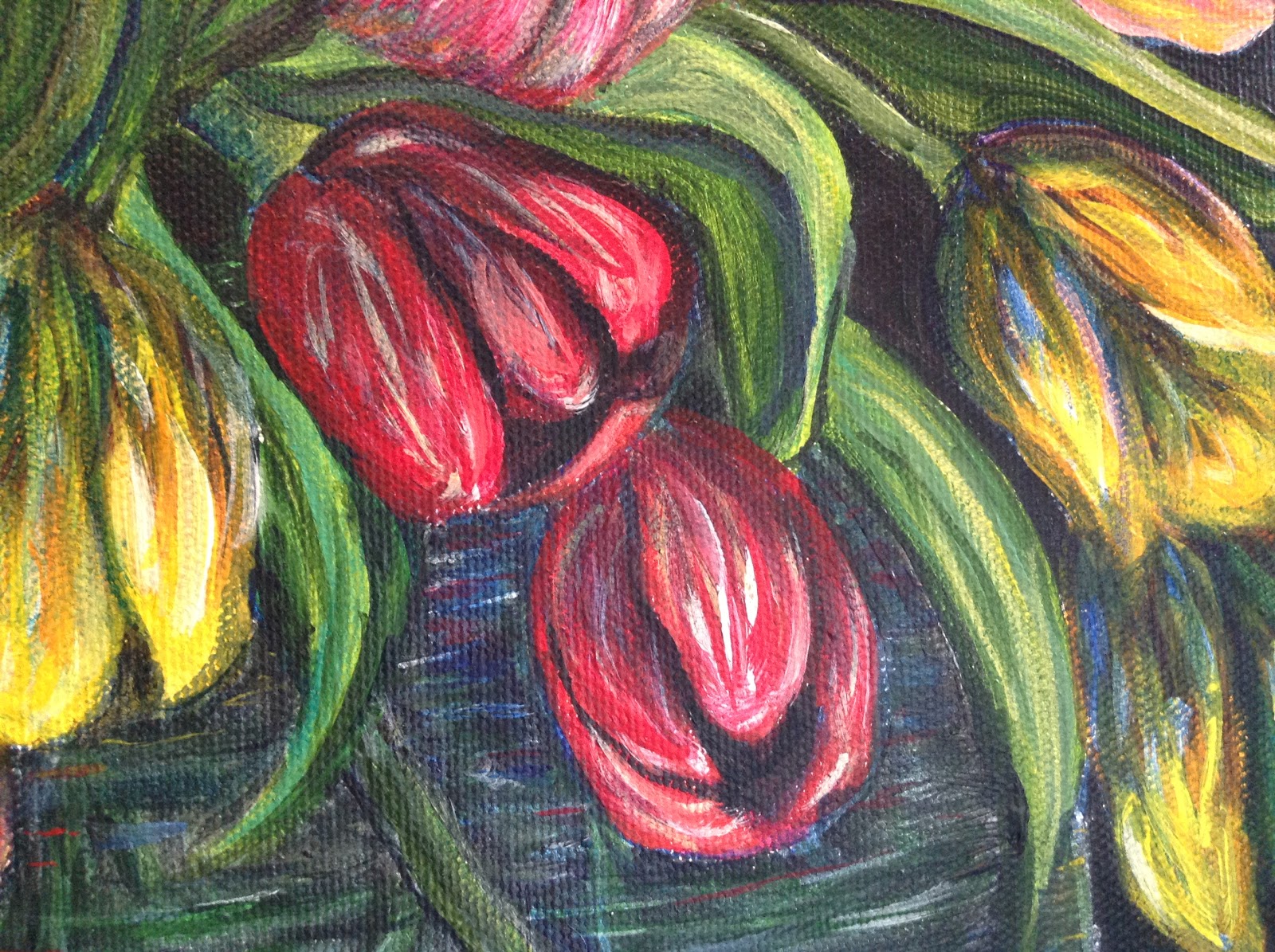
I am throwing in a shadow here or there so that the tulips don't look like flat scraps of paper flittering in the breeze.

And now some yellows.
The flowers were all looking very monochromatic and flat, so I started bouncing in the red, yellow, and pink on all of the flowers to try to give them some life and dimension.

Hmmm....

The cups are for cleaning brushes and general water deployment, and the spray misters (originally came from the optician filled with glasses cleaner - the most awesome fine misters ever!) are used to keep the paint moist.

The tulip you can see at left on the canvas looks more like a fresh bunch of bananas... Coincidence? I think not....!

Although I changed their water every day, I realized that the only way to really preserve a flower is to paint it's portrait. Awesome!

There also seems to be a serious proportion issue with some of the flowers.

Here is the budding tulip in the middle on the right. I am working on trying to add some shadows, dimension and depth. I like the leaf, but the flower looks a bit like a light bulb with a bad haircut, or like a strange sort of bee.

AAAAA - CHOOOOO!

Someone left my cake out, in the rain..... I honestly was starting to agree...
I seriously thought about abandoning the entire painting at this point.

It wasn't well turned, or masterful, or even mildly convincing, but seeing just a tiny part of that flower coming toward me gave me a little bit of courage.
A tiny bit of hope.

So I kept on painting, layering color after color from my moldy palette onto my painting.
Bit by bit, stroke by stroke, I started seeing flowers coming toward me.
That was very encouraging.

Ruh - Roh! Shaggy! I don't know how to paint clear glass!

As you can see, I set up a little tableau with a dark background and a white "tablecloth" so that I could have a look at what I would be trying to paint.
Well, the glass is clear, but what I need to do is not. How, exactly, does one paint the invisible?
Well, how did VvG do it?
 |
| Still Life with Decanter and Lemons on a Plate (1887) |
Vincent's glass was very challenging to render because it is clear glass cut with rounded divots, and positioned up against some patterned wallpaper. Phew!
But with that said, honestly, I don't think I would describe this painting as one of Vincent's best works. I know it is heresy to say that, but really, that is how I see it. I mean the painting is charming, and if I had the opportunity to hang it in my house, I would move out anything that I remotely considered my best work; I mean it is Vincent Van Gogh, for God's sake, but I still don't think it is the best one he ever painted. (Feel free to discuss amongst yourselves....)
So what does this image tell me about how I can paint glass? I see a lot of color and reflections in Vincent's glass, and there are purposeful smudges of white where the glass is highlighted. Some horizontal lines give the bottle a rounded quality, and there is a thin oval of violet? green? gray? that makes a water line in the neck of the vessel.
I decided to look up how to paint glass in a book that I had in my library. I will not mention the book because the author's instructions were just completely nonsensical to me. Here is a sample:
"...apply a light gray for local glass color, erase back for highlight, or use white chalk. Transfer or recreate your drawing on the surface of your choice .. (this was the first mention I could find regarding starting the painting on anything other than the support you were going to paint on.) ... Don't fill in the local glass color value in the transfer stage. Block the surfaces around the glass, as well as inside the glass. If you have a white wall you'll simply see the color of the glass which will be gray in a clear glass. Add cast shadows. Paint the gray value shapes around the contour and inside of the glass and especially the bottom back curve, using a small brush. Use a darker, neutralized color for colored glass shadows (with faux black, black, or a dark compliment added), not a pure color. Paint surrounding surfaces with medium consistency paint using negative space painting....." blah blah blah until I wanted to throw the book across the room!
I don't know about you, but I get kinda lost when reading something like this. The author managed to take art, beautiful art, lovely painting, the most enjoyable part of my day, and she turned it into a lecture so dull that it reminded me of sitting through geometry with Mrs. Carp. In high school, she made all of those lovely shapes (triangle, pentagon, hexagon, circle...) onto the board with her overhead projector, then rendered them as dry and tasteless as an old communion wafer found hidden in the pew of a church that had been condemned.

So instead, I just looked at the pictures in the offending book (which were actually pretty helpful, I forgive the author...), and stared intently again at my crystal vase, then concluded that if Vincent's wasn't perfect, then what did I have to loose?
I got out my brush and re opened my smelly palette. I looked for the most transparent colors I had on deposit, and dove in.
Unfortunately, I did not get out my camera, so that glass lesson has been lost into my canvas, but I will try to describe it to you as follows:
 I laid down a thin layer of transparent grayish black where the dark background would shine through the glass. It was a mixture of a little bit of black and a lot of Payne's Gray. Where the table cloth was, I thinned the blackish gray on my brush with a bit of transparent mixing white. I did follow the book's advice by drawing in a half circle to resemble the back curve of the bottom of the vase. I don't think it is quite right, though.
I tried initially to keep the vertical cuts that you can see in the vase above, but that was not working, so I simplified things by painting those cuts out.
 I then kept on layering on whatever translucent color I had that seemed to make sense. I added blue and green layers in horizontal scumbles (very little quite wet paint on a fairly dry brush), and worked quickly and carefully to keep things blended. In addition, I mixed many other colors on, or rather with, my brush as I went along - I am not one who enjoys mixing "special" colors with a palette knife - I prefer to keep my colors pure from the tube and just blend them with my brush directly on the canvas. You can see in the photo the variety of colors that I worked with; I used most of the ones you can see except the browns and oranges. There are a number of yellows that are hidden from view, and the little blusish blob in between the orange and red was some silver paint, which was put to effective (though sparing) use.
Around the individual flowers I painted in the tiniest (smaller than a single eyelash) horizontal lines where I bounced back the colors of the flowers. I did this to create reflections in the glass that corresponded to the flowers. When I was too heavy handed, I just covered over with with a translucent layer of the opposite color.
 |
| No Glaze |
You can see here and above close ups of what the glass looked like when I got to a stopping place. The area behind the red flower started out as covered with foliage, but the leaves did not make sense and looked like writhing green snakes. I did the correction by painting the area out with the dark blackish gray and then starting over with the translucent color/highlight/blend process until I got it where I wanted it.
 |
| With Glaze |
In the end, I do think the vase looks round, I am believing the stems hanging in the water, but the glass is pretty darn green. The final improvement I made was a clear, shiny glaze on the surface of the entire painting, which lent the glass a much more, well, glassy appearance.

I intend to challenge myself with more clear glass soon; there are some things that I want to try differently, and I am hoping to find a different book (or perhaps a comment from a very smart and very wise blog reader).
Next up is a photo play by play of the set up for the glazing of the painting.
But first, a diversion: some may find the glazing process a little intimidating; you can get over that quickly with a trip to your nearest Krispy Kreme donut emporium. Not only will you learn, first hand, what diabetes must smell like, you will be entertained because Krispy Kreme makes all of their donuts in house on a Rube Goldberg type of massive conveyor belt contraption which takes balls of dough and turns them into the mouth watering carb-bombs you see on your left. In the process, lovely, lighter than air rings of fried dough are lined up on the belt, which takes them, near the end of their journey, underneath a sugary white waterfall. This cascade of recirculating sweetness applies the finishing touch of sugary glaze in a seamless and oh so thin layer. The donut is never ruined by this process (unless it gets stuck and gets too much glaze), instead it is perfected. Bon Appetit!

You apply a final glaze (or finish) to your painting in much the same way, a thin layer at a time.
But instead of the applying the medium/glaze with a sugary glazefall, you use something called a mop brush.

But first, read the instructions on your glaze!

This is the product I used. It is available at most art supply stores. Please note: this glaze is suitable ONLY for use with acrylics! If you are painting with oils, you need special stuff, and visa-versa! Ask at the store before you buy!


I put a little bit of the glaze into a metal cup, and then applied it according to the instructions. If you would like, you can add some paint to the glaze. I glazed the entire painting with clear glaze, then added mars black into the cup (stirring well) to go over the black background and make that area really dark and shiny.
On the left, I have lined up many shots of the unglazed painting. On the right is the glazed version; the first shots have the clear glaze over the black, the later shots have the black mixed in with the glaze. I hope you enjoy looking at these images as much as I enjoyed working on this painting.
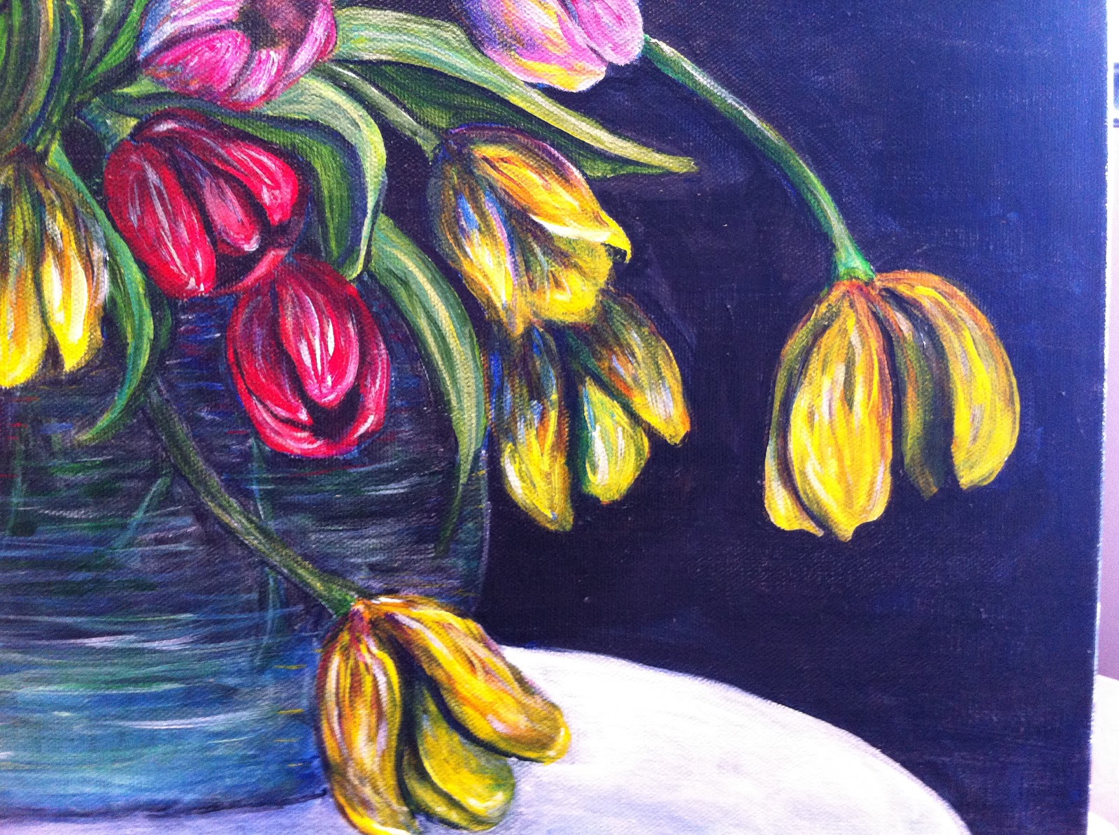
Now shut off your computer and go see which flowers are on special at your grocery store, or florist, or nearby field (don't get shot, though) .. Even if you only get one stem, it will make you happy to see it!


 |
| sideways, so you can check the composition |


 |
| The final painting |
Hi Catherine! I would call you Ms. Hicks but I feel like I know you from afar, as I've been very much inspired by this blog for several weeks now, and I noticed how there are scarcely any comments, which just seems wrong to me. Your painting is beautiful beyond words, and I too love Van Gogh but unfortunately do not know nearly enough about him or his work.. I have only just begun painting this past July and cannot tell you how inspired I have been by your paintings and your process and your way of thinking.. I'd love to talk to you, pick your brain, find out more about how you decided to go about this project, and how I could start my own journey in learning from Vincent, and you.. I feel like I'm behind, having only begun reading yoru blog :D I love it though, and I'd love to talk with you sometime as I am truly a novice in beginning/setting up paintings and I'd love to learn more :)
ReplyDeleteHi Danica!
ReplyDeleteWell, I just figured out how to reply to your very kind comment here on the blog. I really appreciate what you wrote; I have been waiting for someone to paint (via the web!) with ever since I started the blog! I am so glad that you put yourself out there by making a comment, seeing that someone had responded in such a public way was very gratifying to me. I am thrilled beyond measure that I have played even the tiniest role in encouraging your own painting practice, and I am proud that you are getting going! Part of what I wanted to do in writing it all down was to lift the veil on how paintings are made, and your comment made me feel like I was on the way to mission accomplished.
Part of what made Vincent such a great painter is the legacy he left us in the letters that he wrote. When I read his letters, I feel like in some small way, I can get inside of his head, and at least imagine what he was thinking about on his own artistic journey. If the Vincent Project Blog helped you do the same, then the time and effort have been well spent. Keep painting, keep learning, and thanks so much for the comment!
Catherine Hicks
So, I flipped through the Van Gogh gallery last night, and I want to do one too, so ....Am i utterly insane to consider doing this one?
Deletehttp://www.vangoghgallery.com/catalog/Painting/68/Cottages:-Reminiscence-of-the-North.html
Cottages: Reminiscence of the North --? And what advice can you give me about 'transfer' cuz you mentioned doing a pizza slice?? Don't know what that means sadly.. I look forward to hearing from you!! Can't wait to see what you paint next!!!
Hi Danica!
DeleteGood for you! You are never insane for trying... The painting will teach you something, and if you don't learn what you think you want to know, you just paint it again, and it will teach you something else.
I looked at the painting, and it is lovely - it will be a nice piece to work, and I think it will make a lovely finished painting. Paint with turbulence!
The pizza method of transfer was discussed in depth in previous blogs; in a nutshell, you begin by printing out a copy of Vincent's painting, then divide that copy just like you would a pizza. (Divide from corner to corner, then horizontally, then vertically in halves). Next, divide your canvas the same way. Then transfer the image from copy to canvas slice by slice. You can also do this with a grid, if you prefer.
The main thing to keep in mind is that the point of doing this is to learn something, not (necessarily) to produce a completely finished painting...
So, as we say in the Lutheran Church, SIN BOLDLY! The way to learn how to paint is to paint. I can't wait to hear all about it, and good luck!
I am taking a day tomorrow to see a Picasso exhibit, which I hope to report on later in the week.
In the meanwhile, you can't do it wrong, so it's time to shut up and paint!
Good luck, and happy painting!
Catherine