Hi all!
Author's note: I started this posting of the blog about three weeks ago, when I had about 22 more paintings to do in order to meet my project goal of 52 paintings in 52 weeks. Because I chose to focus my time on painting rather than on blogging (because of my June 20th deadline), this blog is being written after the completion of the paintings.
OK, so let me restate this, because it just sounds crazy as I look back on it: my deadline was June 20th, and as of the first of June, I had completed only 30 of the 52 paintings. Thus I had tasked myself with completing 22 paintings in less than three weeks. Yeah, that goal was indeed crazy! Maybe I was becoming more and more like Van Gogh.
I needed to find a way to paint faster.
Yet instead of diving into a frantic painting frenzy, I took a breath, poured a glass of wine, and procrastinated by perusing my books about Vincent. After a few sips of white bordeaux, I looked down at my stacks and noticed the appropriately entitled: "Becoming Van Gogh." OK, Vincent, I'll bite.
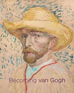 Published by The Denver Art Museum in association with the Yale University press, "Becoming Van Gogh" was a companion publication to an exhibit at the museum (October 2012 - January 2013) which explored the works and artists which influenced Vincent as he transfigured himself from the oft failed "Vincent" to supremely successful "Van Gogh." I am horrified that I missed this exhibit, but grateful for the opportunity to have a make up session with this fine and insightful book.
As I leafed through the tome, I came across an essay by Timothy J. Standring entitled "Vincent's Progress." This essay focuses on Vincent's prolific work using pen and ink on paper. Standring explains that much of the foundation for Vincent's later success with oil painting came directly from the hundreds of ink drawings he produced early in his artistic career. These drawings gave Vincent the confidence in his draftsmanship that he needed in order to take the risks necessary to produce his masterworks.
 Then (God Bless Timothy J. Standring!), the essay goes on to explain just exactly how Vincent did it!
 Standring describes Vincent using both reed and goose quill pens, and his method of working from light to dark in tone after first setting up the basic drawing in pencil.
The book also features numerous reproductions of Vincent's ink drawings, and describes how he later used some of these drawings as the basis for his paintings.
Because he wrote daily with ink pens, Vincent was very facile with this medium. What artistic advantage is there to typing on a keyboard?
 I concluded that if I were going to have a chance to reach my goal, I would have to loosen my definition of "painting." I figured if Vincent worked in inks, and his ink drawings counted as bona fide Van Gogh's, then it would be OK for me to do a few ink drawings in an effort to finish the Vincent Project on time.
I got out some bristol paper, and a pot of ink, some paintbrushes, water and an old nib and holder that I had, and I made a whole page of scribbles (above).

I do like the way you can see all of the images I have taped to the wall above the cup reflected in the inky blackness. Cool!

Certain nibs fit certain holders; that is why there are different ones.
Standring's essay featured a detail from Vincent's View of Arles from Montmajour, (below) which he drew in 1888.

I liked the drawing, primarily because of all of the different textures Vincent used in it. There were puffy clouds, rough trees and rocks, cultivated land, and even factory emissions in the drawing, and Standring practically invited me to copy with his extensive description of exactly how he thought Vincent did it.
 With a fresh piece of paper, working, as Standring suggested, from light to dark, I started with a wash for the sky.
I then added in a few horizontal lines, along with some texture in the foreground.
After loading up my nib with full strength ink, I started to sketch in the outlines of some of the buildings. Everything was going well until I touched down with an overloaded nib and it released a huge blob of ink (below) right where I did not want it!


I was able to incorporate the gray mark that was left, and I was glad that I did not have to throw out my painting because of the "blob."

I guess that was the sequel.
Summer movie season.
Nothin' but sequels!


And on I went. The ink dried so quickly that there was not much time to take photos. What you see at right is the drawing as I was nearing completion, and below is the finished drawing with the addition of some darker tones on the trees and in the clouds.
(I think I overdid this; what do you think?)


My drawing is above, and Vincent's is shown below (in the book). So that was #31.
I liked doing the inks, and quickly (re)embraced the medium. Below you will see some of the other ink drawings I did; I was averaging about one and 1/2 9X12 drawings each day, and in some cases I was even working on multiple drawings at the same time. I am going to just enlarge these photos and let you have a look at the process:
 |
| I started with some penguins, which came from a photocopy I made from a Time Magazine article about animals. |
 |
| photo |
 |
| photocopy |
 |
| this is the paper I used, it is called bristol or bristol board. |
 |
| You can see that it is a little thicker than regular paper, but not as thick as cardstock. |
 |
| Yes, I started by tracing - I had a schedule to keep! |
 |
| I am ready to start inking it in, and will use my penguin magnifier for inspiration and magnification! |


At about this point, I starting trying to think of a caption for what was starting to look like a "New Yorker" cartoon...
 |
| The bodies are filled in with pure ink. |
 |
| I added in some washes for shadows, and some dots to make the birds look rounder. |


 |
| The final drawing - please feel free to add a humorous caption if you can think of one! |
 I was feeling a little guilty because I was not painting with paints, so I decided to do a quick, small painting of a shoe, another image that I had previously cut out of my Time Magazine.
I started with a tracing of my image, then laid out some paints, below.
Along with some genuine reed pens and inks in lovely colors, I had picked up some exciting new Golden brand shades of grey at Asel Art supply near the UT Campus in Austin. I do want to encourage everyone to look to Asel, as well, when you want an excellent selection of art supplies, along with a friendly, and knowledgeable staff. Really, genuine thanks to David Lamplugh (aselartaustin@gmail.com), who was a great help to me when I stopped in. One of the coolest things about becoming an artist is getting to meet the really nice and interesting people in the art community. David is high on that list.


 |
| the beginning |
 |
| the middle |
 |
| the end |
 |
| some details |
 |
| the heel |
|
| a really big shoe! |
That was #33.
OK, what follows is some experimentation with inks, gouache (opaque water color) and transparent water color. This was purely just playing around. This work does not count on my list, but I am including it because I think there is value in following along to see where the end of my pen (or brush) leads me.


I turn him into the Wolfman!
 |
| this was an abstract experiment to use up my leftover gouache. |

To make up for it, I do a completely freehand drawing of Brio and Poco on The ArtDemiGod's leg in my sketch book (below). Ah, sleep! I wonder what that is like?


For this, I used blue painter's tape (which I had on hand) but I am not recommending this because it left a sticky residue on the edges of my drawing.
I have since learned that there is a specific artist's tape that does what the blue tape does but does not leave a residue. I will use that in the future.


This also shows how the reed pen works - ink is drawn up the slit and rests in the little hole until it is deployed onto the paper.

Thanks again, Asel Art!


 |
| the finished drawing |

She is smart, and will be a great mayor!
She also really really loves owls.


To keep the paper flat, I cover the wet image with a sheet of waxed paper and lay on a heavy book while it dries.

Thanks, Vincent!

And now I am working on another version of the Sower.

I start this one with a yellow ink wash, which I set to dry while I resume work on the owl.

The owl and branch are defined in black.
 |
| And here is the finished owl. |
The owl is #35


A thin bead of paper glue, some protective waxed paper, and another press with a heavy book made for a seamless repair.
 |
| here is the finished sower |
That one is #36.
Next, I am going to ink a moth, some trees, and a rocky hillside, all based on drawings that Vincent did. I am starting to understand how a tattoo artist feels, and my studio is starting to look a bit like a production line. I have to pause just a moment to consider art on a deadline. Are deadlines good for art? I have an inkling (ha!) that they are not.
OK, enough stalling!

I had several tubes of old water color (I think I inherited these from my Mother; they are probably at least 15 years old. I have no idea if freshness will count in this experiment.)
In the background you can see my cartoon of the moth.

Starting with just a few drops of blue ink, I suspended (see right) a blob of the green water color; I did it that way so that I could mix it in very sparingly and see what I got.
These stainless steel condiment cups from the restaurant supply are working pretty well for me.

And here we have the addition of a couple of fine mists of water and a tiny bit of the green in with the blue.

Notice how my paper toweling is taped down so that I can rub against it one handed with my brush.
The moth is inked, yet not documented photographically.

For the tree drawing, I decided that the turquoise color was too bright, so I dulled it down with the addition of just a whisper of black ink.

These trees are also based on a drawing that Vincent did - mine will be in color, though.

I am keeping things really thinned down with constant mists of water. This perfect little sprayer is a recycled eyeglass cleaner sprayer.

For the rocky landscape (which Vincent later made into a painting which I have visited many times at the Museum of Fine Arts in Houston), I wanted very little color, so I used some white water color with a little black ink to make shades of grey for the rocks and scrubby trees.

Because these ink drawings are fairly small, I am using a quite small angled shader for the application.

Here is the grey that I got.

I used blue ink for the sky.
You may note that the ink by itself is transparent; the leafy portion of the tree in the drawing still comes through the wash of ink.

Like all artists that work with nibs, I keep them secured in a recycled altoids container.
Vincent's original Sower paintings can be seen in the book propped open on my table.

Here is the progress on the trees, at left, and below near completion.
You can observe how I had the drawings taped down to my desk so that they would not buckle.

OK, so here, in order are the finished ink drawings in this series:
 |
| #31 Landscape at Arles after Van Gogh (ink on bristol) |
 |
| #32 Penguins (ink on bristol) |
 |
| #33 Night walk (acrylic on board) |
 |
| #34 The Night Cafe after Van Gogh (ink on bristol) |
 |
| #35 Owl (for Dawn) after Van Gogh (ink on bristol) |
 |
| #36 The Sower after Van Gogh (ink on bristol) |
 |
| #37 Trees after Van Gogh (ink on bristol) |
 |
| #38 Moth after Van Gogh (ink on bristol) |
 |
| #39 Rocky Landscape at Arles after Van Gogh (ink on bristol) |
 |
| #40 The Poppy after Dongen (MFAH) (ink on bristol) |
 |
| #41 Poco in repose (ink on pastel paper) (Awww!) |
 |
| unnumbered (bonus!) bee from my window (ink on bristol) |
No comments:
Post a Comment